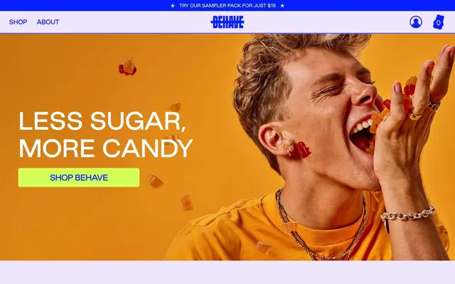
Preview image. Unlock full-res
Vivid candy wrapper
Color palette
Primary interactive elements, brand accents, strong borders, key headlines, icon fills, informational text. Its depth makes it commanding and playful
Primary CTA backgrounds, highlights, active states. This highly saturated green provides a jolt of energy, contrasting sharply with the Ultraviolet
Page backgrounds, card surfaces – a very pale, near-neutral lilac that provides a soft canvas for the brighter brand colors
Secondary card backgrounds, subtle tonal variation in elevated areas
Input field backgrounds. A slightly deeper, muted violet than Lilac Mist, offering a gentle differentiation for form elements
Content backgrounds, high-contrast text against dark backgrounds, essential borders that frame content without adding color
Typography
- Weights
- 400, 500, 700
- Sizes
- 12px, 14px, 16px, 18px, 22px, 24px, 32px, 53px, 56px, 72px, 86px
- Line height
- 1, 1.1, 1.15, 1.2, 1.3, 1.5, 1.51, 2.14, 2.5
- Letter spacing
- -0.0500em, -0.0220em, -0.0200em, -0.0160em, -0.0150em
- Fallback
- Montserrat
All textual content including headings, body text, navigation, and input fields. Its custom nature provides a unique, friendly yet bold voice, ensuring brand consistency across all type.
Spacing & shape
Components
Filled button with a Key Lime background (#d3ff56) and Ultraviolet text (#061fff), featuring a 6.95px border-radius and generous horizontal padding of 55px or 100px. This button is designed for immediate conversion.
Transparent background with Ultraviolet text (#061fff). Used for navigation links or less prominent actions where the focus should remain on the content. No border-radius or padding specified, implying minimal styling.
Key Lime background (#d3ff56) with Ultraviolet text (#061fff) and a high border-radius of 25px for a distinct, rounded shape. Used for smaller, categorizing actions.
Ultraviolet background (#061fff) with Key Lime text (#d3ff56) and a 6.95px border-radius, often used to stand out when placed on a lighter background or as a contrasting action.
Soft Plum background (#ceb3ff) with 20px border-radius and 30px padding on all sides. Used for displaying product information or feature blocks within the main content area.
Lilac Mist background (#efe5ff) with a 20px border-radius and 40px top padding. Used for introductory or visually prominent content, often at the top of a section.
Lavender Haze background (#dfceff) with Ultraviolet text (#061fff) and a 6.95px border-radius. Features 10px vertical and 48px right padding for a spacious input area.
Guidelines
- Always use Ultraviolet (#061fff) for primary text and interactive elements to maintain brand vibrancy.
- Utilize Key Lime (#d3ff56) exclusively for primary call-to-action backgrounds and highlight states, ensuring high contrast and immediate recognition.
- Employ Lilac Mist (#efe5ff) for main page and section backgrounds to establish a soft, airy canvas.
- Apply a 6.95px border-radius to all interactive form elements and most buttons for a consistent rounded aesthetic.
- Maintain generous element spacing of 20px for clear separation and visual breathing room between components.
- Structure primary content areas with a default card padding of 30px to frame information effectively.
- Ensure all type uses the 'Good Sans' family, leveraging its custom character and available weights for specific hierarchy.
- Avoid using Key Lime (#d3ff56) for general text or borders, as its high saturation is reserved for primary actions.
- Do not introduce new grayscale tones; rely on Pure White (#ffffff) and the Lilac Mist (#efe5ff) as the primary neutral canvas.
- Refrain from using hard-edged designs; rounded corners with 6.95px, 20px, or 25px radii are a defining characteristic.
- Do not clutter layouts; maintain the spacious feel by adhering to the established 20px element gap and 30px card padding.
- Do not use dark backgrounds for large content blocks; the brand identity is built on a light, pastel canvas.
- Avoid generic system fonts; the custom 'Good Sans' family is critical for brand personality.
- Do not allow text to appear in colors that fail AA accessibility contrast ratios against its background, particularly Ultraviolet on lighter neutrals.
About this system
ShowHide
BEHAVE Candy uses a playful, high-energy visual system. Vivid violet and bright lime green dominate, creating a bold, almost confectionery palette. Typography is robust and direct, set against ample background space. Components are clean and border-centric, often outlined in the brand's signature blue, maintaining a light, airy feel despite the strong color presence. The overall impression is fun, youthful, and direct.
Reminiscent of Oatly, Chobani (some campaigns), Liquid Death, Magic Spoon.
# BEHAVE Candy — Style Reference
> Vivid candy wrapper

**Theme:** light

**Site:** https://www.eatbehave.com

BEHAVE Candy uses a playful, high-energy visual system. Vivid violet and bright lime green dominate, creating a bold, almost confectionery palette. Typography is robust and direct, set against ample background space. Components are clean and border-centric, often outlined in the brand's signature blue, maintaining a light, airy feel despite the strong color presence. The overall impression is fun, youthful, and direct.

## Tokens — Colors

| Name | Value | Token | Role |
|------|------|------|------|
| Ultraviolet | `#061fff` | `--color-ultraviolet` | Primary interactive elements, brand accents, strong borders, key headlines, icon fills, informational text. Its depth makes it commanding and playful |
| Key Lime | `#d3ff56` | `--color-key-lime` | Primary CTA backgrounds, highlights, active states. This highly saturated green provides a jolt of energy, contrasting sharply with the Ultraviolet |
| Lilac Mist | `#efe5ff` | `--color-lilac-mist` | Page backgrounds, card surfaces – a very pale, near-neutral lilac that provides a soft canvas for the brighter brand colors |
| Soft Plum | `#ceb3ff` | `--color-soft-plum` | Secondary card backgrounds, subtle tonal variation in elevated areas |
| Lavender Haze | `#dfceff` | `--color-lavender-haze` | Input field backgrounds. A slightly deeper, muted violet than Lilac Mist, offering a gentle differentiation for form elements |
| Pure White | `#ffffff` | `--color-pure-white` | Content backgrounds, high-contrast text against dark backgrounds, essential borders that frame content without adding color |

## Tokens — Typography

### Good Sans
- **Substitute:** Montserrat
- **Weights:** 400, 500, 700
- **Sizes:** 12px, 14px, 16px, 18px, 22px, 24px, 32px, 53px, 56px, 72px, 86px
- **Line height:** 1, 1.1, 1.15, 1.2, 1.3, 1.5, 1.51, 2.14, 2.5
- **Letter spacing:** -0.0500em, -0.0220em, -0.0200em, -0.0160em, -0.0150em
- **Role:** All textual content including headings, body text, navigation, and input fields. Its custom nature provides a unique, friendly yet bold voice, ensuring brand consistency across all type.

## Tokens — Type Scale

Perfect Fourth (1.333) from 16px base.

| Role | Size | Line height | Letter spacing |
|------|------|------|------|
| caption | 12px | 1.5 | -0.18px |
| body-sm | 14px | 1.5 | -0.21px |
| body | 16px | 1.5 | -0.24px |
| subheading | 18px | 1.3 | -0.27px |
| heading-sm | 22px | 1.2 | -0.33px |
| heading | 32px | 1.15 | -0.48px |
| heading-lg | 53px | 1.1 | -0.795px |
| display | 86px | 1 | -1.29px |

## Tokens — Spacing

- **Card padding:** 30px
- **Element gap:** 20px

## Tokens — Radius

- **Buttons:** 6.95px
- **Cards:** 20px
- **forms:** 6.95px
- **pills:** 25px

## Components

### Primary Action Button
*Key Call-to-Action*

Filled button with a Key Lime background (#d3ff56) and Ultraviolet text (#061fff), featuring a 6.95px border-radius and generous horizontal padding of 55px or 100px. This button is designed for immediate conversion.

### Ghost Button
*Secondary or Navigational Action*

Transparent background with Ultraviolet text (#061fff). Used for navigation links or less prominent actions where the focus should remain on the content. No border-radius or padding specified, implying minimal styling.

### Pill Button
*Categorization or Tag*

Key Lime background (#d3ff56) with Ultraviolet text (#061fff) and a high border-radius of 25px for a distinct, rounded shape. Used for smaller, categorizing actions.

### Reverse Primary Button
*Highlighted Action on Dark Background*

Ultraviolet background (#061fff) with Key Lime text (#d3ff56) and a 6.95px border-radius, often used to stand out when placed on a lighter background or as a contrasting action.

### Standard Content Card
*Content Grouping*

Soft Plum background (#ceb3ff) with 20px border-radius and 30px padding on all sides. Used for displaying product information or feature blocks within the main content area.

### Hero Section Card
*Promotional Content*

Lilac Mist background (#efe5ff) with a 20px border-radius and 40px top padding. Used for introductory or visually prominent content, often at the top of a section.

### Text Input Field
*Data Entry*

Lavender Haze background (#dfceff) with Ultraviolet text (#061fff) and a 6.95px border-radius. Features 10px vertical and 48px right padding for a spacious input area.

## Guidelines

### Do

- Always use Ultraviolet (#061fff) for primary text and interactive elements to maintain brand vibrancy.
- Utilize Key Lime (#d3ff56) exclusively for primary call-to-action backgrounds and highlight states, ensuring high contrast and immediate recognition.
- Employ Lilac Mist (#efe5ff) for main page and section backgrounds to establish a soft, airy canvas.
- Apply a 6.95px border-radius to all interactive form elements and most buttons for a consistent rounded aesthetic.
- Maintain generous element spacing of 20px for clear separation and visual breathing room between components.
- Structure primary content areas with a default card padding of 30px to frame information effectively.
- Ensure all type uses the 'Good Sans' family, leveraging its custom character and available weights for specific hierarchy.

### Don't

- Avoid using Key Lime (#d3ff56) for general text or borders, as its high saturation is reserved for primary actions.
- Do not introduce new grayscale tones; rely on Pure White (#ffffff) and the Lilac Mist (#efe5ff) as the primary neutral canvas.
- Refrain from using hard-edged designs; rounded corners with 6.95px, 20px, or 25px radii are a defining characteristic.
- Do not clutter layouts; maintain the spacious feel by adhering to the established 20px element gap and 30px card padding.
- Do not use dark backgrounds for large content blocks; the brand identity is built on a light, pastel canvas.
- Avoid generic system fonts; the custom 'Good Sans' family is critical for brand personality.
- Do not allow text to appear in colors that fail AA accessibility contrast ratios against its background, particularly Ultraviolet on lighter neutrals.

## Agent Prompt Guide

Quick Color Reference:
text: #061fff
background: #efe5ff
border: #061fff
accent: #d3ff56
primary action: #d3ff56 (filled action)

Example Component Prompts:
1. Create a Primary Action Button: #d3ff56 background, #ffffff text, 9999px radius, compact pill padding. Use this filled treatment for the main CTA.
2. Design a product card: background Soft Plum (#ceb3ff), 20px border-radius, 30px padding. Inside, place a product title 'GRAPEFRUIT TANGERINE YUZU' in Good Sans 14px weight 400, #061fff. Below, a larger product name 'SUPER SOUR SKULLS' in Good Sans 22px weight 700, #061fff. Add a ghost button 'VIEW PRODUCT' with transparent background, Ultraviolet text (#061fff), and no explicit border-radius.
3. Create an input field: background Lavender Haze (#dfceff), 6.95px border-radius, with placeholder text in Good Sans 16px weight 400, #061fff. Include a border in Ultraviolet (#061fff).
More like this


Keep what you find
A free account saves references to boards and can send you a weekly email of picks based on what you save.
To see every result, go Pro.