Preview image. Unlock full-res
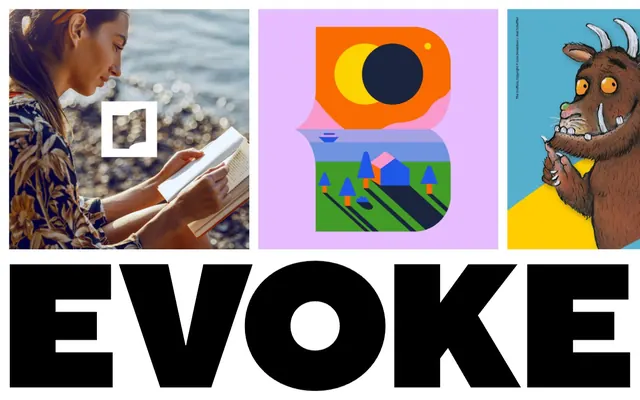
Vibrant billboard clarity
Color palette
Dominant background color, often paired with black text for key sections
Background panels for featured content, providing a bright, energetic lift
Accent background for visual sections, creating a cool, modern backdrop
Subtle background for panels, offering a softer alternative to the more vivid brand colors
Dark borders and separators for elevated surfaces and inverted UI. Do not promote it to the primary CTA color
Content backgrounds, contrasting text against dark backgrounds. Serves as a neutral canvas or a high-contrast foreground
Typography
- Weights
- 400
- Sizes
- 31px
- Line height
- 1.2
- Letter spacing
- -0.0150em
- Fallback
- Bebas Neue
Prominent display text and key branding elements. Despite the 'extrablack' name, the observed weight is 400, but its visual density and tracking imbue it with a heavy, assertive presence.
- Weights
- 400
- Sizes
- 31px
- Line height
- 1.2
- Letter spacing
- -0.0150em
- Fallback
- Inter
Primary headings and large text. Its slightly condensed and tightly spaced nature provides a strong, confident voice without being overly decorative.
Spacing & shape
Components
These sections feature full-bleed background colors (Rosy Flush, Sunbeam Yellow, Sky Cyan, Lavender Mist) without rounded corners, providing a distinct canvas for contained imagery or large typography. Content within these sections uses 21px padding.
A square image container. On hover, a semantically full-bleed overlay appears with the word 'VIEW' in Canvas White (#ffffff) using tt_norms_proextrablack at 31px, line-height 1.2, letter-spacing -0.0150em, with a Midnight Ink (#000000) border, 88px wide. The default state has no visible border.
Guidelines
- Prioritize high-contrast text against solid, vibrant background colors. For example, Midnight Ink (#000000) text on Rosy Flush (#ff5a46).
- Utilize tt_norms_proextrablack (substitute Bebas Neue) at 31px, line-height 1.2, and tight letter-spacing (-0.0150em) for all impactful display text and brand statements.
- Present visual content within distinct, full-bleed color sections using Rosy Flush (#ff5a46), Sunbeam Yellow (#ffe100), Sky Cyan (#00ffff), or Lavender Mist (#ebebf5) as background colors.
- Ensure all interactive elements and image borders clearly use Midnight Ink (#000000) for definition with a sharp, 0px border-radius.
- Apply 21px interior padding consistently to content blocks within colored sections to provide comfortable spacing from edges.
- Maintain a comfortable element gap of 20px between distinct visual components and text blocks for clear separation.
- Avoid gradients or complex background textures; the system relies on flat, bold color blocks.
- Do not introduce rounded corners; all elements, including images and containers, should maintain sharp, 0px edges.
- Refrain from using subtle or low-contrast color pairings; the core aesthetic is built on strong, immediate visual impact.
- Do not deviate from the specified tight letter-spacing for headings; it is crucial to the typographic identity.
- Avoid unnecessary icons or decorative flourishes; maintain a minimalist approach that spotlights typography and content.
- Do not embed imagery with soft edges or complex masking; images should be contained and rectilinear.
- Do not use generic system fonts for display text; stick to tt_norms_pro family (or substitutes) for brand consistency.
About this system
ShowHide
EVOKE presents a bold, high-contrast visual system where stark black and white typography dominates an otherwise colorful, illustrative landscape. The design prioritizes readability and impact through large, heavy type set against vibrant, interchangeable background panels, creating a dynamic, almost billboard-like presentation. Visual content is presented in distinct, contained blocks, allowing each piece to stand out. Spacing is comfortable, offering breathing room for the strong visual elements without feeling sparse.
The page exhibits a full-bleed layout, where content sections stretch across the entire viewport width. The hero section and subsequent content blocks frequently use distinct, solid background colors that fill the screen. Content within these sections often appears to be centered or arranged in a grid for visual projects. There's a strong emphasis on consistent vertical rhythm, with ample space between and around content blocks, creating a comfortable yet impactful presentation. Navigation appears minimal, implied by the 'VIEW' overlays on image blocks rather than a persistent header or sidebar.
The site uses a mix of high-quality lifestyle photography and abstract, colorful flat illustrations. Photography is generally unedited or naturally lit, focusing on people interacting with products or environments, contained within square aspect ratios. Illustrations are abstract, geometric, and vibrant, using the core brand color palette to create distinct scenes or abstract shapes. Iconography is minimalist, outlined, and monochromatic, visible as a 'book' icon within a white square overlay. Imagery primarily serves as portfolio showcase and decorative atmosphere, arranged in a grid-like fashion.
Reminiscent of Huge Inc., Pentagram, Anagram, Koto.
# EVOKE — Style Reference
> Vibrant billboard clarity

**Theme:** light

**Site:** https://studioevoke.co.uk

EVOKE presents a bold, high-contrast visual system where stark black and white typography dominates an otherwise colorful, illustrative landscape. The design prioritizes readability and impact through large, heavy type set against vibrant, interchangeable background panels, creating a dynamic, almost billboard-like presentation. Visual content is presented in distinct, contained blocks, allowing each piece to stand out. Spacing is comfortable, offering breathing room for the strong visual elements without feeling sparse.

## Tokens — Colors

| Name | Value | Token | Role |
|------|------|------|------|
| Rosy Flush | `#ff5a46` | `--color-rosy-flush` | Dominant background color, often paired with black text for key sections |
| Sunbeam Yellow | `#ffe100` | `--color-sunbeam-yellow` | Background panels for featured content, providing a bright, energetic lift |
| Sky Cyan | `#00ffff` | `--color-sky-cyan` | Accent background for visual sections, creating a cool, modern backdrop |
| Lavender Mist | `#ebebf5` | `--color-lavender-mist` | Subtle background for panels, offering a softer alternative to the more vivid brand colors |
| Midnight Ink | `#000000` | `--color-midnight-ink` | Dark borders and separators for elevated surfaces and inverted UI. Do not promote it to the primary CTA color |
| Canvas White | `#ffffff` | `--color-canvas-white` | Content backgrounds, contrasting text against dark backgrounds. Serves as a neutral canvas or a high-contrast foreground |

## Tokens — Typography

### tt_norms_proextrablack
- **Substitute:** Bebas Neue
- **Weights:** 400
- **Sizes:** 31px
- **Line height:** 1.2
- **Letter spacing:** -0.0150em
- **Role:** Prominent display text and key branding elements. Despite the 'extrablack' name, the observed weight is 400, but its visual density and tracking imbue it with a heavy, assertive presence.

### tt_norms_pronormal
- **Substitute:** Inter
- **Weights:** 400
- **Sizes:** 31px
- **Line height:** 1.2
- **Letter spacing:** -0.0150em
- **Role:** Primary headings and large text. Its slightly condensed and tightly spaced nature provides a strong, confident voice without being overly decorative.

## Tokens — Spacing

- **Section gap:** 64px
- **Card padding:** 21px
- **Element gap:** 20px

## Tokens — Radius

- **Default:** 0px

## Layout

The page exhibits a full-bleed layout, where content sections stretch across the entire viewport width. The hero section and subsequent content blocks frequently use distinct, solid background colors that fill the screen. Content within these sections often appears to be centered or arranged in a grid for visual projects. There's a strong emphasis on consistent vertical rhythm, with ample space between and around content blocks, creating a comfortable yet impactful presentation. Navigation appears minimal, implied by the 'VIEW' overlays on image blocks rather than a persistent header or sidebar.

## Imagery

The site uses a mix of high-quality lifestyle photography and abstract, colorful flat illustrations. Photography is generally unedited or naturally lit, focusing on people interacting with products or environments, contained within square aspect ratios. Illustrations are abstract, geometric, and vibrant, using the core brand color palette to create distinct scenes or abstract shapes. Iconography is minimalist, outlined, and monochromatic, visible as a 'book' icon within a white square overlay. Imagery primarily serves as portfolio showcase and decorative atmosphere, arranged in a grid-like fashion.

## Components

### Accent Background Section
*Containers for visual content or key information.*

These sections feature full-bleed background colors (Rosy Flush, Sunbeam Yellow, Sky Cyan, Lavender Mist) without rounded corners, providing a distinct canvas for contained imagery or large typography. Content within these sections uses 21px padding.

### Image Card with 'VIEW' Overlay
*Showcasing portfolio items or visual content.*

A square image container. On hover, a semantically full-bleed overlay appears with the word 'VIEW' in Canvas White (#ffffff) using tt_norms_proextrablack at 31px, line-height 1.2, letter-spacing -0.0150em, with a Midnight Ink (#000000) border, 88px wide. The default state has no visible border.

## Guidelines

### Do

- Prioritize high-contrast text against solid, vibrant background colors. For example, Midnight Ink (#000000) text on Rosy Flush (#ff5a46).
- Utilize tt_norms_proextrablack (substitute Bebas Neue) at 31px, line-height 1.2, and tight letter-spacing (-0.0150em) for all impactful display text and brand statements.
- Present visual content within distinct, full-bleed color sections using Rosy Flush (#ff5a46), Sunbeam Yellow (#ffe100), Sky Cyan (#00ffff), or Lavender Mist (#ebebf5) as background colors.
- Ensure all interactive elements and image borders clearly use Midnight Ink (#000000) for definition with a sharp, 0px border-radius.
- Apply 21px interior padding consistently to content blocks within colored sections to provide comfortable spacing from edges.
- Maintain a comfortable element gap of 20px between distinct visual components and text blocks for clear separation.

### Don't

- Avoid gradients or complex background textures; the system relies on flat, bold color blocks.
- Do not introduce rounded corners; all elements, including images and containers, should maintain sharp, 0px edges.
- Refrain from using subtle or low-contrast color pairings; the core aesthetic is built on strong, immediate visual impact.
- Do not deviate from the specified tight letter-spacing for headings; it is crucial to the typographic identity.
- Avoid unnecessary icons or decorative flourishes; maintain a minimalist approach that spotlights typography and content.
- Do not embed imagery with soft edges or complex masking; images should be contained and rectilinear.
- Do not use generic system fonts for display text; stick to tt_norms_pro family (or substitutes) for brand consistency.

## Agent Prompt Guide

Quick Color Reference:
text: #000000
background: #ffffff
border: #000000
accent: #ff5a46
primary action: no distinct CTA color

Example Component Prompts:
1. Create a full-width hero section: Rosy Flush (#ff5a46) background. Headline 'INSPIRE CHANGE' centered, using tt_norms_proextrablack (or Bebas Neue) weight 400, size 31px, line-height 1.2, letter-spacing -0.0150em, in Midnight Ink (#000000).
2. Create an image gallery entry: A square image with 0px radius. On hover, show an overlay of Canvas White (#ffffff) text 'VIEW' in tt_norms_proextrablack weight 400, size 31px, line-height 1.2, letter-spacing -0.0150em, centered within a square border of Midnight Ink (#000000) that is 88px wide.
3. Create a content section: Background in Sky Cyan (#00ffff). Content text in Midnight Ink (#000000) at 20px font size. Ensure 21px padding around the content and a 20px gap to the next element.
More like this









Keep what you find
A free account saves references to boards and can send you a weekly email of picks based on what you save.
To see every result, go Pro.