Preview image. Unlock full-res
High-contrast digital clarity
Color palette
Primary call-to-action buttons, active states, key highlights
Decorative indicators, high-emphasis small text (e.g., notification counts)
Page backgrounds, elevated surfaces
Dark borders and separators for elevated surfaces and inverted UI. Do not promote it to the primary CTA color
Secondary text, muted links, subtle borders
Typography
- Weights
- 400, 600, 700
- Sizes
- 10px, 18px, 22px, 72px
- Line height
- 1, 1.1, 1.11
- Letter spacing
- -0.0070em
- Fallback
- Montserrat
Primary brand typography for headings, navigation, and body text. The tight letter-spacing gives a modern, compact feel, especially for headlines.
- Weights
- 400
- Sizes
- 14px
- Line height
- 1.43
- Letter spacing
- normal
- Fallback
- Helvetica Neue
System fallback or specific small text usage, such as meta information or captions.
Spacing & shape
Components
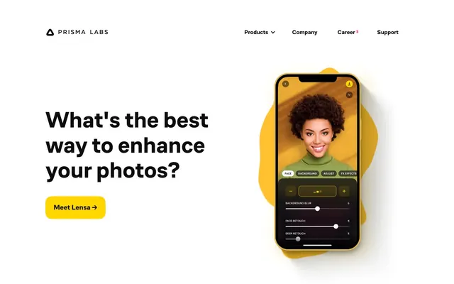
Filled rectangular button with vivid Action Yellow background, Charcoal Text, and substantial padding, defining primary calls to action. Uses 16px border-radius. Example text: 'Meet Lensa →'.
Text-only button for navigation items or secondary actions, Charcoal Text on Canvas White. Minimal padding and no border-radius. Example text: 'Products', 'Company'.
Large, bold Cofo sans text (72px, 700 weight, 1.0 lineHeight) in Charcoal Text for immediate impact and clarity at the top of sections. Significant negative letter spacing.
Cofo sans text (18px, 400 weight) in Charcoal Text, appearing in the main navigation. Small indicators (like '1') may use Highlight Red. No distinct background or border.
Guidelines
- Always use Action Yellow (#ffd600) for primary interactive elements, ensuring high contrast against Canvas White.
- Apply Charcoal Text (#0d0d0d) for all main headings and body text, maintaining a crisp reading experience.
- Utilize Cofo sans at 72px weight 700 with -0.0070em letter-spacing for all hero-level headlines.
- Implement 16px border-radius for all interactive buttons and 10px for other UI containers, providing a consistent soft-edged feel.
- Maintain a clear visual hierarchy by limiting color; use Highlight Red (#ff0062) sparingly for small, high-emphasis notifications or markers.
- Ensure generous vertical spacing for sections, using the 84px sectionGap to create breathing room between content blocks.
- Use Greyed Text (#333333) for secondary information, sub-navigation, and less prominent links to establish visual hierarchy.
- Do not use Action Yellow (#ffd600) for decorative purposes; reserve it strictly for calls-to-action and active states.
- Avoid introducing additional saturated colors unless they serve a clear and distinct functional purpose (e.g., semantic states not present on site).
- Do not use Cofo sans without its characteristic tight letter-spacing; it is integral to the brand's typographic aesthetic.
- Refrain from heavy shadows or multiple borders on components, as the system favors a light and direct visual style.
- Do not vary line-height significantly for Cofo sans headings; maintain values close to 1.1 or 1.0 to keep text compact.
- Avoid using Charcoal Text (#0d0d0d) on any background color other than Canvas White or Action Yellow to preserve contrast.
- Do not use a body text size smaller than 14px (Arial) or 18px (Cofo sans) to ensure readability against the high contrast background.
About this system
ShowHide
Prisma Labs uses a high-contrast experience with a bright, functional yellow acting as the primary accent against a stark white canvas and deep charcoal text. This creates an energetic and direct communication style. Typography is dense and assertive, with close letter-spacing giving a compact feel. Call-to-action elements are distinct and bold, leveraging the vivid yellow to draw immediate attention. Components are lightweight with minimal adornment, emphasizing content and interaction over heavy UI chrome.
The page adheres to a max-width of 1500px, centered on the canvas. The hero section and subsequent content blocks are structured in a two-column layout, often with a large headline and primary action button on the left, and a product screenshot on the right. This arrangement creates a clear focal point and guiding visual flow. Sections are separated by a consistent 84px vertical gap, creating a comfortable density. Navigation is a sticky top bar, containing text links and a brand logo.
The site predominantly uses product screenshots of mobile applications, set within realistic device mockups. These screenshots are often accompanied by abstract, organic shapes in brand colors (yellow, blue), positioned behind or wrapping around the device, providing a soft background detail. The screenshots themselves are central and feature realistic portrait photography. Icons are minimal, likely filled, and appear functional within the product UI. Imagery serves a functional and showcasing role, highlighting the application's capabilities directly.
Reminiscent of Figma, Linear, Canva, Snapchat.
# Prisma Labs — Style Reference
> High-contrast digital clarity

**Theme:** light

**Site:** https://prisma-ai.com

Prisma Labs uses a high-contrast experience with a bright, functional yellow acting as the primary accent against a stark white canvas and deep charcoal text. This creates an energetic and direct communication style. Typography is dense and assertive, with close letter-spacing giving a compact feel. Call-to-action elements are distinct and bold, leveraging the vivid yellow to draw immediate attention. Components are lightweight with minimal adornment, emphasizing content and interaction over heavy UI chrome.

## Tokens — Colors

| Name | Value | Token | Role |
|------|------|------|------|
| Action Yellow | `#ffd600` | `--color-action-yellow` | Primary call-to-action buttons, active states, key highlights |
| Highlight Red | `#ff0062` | `--color-highlight-red` | Decorative indicators, high-emphasis small text (e.g., notification counts) |
| Canvas White | `#ffffff` | `--color-canvas-white` | Page backgrounds, elevated surfaces |
| Charcoal Text | `#0d0d0d` | `--color-charcoal-text` | Dark borders and separators for elevated surfaces and inverted UI. Do not promote it to the primary CTA color |
| Greyed Text | `#333333` | `--color-greyed-text` | Secondary text, muted links, subtle borders |

## Tokens — Typography

### Cofo sans
- **Substitute:** Montserrat
- **Weights:** 400, 600, 700
- **Sizes:** 10px, 18px, 22px, 72px
- **Line height:** 1, 1.1, 1.11
- **Letter spacing:** -0.0070em
- **Role:** Primary brand typography for headings, navigation, and body text. The tight letter-spacing gives a modern, compact feel, especially for headlines.

### Arial
- **Substitute:** Helvetica Neue
- **Weights:** 400
- **Sizes:** 14px
- **Line height:** 1.43
- **Letter spacing:** normal
- **Role:** System fallback or specific small text usage, such as meta information or captions.

## Tokens — Type Scale

Golden Ratio (1.618) from 14px base.

| Role | Size | Line height | Letter spacing |
|------|------|------|------|
| caption | 10px | 1.11 | — |
| body | 14px | 1.43 | — |
| subheading | 18px | 1.1 | — |
| heading | 22px | 1.1 | — |
| display | 72px | 1 | -0.7px |

## Tokens — Spacing

- **Max width:** 1500px
- **Section gap:** 84px
- **Card padding:** 24px
- **Element gap:** 16px

## Tokens — Radius

- **Buttons:** 16px
- **others:** 10px

## Layout

The page adheres to a max-width of 1500px, centered on the canvas. The hero section and subsequent content blocks are structured in a two-column layout, often with a large headline and primary action button on the left, and a product screenshot on the right. This arrangement creates a clear focal point and guiding visual flow. Sections are separated by a consistent 84px vertical gap, creating a comfortable density. Navigation is a sticky top bar, containing text links and a brand logo.

## Imagery

The site predominantly uses product screenshots of mobile applications, set within realistic device mockups. These screenshots are often accompanied by abstract, organic shapes in brand colors (yellow, blue), positioned behind or wrapping around the device, providing a soft background detail. The screenshots themselves are central and feature realistic portrait photography. Icons are minimal, likely filled, and appear functional within the product UI. Imagery serves a functional and showcasing role, highlighting the application's capabilities directly.

## Components

### Primary Action Button
*Interactive element*

Filled rectangular button with vivid Action Yellow background, Charcoal Text, and substantial padding, defining primary calls to action. Uses 16px border-radius. Example text: 'Meet Lensa →'.

### Ghost Navigation Button
*Interactive element*

Text-only button for navigation items or secondary actions, Charcoal Text on Canvas White. Minimal padding and no border-radius. Example text: 'Products', 'Company'.

### Hero Headline
*Text element*

Large, bold Cofo sans text (72px, 700 weight, 1.0 lineHeight) in Charcoal Text for immediate impact and clarity at the top of sections. Significant negative letter spacing.

### Navigation Item
*Interactive element*

Cofo sans text (18px, 400 weight) in Charcoal Text, appearing in the main navigation. Small indicators (like '1') may use Highlight Red. No distinct background or border.

## Guidelines

### Do

- Always use Action Yellow (#ffd600) for primary interactive elements, ensuring high contrast against Canvas White.
- Apply Charcoal Text (#0d0d0d) for all main headings and body text, maintaining a crisp reading experience.
- Utilize Cofo sans at 72px weight 700 with -0.0070em letter-spacing for all hero-level headlines.
- Implement 16px border-radius for all interactive buttons and 10px for other UI containers, providing a consistent soft-edged feel.
- Maintain a clear visual hierarchy by limiting color; use Highlight Red (#ff0062) sparingly for small, high-emphasis notifications or markers.
- Ensure generous vertical spacing for sections, using the 84px sectionGap to create breathing room between content blocks.
- Use Greyed Text (#333333) for secondary information, sub-navigation, and less prominent links to establish visual hierarchy.

### Don't

- Do not use Action Yellow (#ffd600) for decorative purposes; reserve it strictly for calls-to-action and active states.
- Avoid introducing additional saturated colors unless they serve a clear and distinct functional purpose (e.g., semantic states not present on site).
- Do not use Cofo sans without its characteristic tight letter-spacing; it is integral to the brand's typographic aesthetic.
- Refrain from heavy shadows or multiple borders on components, as the system favors a light and direct visual style.
- Do not vary line-height significantly for Cofo sans headings; maintain values close to 1.1 or 1.0 to keep text compact.
- Avoid using Charcoal Text (#0d0d0d) on any background color other than Canvas White or Action Yellow to preserve contrast.
- Do not use a body text size smaller than 14px (Arial) or 18px (Cofo sans) to ensure readability against the high contrast background.

## Agent Prompt Guide

**Quick Color Reference:**
- text: #0d0d0d
- background: #ffffff
- border: #0d0d0d
- accent: #ff0062
- primary action: #ffd600 (filled action)

**Example Component Prompts:**
- Create a hero section with a headline "Unlock professional photo editing" at 72px Cofo sans, weight 700 (#0d0d0d, letter-spacing -0.7px). Below it, a Primary Action Button "Get the App →" (#ffd600 background, #0d0d0d text, 16px radius, 26px padding). The section background should be Canvas White (#ffffff).
- Design a navigation bar with a Ghost Navigation Button "Careers" (Cofo sans 18px, weight 400, #0d0d0d) and a small '1' next to it using Highlight Red (#ff0062). The navbar should have a Canvas White (#ffffff) background.
- Implement a card for a feature description: 10px radius, Canvas White (#ffffff) background, 24px padding. Inside, use a subheading (Cofo sans 22px, weight 700, #0d0d0d) for the title and body text (Cofo sans 18px, weight 400, #0d0d0d) for description. The card should be separated from other elements by a 16px elementGap.
More like this









Keep what you find
A free account saves references to boards and can send you a weekly email of picks based on what you save.
To see every result, go Pro.