Preview image. Unlock full-res
Vibrant gradient canvas
Color palette
Animated navigation background segment within the gradient
Animated navigation background segment within the gradient
Animated navigation background segment within the gradient
Animated navigation background segment within the gradient
Page backgrounds, left-hand navigation pane background
Primary text, navigation links, borders, logo fill
Typography
- Weights
- 400
- Sizes
- 14px, 16px
- Line height
- 1
- Letter spacing
- normal
- Fallback
- Montserrat
All text elements: logo, navigation links, body copy, and footer copyright
Spacing & shape
Components
Black text (#000000) at 16px, weight 400. Hover state introduces a colored background segment derived from the vibrant gradient, such as Scarlet Flash (#de3333), creating an impactful visual switch. Spacing is 10px below each item and 5px left margin.
Black text (#000000) at 14px, weight 400. positioned to the bottom left.
Guidelines
- Prioritize a stark white background (#ffffff) for all UI content on the left pane and use Ink Black (#000000) for all text and UI outlines.
- Use StudioFeixenSans (or Montserrat) at weight 400 for all textual content, adhering to minimal letter spacing.
- Introduce dynamic color via full-bleed gradient sections that contrast sharply with static UI elements. These gradients should feature vivid brand colors like Scarlet Flash (#de3333), Ocean Dream (#70b2ff), Emerald Glaze (#7bdcb5), and Golden Burst (#f9bf03).
- Maintain a compact density for UI elements, utilizing a base spacing unit of 6px and minimal gaps like 5px between navigation items.
- Ensure the logo is prominent black text (#000000) against the white canvas, consistent with the typographic style.
- Implement interactive states for navigation items by applying one of the distinct brand colors as a solid background fill on hover, ensuring high contrast with the black text.
- Avoid using multiple font families or weights beyond 400 (StudioFeixenSans) to maintain typographic consistency.
- Do not introduce shadows or complex elevation schemes, as the design relies on flat surfaces and high contrast.
- Refrain from using muted or desaturated colors for UI elements; chromatic colors should be vivid and high-impact when used.
- Do not use iconography or other decorative elements that could detract from the strong contrast and gradient visual.
- Avoid excessive padding or large empty spaces within the UI content area; maintain a concentrated, information-dense display for text.
- Do not break the full-bleed nature of the gradient sections with contained content or overlays that obscure their vibrancy.
About this system
ShowHide
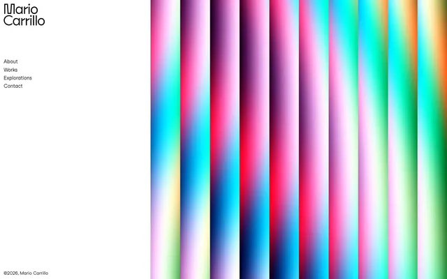
The Mario Carrillo site presents a bold, high-contrast aesthetic, pairing stark white canvases with black typography for a graphic, almost stark feel. The visual dynamism is introduced through a vibrant, full-bleed gradient background that serves as the site's primary visual element, contrasting sharply with the minimalist UI. Typography is concise and direct, maintaining a clean presentation. The design leverages visual simplicity to foreground the impactful background imagery.
The page uses a split layout: a fixed-width left navigation sidebar (max-width implicitly defined by content) against a full-height, full-width gradient background on the right. The left section maintains a stark white canvas with vertically stacked navigation links. The hero pattern is effectively this full-bleed, animated gradient on the right, providing visual energy without explicit content. Section rhythm is absent beyond the initial split, as content beyond the navigation footer is not visible. Content arrangement is primarily a left-aligned vertical stack of navigation elements. Overall density is compact on the left, with the right dedicated to expansive visual display.
The site's primary imagery consists of abstract, vibrant, vertically-striped gradients that function as energetic, full-bleed backgrounds. They are highly saturated and appear to shift fluidly, serving a purely decorative and atmospheric role rather than explanatory content. There are no photographs, illustrations, or product screenshots in the UI. Icons are not present. The density of imagery is high, as it occupies a significant portion of the screen, contrasting with the text-dominant UI on the left.
Reminiscent of AIGA (American Institute of Graphic Arts), Hyper Island, Future Fonts, Lusion.
# Mario Carrillo — Style Reference
> Vibrant gradient canvas

**Theme:** light

**Site:** https://marioecg.com

The Mario Carrillo site presents a bold, high-contrast aesthetic, pairing stark white canvases with black typography for a graphic, almost stark feel. The visual dynamism is introduced through a vibrant, full-bleed gradient background that serves as the site's primary visual element, contrasting sharply with the minimalist UI. Typography is concise and direct, maintaining a clean presentation. The design leverages visual simplicity to foreground the impactful background imagery.

## Tokens — Colors

| Name | Value | Token | Role |
|------|------|------|------|
| Scarlet Flash | `#de3333` | `--color-scarlet-flash` | Animated navigation background segment within the gradient |
| Ocean Dream | `#70b2ff` | `--color-ocean-dream` | Animated navigation background segment within the gradient |
| Emerald Glaze | `#7bdcb5` | `--color-emerald-glaze` | Animated navigation background segment within the gradient |
| Golden Burst | `#f9bf03` | `--color-golden-burst` | Animated navigation background segment within the gradient |
| Canvas White | `#ffffff` | `--color-canvas-white` | Page backgrounds, left-hand navigation pane background |
| Ink Black | `#000000` | `--color-ink-black` | Primary text, navigation links, borders, logo fill |

## Tokens — Typography

### StudioFeixenSans
- **Substitute:** Montserrat
- **Weights:** 400
- **Sizes:** 14px, 16px
- **Line height:** 1
- **Letter spacing:** normal
- **Role:** All text elements: logo, navigation links, body copy, and footer copyright

## Tokens — Spacing

- **Card padding:** 0px
- **Element gap:** 5px

## Tokens — Radius

- **none:** 0px

## Layout

The page uses a split layout: a fixed-width left navigation sidebar (max-width implicitly defined by content) against a full-height, full-width gradient background on the right. The left section maintains a stark white canvas with vertically stacked navigation links. The hero pattern is effectively this full-bleed, animated gradient on the right, providing visual energy without explicit content. Section rhythm is absent beyond the initial split, as content beyond the navigation footer is not visible. Content arrangement is primarily a left-aligned vertical stack of navigation elements. Overall density is compact on the left, with the right dedicated to expansive visual display.

## Imagery

The site's primary imagery consists of abstract, vibrant, vertically-striped gradients that function as energetic, full-bleed backgrounds. They are highly saturated and appear to shift fluidly, serving a purely decorative and atmospheric role rather than explanatory content. There are no photographs, illustrations, or product screenshots in the UI. Icons are not present. The density of imagery is high, as it occupies a significant portion of the screen, contrasting with the text-dominant UI on the left.

## Components

### Navigation Link
*Interactive text link*

Black text (#000000) at 16px, weight 400. Hover state introduces a colored background segment derived from the vibrant gradient, such as Scarlet Flash (#de3333), creating an impactful visual switch. Spacing is 10px below each item and 5px left margin.

### Footer Copyright
*Small, unobtrusive legal text*

Black text (#000000) at 14px, weight 400. positioned to the bottom left.

## Guidelines

### Do

- Prioritize a stark white background (#ffffff) for all UI content on the left pane and use Ink Black (#000000) for all text and UI outlines.
- Use StudioFeixenSans (or Montserrat) at weight 400 for all textual content, adhering to minimal letter spacing.
- Introduce dynamic color via full-bleed gradient sections that contrast sharply with static UI elements. These gradients should feature vivid brand colors like Scarlet Flash (#de3333), Ocean Dream (#70b2ff), Emerald Glaze (#7bdcb5), and Golden Burst (#f9bf03).
- Maintain a compact density for UI elements, utilizing a base spacing unit of 6px and minimal gaps like 5px between navigation items.
- Ensure the logo is prominent black text (#000000) against the white canvas, consistent with the typographic style.
- Implement interactive states for navigation items by applying one of the distinct brand colors as a solid background fill on hover, ensuring high contrast with the black text.

### Don't

- Avoid using multiple font families or weights beyond 400 (StudioFeixenSans) to maintain typographic consistency.
- Do not introduce shadows or complex elevation schemes, as the design relies on flat surfaces and high contrast.
- Refrain from using muted or desaturated colors for UI elements; chromatic colors should be vivid and high-impact when used.
- Do not use iconography or other decorative elements that could detract from the strong contrast and gradient visual.
- Avoid excessive padding or large empty spaces within the UI content area; maintain a concentrated, information-dense display for text.
- Do not break the full-bleed nature of the gradient sections with contained content or overlays that obscure their vibrancy.

## Agent Prompt Guide

Quick Color Reference:
text: #000000
background: #ffffff
border: #000000
accent: no distinct accent color
primary action: no distinct CTA color

Example Component Prompts:
1. Create a navigational link for 'Works': Use StudioFeixenSans (Montserrat) weight 400, size 16px, color #000000. Add a 10px bottom margin. On hover, set background color to #de3333.
2. Create the site's logo text: 'Mario Carrillo' in StudioFeixenSans (Montserrat) weight 400, color #000000, size around 24px, line height 1. Be positioned in the top-left corner.
3. Create the footer copyright text: '©2026. Mario Carrillo' in StudioFeixenSans (Montserrat) weight 400, size 14px, color #000000. Ensure 12px padding below the text.
More like this









Keep what you find
A free account saves references to boards and can send you a weekly email of picks based on what you save.
To see every result, go Pro.