Preview image. Unlock full-res
Chromatic interactive blocks
Color palette
Interactive block background
Interactive block background
Interactive block background
Interactive block background
Interactive block background
Interactive block background
Interactive block background
Interactive block background
Page background, primary surface
Primary text, headings, general UI elements and borders
Decorative icons, button text, subtle borders
Interactive block background
Interactive block background
Interactive block background
Typography
- Weights
- 400, 500
- Sizes
- 16px, 22px, 24px
- Line height
- 1, 1.1, 1.36
- Letter spacing
- normal
Primary UI text for body copy, headings, links, and buttons. Its clean, utilitarian nature grounds the colorful design.
- Weights
- 400
- Sizes
- 24px
- Line height
- 1.1
- Letter spacing
- normal
Used for specific body text, possibly decorative or highlighting short phrases against the sans-serif dominant typography.
Spacing & shape
Components
Text in Pure Black (#000000) or Ink Black (#15181e), no background, no border, and 0px radius. Minimal padding as defined by the parent layout.
These blocks are the core interaction. They use one of the vivid brand colors (e.g., Regal Violet #8d7fc8, Sunshine Yellow #fff731, Sky Blue #9dc4f2, etc.) as the background. Text is Ink Black (#15181e) or Pure Black (#000000), using Untitled Sans at 24px weight 400. They have square corners (0px radius) and significant vertical padding (padding-top: 20px, padding-bottom: 20px).
Guidelines
- Prioritize Canvas White (#ffffff) as the primary page background.
- Use Ink Black (#15181e) for all primary text and headings.
- Employ the vibrant brand colors (e.g., Regal Violet #8d7fc8, Sunshine Yellow #fff731) exclusively for large interactive block backgrounds.
- Maintain a consistent 0px border-radius across all interactive elements and sections.
- Use Untitled Sans for all general UI text at 16px, 22px, or 24px, with normal letterSpacing.
- Ensure interactive color blocks have at least 20px vertical padding (padding-top and padding-bottom) for comfortable interaction.
- Do not introduce shadows or elevation; the system relies on flat planes of color.
- Avoid using the vibrant brand colors for small accents or text; reserve them for interactive block backgrounds.
- Do not use rounded corners on any elements; all shapes should be clean and rectilinear.
- Do not use gradients; the color palette is intentionally flat and solid.
- Avoid using more than one font family in very close proximity; Untitled Sans and Untitled Serif have distinct functional roles.
- Do not clutter the layout; maintain generous whitespace around header elements and between main content blocks.
About this system
ShowHide
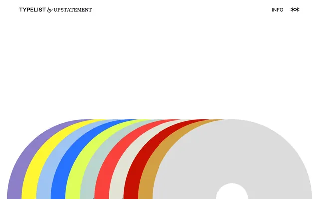
TypeList adopts a vibrant, playful design language built on an entirely white canvas punctuated by large, brightly colored interactive blocks. Typography is classic and understated, serving as an anchor to the dynamic color palette. The entire system feels like an interactive art exhibit, where color reveals content through large, expressive swatches rather than subtle accents.
The page primarily uses a full-bleed layout, allowing color blocks to extend edge-to-edge. The hero features a centered headline against the white canvas. Content sections are composed of alternating large, full-width color blocks, each representing a distinct content category, creating a strong vertical rhythm. Navigation is minimal, limited to a header bar with sparse, right-aligned text links. The information density is low, emphasizing visual impact and interaction over extensive text.
The site's imagery strategy is pure UI, focusing on large, solid blocks of color rather than photography or complex illustrations. The 'rainbow' motif from the screenshot suggests a visual system built around contrasting, bold color fields. Icons are minimal, likely mono-color and outline-based, serving a functional rather than decorative role.
Reminiscent of Are.na, Fonts In Use, Italic.co, Eye Magazine.
# TypeList — Style Reference
> Chromatic interactive blocks

**Theme:** light

**Site:** https://typelist.upstatement.com

TypeList adopts a vibrant, playful design language built on an entirely white canvas punctuated by large, brightly colored interactive blocks. Typography is classic and understated, serving as an anchor to the dynamic color palette. The entire system feels like an interactive art exhibit, where color reveals content through large, expressive swatches rather than subtle accents.

## Tokens — Colors

| Name | Value | Token | Role |
|------|------|------|------|
| Regal Violet | `#8d7fc8` | `--color-regal-violet` | Interactive block background |
| Sunshine Yellow | `#fff731` | `--color-sunshine-yellow` | Interactive block background |
| Sky Blue | `#9dc4f2` | `--color-sky-blue` | Interactive block background |
| Electric Blue | `#2772ff` | `--color-electric-blue` | Interactive block background |
| Lime Green | `#dffe5a` | `--color-lime-green` | Interactive block background |
| Flame Red | `#f9423b` | `--color-flame-red` | Interactive block background |
| Crimson Red | `#c81103` | `--color-crimson-red` | Interactive block background |
| Golden Ochre | `#d39f43` | `--color-golden-ochre` | Interactive block background |
| Canvas White | `#ffffff` | `--color-canvas-white` | Page background, primary surface |
| Ink Black | `#15181e` | `--color-ink-black` | Primary text, headings, general UI elements and borders |
| Pure Black | `#000000` | `--color-pure-black` | Decorative icons, button text, subtle borders |
| Textured Gray | `#e3e3d5` | `--color-textured-gray` | Interactive block background |
| Light Gray | `#dcdcdc` | `--color-light-gray` | Interactive block background |
| Soft Greenish Gray | `#b9d4cd` | `--color-soft-greenish-gray` | Interactive block background |

## Tokens — Typography

### Untitled Sans
- **Weights:** 400, 500
- **Sizes:** 16px, 22px, 24px
- **Line height:** 1, 1.1, 1.36
- **Letter spacing:** normal
- **Role:** Primary UI text for body copy, headings, links, and buttons. Its clean, utilitarian nature grounds the colorful design.

### Untitled Serif
- **Weights:** 400
- **Sizes:** 24px
- **Line height:** 1.1
- **Letter spacing:** normal
- **Role:** Used for specific body text, possibly decorative or highlighting short phrases against the sans-serif dominant typography.

## Tokens — Type Scale

Minor Third (1.2) from 16px base.

| Role | Size | Line height | Letter spacing |
|------|------|------|------|
| body | 16px | 1.36 | — |
| body-lg | 22px | 1.1 | — |
| heading | 24px | 1.1 | — |

## Tokens — Spacing

- **Section gap:** 48px
- **Card padding:** 20px
- **Element gap:** 30px

## Tokens — Radius

- **Default:** 0px

## Layout

The page primarily uses a full-bleed layout, allowing color blocks to extend edge-to-edge. The hero features a centered headline against the white canvas. Content sections are composed of alternating large, full-width color blocks, each representing a distinct content category, creating a strong vertical rhythm. Navigation is minimal, limited to a header bar with sparse, right-aligned text links. The information density is low, emphasizing visual impact and interaction over extensive text.

## Imagery

The site's imagery strategy is pure UI, focusing on large, solid blocks of color rather than photography or complex illustrations. The 'rainbow' motif from the screenshot suggests a visual system built around contrasting, bold color fields. Icons are minimal, likely mono-color and outline-based, serving a functional rather than decorative role.

## Components

### Ghost Navigation Button
*Header navigation item, typically for informational links.*

Text in Pure Black (#000000) or Ink Black (#15181e), no background, no border, and 0px radius. Minimal padding as defined by the parent layout.

### Interactive Color Block Link
*Large, full-width interactive sections that serve as primary navigation or content categories.*

These blocks are the core interaction. They use one of the vivid brand colors (e.g., Regal Violet #8d7fc8, Sunshine Yellow #fff731, Sky Blue #9dc4f2, etc.) as the background. Text is Ink Black (#15181e) or Pure Black (#000000), using Untitled Sans at 24px weight 400. They have square corners (0px radius) and significant vertical padding (padding-top: 20px, padding-bottom: 20px).

## Guidelines

### Do

- Prioritize Canvas White (#ffffff) as the primary page background.
- Use Ink Black (#15181e) for all primary text and headings.
- Employ the vibrant brand colors (e.g., Regal Violet #8d7fc8, Sunshine Yellow #fff731) exclusively for large interactive block backgrounds.
- Maintain a consistent 0px border-radius across all interactive elements and sections.
- Use Untitled Sans for all general UI text at 16px, 22px, or 24px, with normal letterSpacing.
- Ensure interactive color blocks have at least 20px vertical padding (padding-top and padding-bottom) for comfortable interaction.

### Don't

- Do not introduce shadows or elevation; the system relies on flat planes of color.
- Avoid using the vibrant brand colors for small accents or text; reserve them for interactive block backgrounds.
- Do not use rounded corners on any elements; all shapes should be clean and rectilinear.
- Do not use gradients; the color palette is intentionally flat and solid.
- Avoid using more than one font family in very close proximity; Untitled Sans and Untitled Serif have distinct functional roles.
- Do not clutter the layout; maintain generous whitespace around header elements and between main content blocks.

## Agent Prompt Guide

Quick Color Reference:
text: #15181e
background: #ffffff
border: #15181e
accent: #8d7fc8
primary action: no distinct CTA color

Example Component Prompts:
1. Create a header: white background (#ffffff), text 'TypeList by Upstatement' in Untitled Sans, 24px, weight 400, Ink Black (#15181e). On the right, 'INFO' and a decorative icon in Pure Black (#000000), Untitled Sans 16px weight 400. All elements have 0px radius.
2. Design an interactive content block for 'TAROT': background Regal Violet (#8d7fc8). Text 'TAROT' in Pure Black (#000000), Untitled Sans 24px weight 400. Ensure 0px radius and at least 20px top/bottom padding.
3. Create an interactive content block for 'TAKEOUT BAGS': background Sunshine Yellow (#fff731). Text 'TAKEOUT BAGS' in Pure Black (#000000), Untitled Sans 24px weight 400. Ensure 0px radius and at least 20px top/bottom padding.
More like this









Keep what you find
A free account saves references to boards and can send you a weekly email of picks based on what you save.
To see every result, go Pro.