Preview image. Unlock full-res
Architectural blueprint on parchment
Color palette
Blue outline accent for tags, dividers, and focused UI edges. Do not promote it to the primary CTA color
Page background, primary surface for lightweight components, subtle contrast from pure white
Primary text for headlines and main content, structural borders and decorative fills for key elements
Secondary text, body copy on main canvas, subtle borders
Medium-contrast borders, control outlines, and structural separators. Do not promote it to the primary CTA color
Typography
- Weights
- 400
- Sizes
- 12px
- Line height
- 1.2
sans-serif — detected in extracted data but not described by AI
- Weights
- 400
- Sizes
- 16px
- Line height
- 1.4
- Letter spacing
- 0.0060em
- Fallback
- system-ui
Primary body text. The subtle tracking creates a sense of meticulousness, preventing the text from feeling too dense.
- Weights
- 400
- Sizes
- 16px
- Line height
- 1
- Letter spacing
- normal
- Fallback
- system-ui
Specific prominent body copy, like introductory statements. The tight line height emphasizes compact presentation.
- Weights
- 400
- Sizes
- 12px
- Line height
- 1
- Letter spacing
- 0.2000em
- Fallback
- ui-monospace, SFMono-Regular, Menlo, Monaco, Consolas, Liberation Mono, Courier New, monospace
Monospaced utility text, links in footer, small labels. The wide letter-spacing is a signature decision, making even small text feel deliberate and architectural.
- Letter spacing
- normal
- Fallback
- sans-serif
Small functional text, button labels, icons, general UI elements that don't require the distinct brand typography.
Spacing & shape
Components
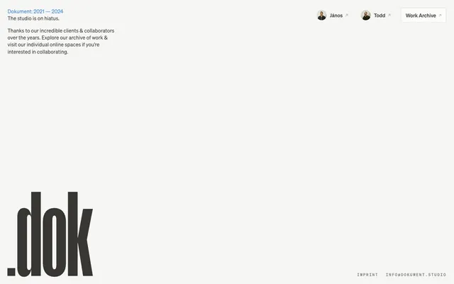
Background: Canvas (#f6f6f4). Text: Faded Stone (#7a7874). Border: Digital Blue (#2c7ef8) if active/hover. Radius: 600px (fully rounded). Padding: 8px around content, with an additional 6px of left padding for image-text separation when combined with an avatar (as seen in the 'János' and 'Todd' buttons).
Background: Canvas (#f6f6f4). Text: Faded Stone (#7a7874). Border: Digital Blue (#2c7ef8). Radius: 4px. Padding: 8px vertical, 16px horizontal. Font: system-ui 12px.
Text: Faded Stone (#7a7874) (default) or Digital Blue (#2c7ef8) (for active state or highlight). Font: Söhne Mono Kräftig 12px, letter-spacing 0.2em for distinctive styling. No explicit background or border, relies on text color for interaction states.
Guidelines
- Prioritize Canvas (#f6f6f4) for all background surfaces to maintain the foundational lightness.
- Use Ink Black (#000000) for primary headlines and core content to establish strong contrast.
- Apply Söhne Mono Kräftig 12px with 0.2em letter-spacing for all tertiary links and utility text.
- Utilize 600px border-radius for avatars and small profile-like buttons, creating a circular or pill shape.
- Implement Digital Blue (#2c7ef8) exclusively as an accent for interactive states (hover/active on text links or ghost buttons), never as a solid background color for major elements.
- Maintain maximum vertical separation using 24px section gaps between major content blocks.
- Frame textual blocks (like the introductory text) with 16px of vertical padding to provide breathing room.
- Avoid using saturated background colors; all surfaces should remain within the neutral palette.
- Do not use heavy shadows or gradients; the design system emphasizes flatness and minimal elevation.
- Refrain from using common rounded corner values (e.g. 8px or 12px) on buttons or cards; instead, use 4px or 600px for specific shapes.
- Do not introduce new typefaces; adhere strictly to Söhne Buch, Söhne Mono Kräftig, Söhne Kräftig, and a system sans-serif.
- Avoid large imagery; visual elements should be highly contained and functional.
- Do not use full-width banners or hero components that break the central content column's composition.
- Never treat the browser's default blue link color as a brand color; always use Digital Blue (#2c7ef8).
About this system
ShowHide
Dokument presents a stark, minimalist aesthetic operating on a canvas of near-white. Typography is the primary visual driver, featuring precise letter-spacing and a carefully controlled hierarchy of an industrial, mono-like custom font and a refined sans-serif. The interface avoids complex UI elements, relying instead on ghosted or subtly-bordered components that provide functionality without visual weight. A single vivid blue serves as an accent, disrupting the monochrome with a sharp, digital punctuation for specific linked or action states, rather than broad splashes of color. The overall impression is one of restrained precision and quiet authority, where content takes absolute precedence.
The page adheres to a centered maximum-width layout, with content primarily confined to a central column, although no explicit max-width is provided in the data. The hero section is minimal, featuring centered textual content in the unique brand typography, rather than large visuals or complex arrangements. Sections are defined by consistent vertical spacing (24px) rather than distinct background color bands or dividers, creating a seamless flow. Content tends to be stacked vertically or in simple grid-like arrangements for functional elements like buttons. The navigation is minimal, appearing as a top-right cluster of ghost buttons. The footer is also minimal, using finely tracked monospaced text.
The site largely avoids traditional imagery. Instead, it features monochrome, functional icons with apparent stroke lines, leveraging a clean, graphical approach. There is one instance of small circular avatar images for person-specific buttons, which are tightly cropped and contained, serving as functional identifiers rather than decorative elements. The overall impression is text-dominant, with visual elements acting as subtle accents or clear functional indicators. Graphics are highly stylized, precise, and serve to support the minimalist UI rather than to add atmospheric or illustrative content.
Reminiscent of Are.na, Linear, Stripe, Framer.
# Dokument — Style Reference
> Architectural blueprint on parchment

**Theme:** light

**Site:** https://www.dokument.studio

Dokument presents a stark, minimalist aesthetic operating on a canvas of near-white. Typography is the primary visual driver, featuring precise letter-spacing and a carefully controlled hierarchy of an industrial, mono-like custom font and a refined sans-serif. The interface avoids complex UI elements, relying instead on ghosted or subtly-bordered components that provide functionality without visual weight. A single vivid blue serves as an accent, disrupting the monochrome with a sharp, digital punctuation for specific linked or action states, rather than broad splashes of color. The overall impression is one of restrained precision and quiet authority, where content takes absolute precedence.

## Tokens — Colors

| Name | Value | Token | Role |
|------|------|------|------|
| Digital Blue | `#2c7ef8` | `--color-digital-blue` | Blue outline accent for tags, dividers, and focused UI edges. Do not promote it to the primary CTA color |
| Canvas | `#f6f6f4` | `--color-canvas` | Page background, primary surface for lightweight components, subtle contrast from pure white |
| Ink Black | `#000000` | `--color-ink-black` | Primary text for headlines and main content, structural borders and decorative fills for key elements |
| Slate Gray | `#383734` | `--color-slate-gray` | Secondary text, body copy on main canvas, subtle borders |
| Faded Stone | `#7a7874` | `--color-faded-stone` | Medium-contrast borders, control outlines, and structural separators. Do not promote it to the primary CTA color |

## Tokens — Typography

### sans-serif
- **Weights:** 400
- **Sizes:** 12px
- **Line height:** 1.2
- **Role:** sans-serif — detected in extracted data but not described by AI

### Söhne Buch
- **Substitute:** system-ui
- **Weights:** 400
- **Sizes:** 16px
- **Line height:** 1.4
- **Letter spacing:** 0.0060em
- **Role:** Primary body text. The subtle tracking creates a sense of meticulousness, preventing the text from feeling too dense.

### Söhne Kräftig
- **Substitute:** system-ui
- **Weights:** 400
- **Sizes:** 16px
- **Line height:** 1
- **Letter spacing:** normal
- **Role:** Specific prominent body copy, like introductory statements. The tight line height emphasizes compact presentation.

### Söhne Mono Kräftig
- **Substitute:** ui-monospace, SFMono-Regular, Menlo, Monaco, Consolas, Liberation Mono, Courier New, monospace
- **Weights:** 400
- **Sizes:** 12px
- **Line height:** 1
- **Letter spacing:** 0.2000em
- **Role:** Monospaced utility text, links in footer, small labels. The wide letter-spacing is a signature decision, making even small text feel deliberate and architectural.

### system-ui
- **Substitute:** sans-serif
- **Letter spacing:** normal
- **Role:** Small functional text, button labels, icons, general UI elements that don't require the distinct brand typography.

## Tokens — Type Scale

| Role | Size | Line height | Letter spacing |
|------|------|------|------|
| caption | 12px | 1 | 0.2px |
| body | 16px | 1.4 | 0.006em |

## Tokens — Spacing

- **Section gap:** 24px
- **Card padding:** 16px
- **Element gap:** 8px

## Tokens — Radius

- **Buttons:** 4px
- **avatars:** 600px
- **tags:** 600px

## Layout

The page adheres to a centered maximum-width layout, with content primarily confined to a central column, although no explicit max-width is provided in the data. The hero section is minimal, featuring centered textual content in the unique brand typography, rather than large visuals or complex arrangements. Sections are defined by consistent vertical spacing (24px) rather than distinct background color bands or dividers, creating a seamless flow. Content tends to be stacked vertically or in simple grid-like arrangements for functional elements like buttons. The navigation is minimal, appearing as a top-right cluster of ghost buttons. The footer is also minimal, using finely tracked monospaced text.

## Imagery

The site largely avoids traditional imagery. Instead, it features monochrome, functional icons with apparent stroke lines, leveraging a clean, graphical approach. There is one instance of small circular avatar images for person-specific buttons, which are tightly cropped and contained, serving as functional identifiers rather than decorative elements. The overall impression is text-dominant, with visual elements acting as subtle accents or clear functional indicators. Graphics are highly stylized, precise, and serve to support the minimalist UI rather than to add atmospheric or illustrative content.

## Components

### Avatar Button
*Interactive action button with an avatar image, commonly used for user profiles or small interactive elements.*

Background: Canvas (#f6f6f4). Text: Faded Stone (#7a7874). Border: Digital Blue (#2c7ef8) if active/hover. Radius: 600px (fully rounded). Padding: 8px around content, with an additional 6px of left padding for image-text separation when combined with an avatar (as seen in the 'János' and 'Todd' buttons).

### Work Archive Button
*Primary ghost action button for navigation or important secondary actions.*

Background: Canvas (#f6f6f4). Text: Faded Stone (#7a7874). Border: Digital Blue (#2c7ef8). Radius: 4px. Padding: 8px vertical, 16px horizontal. Font: system-ui 12px.

### Navigation Link
*Subtle, functional text links primarily for navigation or supplementary information.*

Text: Faded Stone (#7a7874) (default) or Digital Blue (#2c7ef8) (for active state or highlight). Font: Söhne Mono Kräftig 12px, letter-spacing 0.2em for distinctive styling. No explicit background or border, relies on text color for interaction states.

## Guidelines

### Do

- Prioritize Canvas (#f6f6f4) for all background surfaces to maintain the foundational lightness.
- Use Ink Black (#000000) for primary headlines and core content to establish strong contrast.
- Apply Söhne Mono Kräftig 12px with 0.2em letter-spacing for all tertiary links and utility text.
- Utilize 600px border-radius for avatars and small profile-like buttons, creating a circular or pill shape.
- Implement Digital Blue (#2c7ef8) exclusively as an accent for interactive states (hover/active on text links or ghost buttons), never as a solid background color for major elements.
- Maintain maximum vertical separation using 24px section gaps between major content blocks.
- Frame textual blocks (like the introductory text) with 16px of vertical padding to provide breathing room.

### Don't

- Avoid using saturated background colors; all surfaces should remain within the neutral palette.
- Do not use heavy shadows or gradients; the design system emphasizes flatness and minimal elevation.
- Refrain from using common rounded corner values (e.g. 8px or 12px) on buttons or cards; instead, use 4px or 600px for specific shapes.
- Do not introduce new typefaces; adhere strictly to Söhne Buch, Söhne Mono Kräftig, Söhne Kräftig, and a system sans-serif.
- Avoid large imagery; visual elements should be highly contained and functional.
- Do not use full-width banners or hero components that break the central content column's composition.
- Never treat the browser's default blue link color as a brand color; always use Digital Blue (#2c7ef8).

## Agent Prompt Guide

Quick Color Reference:
text: #000000
background: #f6f6f4
border: #7a7874
accent: #2c7ef8
primary action: no distinct CTA color

Example Component Prompts:
Create a primary text block: Text 'Dokument: 2021 — 2024' using Söhne Kräftig 16px #000000, line-height 1.0, normal letter-spacing, followed by 'The studio is on hiatus.' using Söhne Buch 16px #383734, line-height 1.4, letter-spacing 0.006em.
Create an Avatar Button for 'János': Background Canvas (#f6f6f4), text Faded Stone (#7a7874), border Digital Blue (#2c7ef8), radius 600px, padding 8px top/bottom, 14px right, 8px left. Place a circular avatar to the left with a 600px radius and 8px right margin.
Create a Work Archive Button: Background Canvas (#f6f6f4), text Faded Stone (#7a7874), border Digital Blue (#2c7ef8), radius 4px, padding 8px vertical, 16px horizontal. Use system-ui 12px, normal letter-spacing.
Create a footer link: Text 'INFO@DOKUMENT.STUDIO' using Söhne Mono Kräftig 12px #7a7874, line-height 1.0, letter-spacing 0.2em for distinctive styling.
More like this









Keep what you find
A free account saves references to boards and can send you a weekly email of picks based on what you save.
To see every result, go Pro.