Preview image. Unlock full-res
Abstract art playground
Color palette
Section backgrounds, decorative accents, illustration elements
Section backgrounds, subtle calls to attention, illustration elements
Dark borders and separators for elevated surfaces and inverted UI. Do not promote it to the primary CTA color
Page background, light canvas sections, text on dark backgrounds
Subtle borders, secondary icons, light background elements
Headings, body text where slightly softer than pure black
Typography
- Weights
- 400
- Sizes
- 24px
- Line height
- 1.2
Figma VF-normal-700-75 — detected in extracted data but not described by AI
- Weights
- 400, 600
- Sizes
- 13px, 16px, 18px, 24px, 72px
- Line height
- 1, 1.2, 1.22, 1.4
- Letter spacing
- -0.02em at 72px, 0.03em at 13px
- Fallback
- Inter
Primary UI text for buttons, navigation, body copy, and some headings. Its varied weights support clear hierarchy without sacrificing readability.
- Weights
- 400, 700
- Sizes
- 16px, 24px, 32px, 56px, 72px, 86px
- Line height
- 0.9, 1, 1.1, 1.2, 1.3, 1.4
- Letter spacing
- -0.02em at larger sizes (e.g., 86px), reverting to 0.03em at smaller.
- Fallback
- Inter Display
Used for prominent headlines and display text, its compressed line heights enhance visual impact and create a tight, modern aesthetic.
- Weights
- 400
- Sizes
- 16px
- Line height
- 1.2
- Fallback
- Roboto
Auxiliary body text, likely for longer content blocks or specific informational areas, offering high legibility.
- Weights
- 400
- Sizes
- 16px
- Line height
- 1.3, 1.4
- Letter spacing
- 0.03em
- Fallback
- Space Mono
Monospaced text for technical details, code snippets, or specific labels where character alignment is key.
- Weights
- 400
- Sizes
- 16px
- Line height
- 1.2
- Letter spacing
- 0.03
Figma VF-normal-400-100 — detected in extracted data but not described by AI
Spacing & shape
Components
Text-based, with an implied boundary. No explicit background or border, but appears within a container with a 1px solid #000000 line as a separator.
Uses Figma Sans Text, weight 400, at 16px, color #000000. Underlined on hover or active states. Padding of 8px vertically and 16px horizontally.
Large blocks of solid color, like #24cb71 or #c7f8fb, used as full-width backgrounds for sections, providing visual rhythm.
Features a circular monochrome portrait against a solid, vibrant background color (e.g., #24cb71, #c7f8fb), with speaker name in Figma Sans Text 600 and title in Figma Sans Text 400, both #000000.
Guidelines
- Prioritize #000000 and #ffffff as primary text and background colors respectively, establishing a high-contrast foundation.
- Use Figma Sans Display for all major headings and prominent text elements, leveraging its varied sizes and tight line heights for impact.
- Apply -0.02em letter-spacing to Figma Sans Display at larger sizes (56px and up) to maintain visual density.
- Utilize Jade Accent (#24cb71) and Aqua Wash (#c7f8fb) as large, flat background color blocks to define sections and provide strong visual breaks.
- Maintain a clear element gap of 24px between distinct interface elements for spaciousness.
- Incorporate 1px solid #000000 borders for subtle delineation of interactive states or containers where a delicate definition is needed.
- Avoid using soft shadows or gradients for elevation; surfaces should primarily be flat and distinct through color blocks or sharp outlines.
- Do not introduce additional sans-serif fonts; restrict typography to the specified Figma Sans Text, Figma Sans Display, and Source Sans Pro for consistency.
- Refrain from small, intricate patterns; favor large, bold geometric shapes and solid color fields for graphical elements.
- Do not introduce more than two distinct chromatic accent colors per page to maintain the graphic rigor.
- Avoid standard button styles with fills and explicit borders for primary actions; use ghost button treatments or text links within defined areas.
- Do not use smaller spacing units (e.g., 4px, 8px) for large section separation; reserve 60px for section gaps and 24px for component-level spacing.
About this system
ShowHide
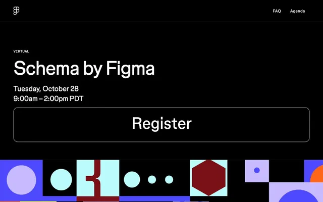
Schema by Figma employs a bold, graphic language, reminiscent of abstract art on an interactive canvas. Its foundation is a stark black and white palette, punctuated by large, flat blocks of vivid and muted chromatic colors that act as dividers and background accents. Typography is primarily functional, featuring custom sans-serifs that maintain clarity even at large display sizes, often against contrasting backgrounds. The layout is structured yet playfully asymmetric, utilizing full-width sections that transition between solid colors and complex, overlapping geometric patterns, often making strong use of negative space.
The page primarily uses a full-bleed layout, where sections extend across the full width of the viewport, with content often centered or left-aligned within. The hero section features a stark black background with a large, centered headline. Subsequent sections alternate between solid color backgrounds and more complex, abstract graphic patterns. Content often uses a centered stacking approach or a 2-column layout (text left, image right) within these full-width bands. A 4-column grid is evident for speaker profiles. Vertical spacing is consistent between sections, often using the 60px section gap. Navigation is a minimal top bar, fixed to the top, with simple text links.
The imagery is a blend of abstract geometric compositions and tightly cropped, high-contrast monochrome photography. Abstract graphics feature overlapping circles, squares, and polygonal shapes in a vibrant, unpredictable palette, often used as full-bleed backgrounds or section dividers. Photography consists of black and white headshots with high contrast, often set against a single, bold background color (like Jade Accent or Aqua Wash), giving a graphic, almost poster-like quality. Icons are minimal, outlined, and monochromatic, with a fine stroke weight, serving primarily as functional UI elements rather than elaborate decoration. The approach is graphic-heavy, with imagery functioning decoratively and to provide strong visual anchors.
# Schema — Style Reference
> Abstract art playground

**Theme:** light

**Site:** https://schema.figma.com

Schema by Figma employs a bold, graphic language, reminiscent of abstract art on an interactive canvas. Its foundation is a stark black and white palette, punctuated by large, flat blocks of vivid and muted chromatic colors that act as dividers and background accents. Typography is primarily functional, featuring custom sans-serifs that maintain clarity even at large display sizes, often against contrasting backgrounds. The layout is structured yet playfully asymmetric, utilizing full-width sections that transition between solid colors and complex, overlapping geometric patterns, often making strong use of negative space.

## Tokens — Colors

| Name | Value | Token | Role |
|------|------|------|------|
| Jade Accent | `#24cb71` | `--color-jade-accent` | Section backgrounds, decorative accents, illustration elements |
| Aqua Wash | `#c7f8fb` | `--color-aqua-wash` | Section backgrounds, subtle calls to attention, illustration elements |
| Midnight Ink | `#000000` | `--color-midnight-ink` | Dark borders and separators for elevated surfaces and inverted UI. Do not promote it to the primary CTA color |
| Canvas White | `#ffffff` | `--color-canvas-white` | Page background, light canvas sections, text on dark backgrounds |
| Pale Mist | `#e2e2e2` | `--color-pale-mist` | Subtle borders, secondary icons, light background elements |
| Charcoal Text | `#0f0f0f` | `--color-charcoal-text` | Headings, body text where slightly softer than pure black |

## Tokens — Typography

### Figma VF-normal-700-75
- **Weights:** 400
- **Sizes:** 24px
- **Line height:** 1.2
- **Role:** Figma VF-normal-700-75 — detected in extracted data but not described by AI

### Figma Sans Text
- **Substitute:** Inter
- **Weights:** 400, 600
- **Sizes:** 13px, 16px, 18px, 24px, 72px
- **Line height:** 1, 1.2, 1.22, 1.4
- **Letter spacing:** -0.02em at 72px, 0.03em at 13px
- **Role:** Primary UI text for buttons, navigation, body copy, and some headings. Its varied weights support clear hierarchy without sacrificing readability.

### Figma Sans Display
- **Substitute:** Inter Display
- **Weights:** 400, 700
- **Sizes:** 16px, 24px, 32px, 56px, 72px, 86px
- **Line height:** 0.9, 1, 1.1, 1.2, 1.3, 1.4
- **Letter spacing:** -0.02em at larger sizes (e.g., 86px), reverting to 0.03em at smaller.
- **Role:** Used for prominent headlines and display text, its compressed line heights enhance visual impact and create a tight, modern aesthetic.

### Source Sans Pro
- **Substitute:** Roboto
- **Weights:** 400
- **Sizes:** 16px
- **Line height:** 1.2
- **Role:** Auxiliary body text, likely for longer content blocks or specific informational areas, offering high legibility.

### Figma Mono
- **Substitute:** Space Mono
- **Weights:** 400
- **Sizes:** 16px
- **Line height:** 1.3, 1.4
- **Letter spacing:** 0.03em
- **Role:** Monospaced text for technical details, code snippets, or specific labels where character alignment is key.

### Figma VF-normal-400-100
- **Weights:** 400
- **Sizes:** 16px
- **Line height:** 1.2
- **Letter spacing:** 0.03
- **Role:** Figma VF-normal-400-100 — detected in extracted data but not described by AI

## Tokens — Type Scale

Augmented Fourth (1.414) from 16px base.

| Role | Size | Line height | Letter spacing |
|------|------|------|------|
| caption | 13px | 1.22 | — |
| body | 16px | 1.2 | — |
| subheading | 24px | 1.2 | — |
| heading | 32px | 1.1 | — |
| heading-lg | 56px | 1 | -1.12px |
| display | 72px | 1 | -1.44px |

## Tokens — Spacing

- **Section gap:** 60px
- **Card padding:** 16px
- **Element gap:** 24px

## Tokens — Radius

- **Buttons:** 20px
- **links:** 20px

## Layout

The page primarily uses a full-bleed layout, where sections extend across the full width of the viewport, with content often centered or left-aligned within. The hero section features a stark black background with a large, centered headline. Subsequent sections alternate between solid color backgrounds and more complex, abstract graphic patterns. Content often uses a centered stacking approach or a 2-column layout (text left, image right) within these full-width bands. A 4-column grid is evident for speaker profiles. Vertical spacing is consistent between sections, often using the 60px section gap. Navigation is a minimal top bar, fixed to the top, with simple text links.

## Imagery

The imagery is a blend of abstract geometric compositions and tightly cropped, high-contrast monochrome photography. Abstract graphics feature overlapping circles, squares, and polygonal shapes in a vibrant, unpredictable palette, often used as full-bleed backgrounds or section dividers. Photography consists of black and white headshots with high contrast, often set against a single, bold background color (like Jade Accent or Aqua Wash), giving a graphic, almost poster-like quality. Icons are minimal, outlined, and monochromatic, with a fine stroke weight, serving primarily as functional UI elements rather than elaborate decoration. The approach is graphic-heavy, with imagery functioning decoratively and to provide strong visual anchors.

## Components

### Ghost Button
*Primary interactive element for event registration or key actions.*

Text-based, with an implied boundary. No explicit background or border, but appears within a container with a 1px solid #000000 line as a separator.

### Navigation Link
*Top-level navigation items.*

Uses Figma Sans Text, weight 400, at 16px, color #000000. Underlined on hover or active states. Padding of 8px vertically and 16px horizontally.

### Section Divider Accent
*Visual separator for content blocks, creating graphic interest.*

Large blocks of solid color, like #24cb71 or #c7f8fb, used as full-width backgrounds for sections, providing visual rhythm.

### Speaker Card
*Display individual speaker profiles.*

Features a circular monochrome portrait against a solid, vibrant background color (e.g., #24cb71, #c7f8fb), with speaker name in Figma Sans Text 600 and title in Figma Sans Text 400, both #000000.

## Guidelines

### Do

- Prioritize #000000 and #ffffff as primary text and background colors respectively, establishing a high-contrast foundation.
- Use Figma Sans Display for all major headings and prominent text elements, leveraging its varied sizes and tight line heights for impact.
- Apply -0.02em letter-spacing to Figma Sans Display at larger sizes (56px and up) to maintain visual density.
- Utilize Jade Accent (#24cb71) and Aqua Wash (#c7f8fb) as large, flat background color blocks to define sections and provide strong visual breaks.
- Maintain a clear element gap of 24px between distinct interface elements for spaciousness.
- Incorporate 1px solid #000000 borders for subtle delineation of interactive states or containers where a delicate definition is needed.

### Don't

- Avoid using soft shadows or gradients for elevation; surfaces should primarily be flat and distinct through color blocks or sharp outlines.
- Do not introduce additional sans-serif fonts; restrict typography to the specified Figma Sans Text, Figma Sans Display, and Source Sans Pro for consistency.
- Refrain from small, intricate patterns; favor large, bold geometric shapes and solid color fields for graphical elements.
- Do not introduce more than two distinct chromatic accent colors per page to maintain the graphic rigor.
- Avoid standard button styles with fills and explicit borders for primary actions; use ghost button treatments or text links within defined areas.
- Do not use smaller spacing units (e.g., 4px, 8px) for large section separation; reserve 60px for section gaps and 24px for component-level spacing.

## Agent Prompt Guide

primary action: no distinct CTA color
More like this










Keep what you find
A free account saves references to boards and can send you a weekly email of picks based on what you save.
To see every result, go Pro.