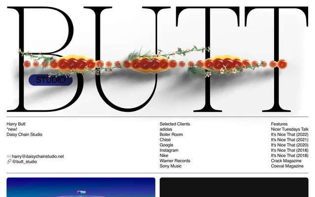
Preview image. Unlock full-res
Minimalist canvas, bold typography, selective accents.
Color palette
Primary page background, clear surfaces
Primary text, borders, decorative elements — creates strong contrast against light surfaces
Dark UI elements backgrounds, content blocks like video players
Subtle background for button fills and secondary surface differentiation
Typography
- Weights
- 400
- Sizes
- 20px, 40px
- Line height
- 1, 1.2
- Letter spacing
- -0.0300em at 40px, -0.0200em at 20px
- Fallback
- Avenir Next, Arial
Body text, navigation links, secondary headings, and button labels. Its neutrality provides a stable baseline against more expressive elements.
- Weights
- 400
- Sizes
- 42px
- Line height
- 1
- Letter spacing
- -0.0200em
- Fallback
- Libre Caslon Display
Primary headings and artistic display text. The elegant serif creates a sophisticated, editorial feel.
- Weights
- 400
- Sizes
- 20px
- Line height
- 1.2
- Letter spacing
- -0.0200em
- Fallback
- Times New Roman (with custom stylistic sets)
Specific display text for project titles or highlighted content. Its unique character adds brand personality.
- Weights
- 400
- Sizes
- 20px, 40px
- Line height
- 1, 1.2
- Letter spacing
- -0.0200em
- Fallback
- Avenir Next, Arial
Body copy on project descriptions, client lists, and features. Ensures readability in informative sections.
Spacing & shape
Components
Background: #e0e0e0 (Smoke Gray). Text color: #000000 (Pitch Black). Border: 1px solid #000000. Radius: 50px. Padding: 5px vertical, 20px horizontal. Font: Helvetica 400, 20px, 1.2 line height.
Guidelines
- Always use Canvas White (#ffffff) for the main page background to maintain visual clarity.
- Apply Pitch Black (#000000) for all primary text and borders to ensure strong contrast and visual impact.
- Utilize Caslon 400 at 42px with 1.0 line height and -0.0200em letter spacing for major headlines.
- Maintain an element gap of 20px for consistent vertical spacing between content blocks.
- Incorporate 50px border-radius specifically for all interactive buttons to establish a consistent brand interaction aesthetic.
- Use 180px as the section gap to create generous visual breaks between distinct content areas.
- Avoid using multiple accent colors; concentrate on black and white with minimal chromatic interference.
- Do not deviate from the specified font families or their assigned weights; Helvetica, Caslon, and Sometimes Times are the only typefaces.
- Refrain from using hard-edged rectangles for buttons; all buttons must have a 50px border-radius.
- Do not introduce additional background colors for content sections beyond Canvas White, Deep Space, and Smoke Gray.
- Avoid tight spacing between sections; always adhere to the 180px section gap.
About this system
ShowHide
BUTT STUDIO employs a high-contrast aesthetic blending stark whitespace with deeply saturated accents. Typography is a focal point, using a mix of classic serif and system sans-serif for clear hierarchy. Layouts are spacious, allowing content and bold elements to breathe, while interactions are subtly animated. The overall impression is one of artful simplicity, where carefully chosen details make a strong visual statement without clutter.
The page primarily employs a max-width contained layout even though `pageMaxWidth` is null, evident by content being centered with significant whitespace on either side. The hero section features oversized, decorative serif typography with a smaller, pill-shaped button overlayed. Content follows a rhythmic pattern of large media blocks (videos/images) paired with adjacent text descriptions, often in a two-column arrangement. Vertical spacing is generous, creating distinct sections without visible dividers. The navigation appears to be a minimal footer with contact information, client lists, and features.
This site prominently features product screenshots and video embeds, often with a highly artistic or abstract bent. Imagery is typically contained within rectangular frames, with sharp edges, and tends to dominate its immediate section. The visuals themselves vary from vibrant, saturated photography to abstract animations, serving primarily to showcase the studio's portfolio rather than providing decorative atmosphere. Icons, if present, are minimal and likely black outlines against white backgrounds, functioning as clear functional elements.
Reminiscent of Stripe, Awwwards, AREA 17.
# BUTT STUDIO — Style Reference
> Minimalist canvas, bold typography, selective accents.

**Theme:** light

**Site:** https://www.butt-studio.com

BUTT STUDIO employs a high-contrast aesthetic blending stark whitespace with deeply saturated accents. Typography is a focal point, using a mix of classic serif and system sans-serif for clear hierarchy. Layouts are spacious, allowing content and bold elements to breathe, while interactions are subtly animated. The overall impression is one of artful simplicity, where carefully chosen details make a strong visual statement without clutter.

## Tokens — Colors

| Name | Value | Token | Role |
|------|------|------|------|
| Canvas White | `#ffffff` | `--color-canvas-white` | Primary page background, clear surfaces |
| Pitch Black | `#000000` | `--color-pitch-black` | Primary text, borders, decorative elements — creates strong contrast against light surfaces |
| Deep Space | `#131313` | `--color-deep-space` | Dark UI elements backgrounds, content blocks like video players |
| Smoke Gray | `#e0e0e0` | `--color-smoke-gray` | Subtle background for button fills and secondary surface differentiation |

## Tokens — Typography

### helvetica
- **Substitute:** Avenir Next, Arial
- **Weights:** 400
- **Sizes:** 20px, 40px
- **Line height:** 1, 1.2
- **Letter spacing:** -0.0300em at 40px, -0.0200em at 20px
- **Role:** Body text, navigation links, secondary headings, and button labels. Its neutrality provides a stable baseline against more expressive elements.

### Caslon
- **Substitute:** Libre Caslon Display
- **Weights:** 400
- **Sizes:** 42px
- **Line height:** 1
- **Letter spacing:** -0.0200em
- **Role:** Primary headings and artistic display text. The elegant serif creates a sophisticated, editorial feel.

### Sometimes Times
- **Substitute:** Times New Roman (with custom stylistic sets)
- **Weights:** 400
- **Sizes:** 20px
- **Line height:** 1.2
- **Letter spacing:** -0.0200em
- **Role:** Specific display text for project titles or highlighted content. Its unique character adds brand personality.

### helvetica
- **Substitute:** Avenir Next, Arial
- **Weights:** 400
- **Sizes:** 20px, 40px
- **Line height:** 1, 1.2
- **Letter spacing:** -0.0200em
- **Role:** Body copy on project descriptions, client lists, and features. Ensures readability in informative sections.

## Tokens — Spacing

- **Section gap:** 180px
- **Card padding:** 20px
- **Element gap:** 20px

## Tokens — Radius

- **Buttons:** 50px
- **Cards:** 10px
- **headings:** 68px

## Layout

The page primarily employs a max-width contained layout even though `pageMaxWidth` is null, evident by content being centered with significant whitespace on either side. The hero section features oversized, decorative serif typography with a smaller, pill-shaped button overlayed. Content follows a rhythmic pattern of large media blocks (videos/images) paired with adjacent text descriptions, often in a two-column arrangement. Vertical spacing is generous, creating distinct sections without visible dividers. The navigation appears to be a minimal footer with contact information, client lists, and features.

## Imagery

This site prominently features product screenshots and video embeds, often with a highly artistic or abstract bent. Imagery is typically contained within rectangular frames, with sharp edges, and tends to dominate its immediate section. The visuals themselves vary from vibrant, saturated photography to abstract animations, serving primarily to showcase the studio's portfolio rather than providing decorative atmosphere. Icons, if present, are minimal and likely black outlines against white backgrounds, functioning as clear functional elements.

## Components

### Pill Button
*Text button with rounded corners for primary actions.*

Background: #e0e0e0 (Smoke Gray). Text color: #000000 (Pitch Black). Border: 1px solid #000000. Radius: 50px. Padding: 5px vertical, 20px horizontal. Font: Helvetica 400, 20px, 1.2 line height.

## Guidelines

### Do

- Always use Canvas White (#ffffff) for the main page background to maintain visual clarity.
- Apply Pitch Black (#000000) for all primary text and borders to ensure strong contrast and visual impact.
- Utilize Caslon 400 at 42px with 1.0 line height and -0.0200em letter spacing for major headlines.
- Maintain an element gap of 20px for consistent vertical spacing between content blocks.
- Incorporate 50px border-radius specifically for all interactive buttons to establish a consistent brand interaction aesthetic.
- Use 180px as the section gap to create generous visual breaks between distinct content areas.

### Don't

- Avoid using multiple accent colors; concentrate on black and white with minimal chromatic interference.
- Do not deviate from the specified font families or their assigned weights; Helvetica, Caslon, and Sometimes Times are the only typefaces.
- Refrain from using hard-edged rectangles for buttons; all buttons must have a 50px border-radius.
- Do not introduce additional background colors for content sections beyond Canvas White, Deep Space, and Smoke Gray.
- Avoid tight spacing between sections; always adhere to the 180px section gap.

## Agent Prompt Guide

Quick Color Reference:
text: #000000
background: #ffffff
border: #000000
accent: no distinct accent color
primary action: no distinct CTA color

Example Component Prompts:
1. Create a primary headline: Caslon 400, 42px, 1.0 line height, #000000, -0.0200em letter-spacing. Accompanied by Helvetica 400, 20px, 1.2 line height, #000000 for a descriptive subtext. Ensure 8px margin-bottom after the headline.
2. Design a 'Download' button: background #e0e0e0, text #000000, 1px solid #000000 border, 50px border-radius, 5px vertical padding, 20px horizontal padding. Text uses Helvetica 400, 20px, 1.2 line height.
3. Implement a video block: background #131313, with content centered. The block should have 30px padding all around. The element should be followed by a copy block with an 180px gap.
More like this









Keep what you find
A free account saves references to boards and can send you a weekly email of picks based on what you save.
To see every result, go Pro.