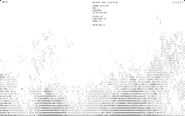
Preview image. Unlock full-res
Color palette
Page backgrounds, card surfaces, primary content canvas
Primary text, informational text, link text. Creates high contrast against white surfaces
Subtle borders for content blocks, lists, and headings, providing soft visual separation
Typography
- Weights
- 100, 400, 700
- Sizes
- 12px, 14px, 16px, 48px
- Line height
- 1.15
- Letter spacing
- normal
- Fallback
- monospace
All textual content including body, headings, links, and list items. The monospace choice underpins the terminal-like aesthetic, enforcing a uniform character width crucial for the ASCII art elements.
Spacing & shape
Components
A background of Canvas White (#ffffff) with 16px border-radius, no shadow, and 0px padding. Designed to be a blank canvas within the page structure.
Guidelines
- Prioritize Canvas White (#ffffff) as the dominant background for all major content areas.
- Use Ink Black (#000000) for all primary text and link states to ensure maximum contrast.
- Apply Ghost Border (#e5e7eb) for subtle separation lines around content, lists, and headings.
- Maintain IBM Plex Mono as the sole typeface, utilizing its various weights for hierarchy.
- Use 16px border-radius for cards and 8px for smaller body-level elements.
- Implement 4px spacing between elements for compact, dense information presentation.
- Ensure all textual content is presented with a 1.15 line-height to maintain consistent vertical rhythm.
- Avoid using any saturated colors; limit the palette strictly to the defined neutrals.
- Do not introduce any drop shadows or elevation effects, as the system relies on flat surfaces.
- Do not deviate from IBM Plex Mono; decorative or serif fonts are antithetical to the brand.
- Avoid large empty spaces; maintain a compact information density.
- Do not use gradients; the system is based on flat, solid color fields.
- Do not apply padding to Content Cards, as they are designed for unconstrained content flow.
About this system
ShowHide
WRDLSS employs a stark, monospaced ASCII-art aesthetic, reminiscent of early terminal interfaces. The design system prioritizes textual information over graphical elements, creating a dense, almost cryptographic visual texture for content. Interaction thrives on pure contrast and minimal UI elements. The overall impression is one of rigorous, almost ascetic functionality.
The page primarily uses a full-bleed layout without a fixed max-width, allowing content, especially the ASCII art, to extend across the entire viewport. The hero section displays centered text and interface metadata over a full-bleed ASCII background. Section rhythm is continuous, with content flowing seamlessly without distinct visual dividers or alternating bands. Content arrangement is typically centered or left-aligned, stacked vertically, giving prominence to the monospaced text blocks. There are no traditional grid layouts for cards or features; content is an uninterrupted stream. Overall density is compact, maximizing information within the screen space, with minimal white space.
The site primarily uses abstract ASCII-art graphics created from hyphens, slashes, and dots. These graphics serve a decorative and atmospheric role, forming patterns that evoke a glitchy, digital landscape. There is no photography, traditional illustration, or product screenshots. Icons are minimal, represented by monochromatic dots like `[•]`. The density of these graphics is very high, often forming large, textured backgrounds and almost all content is represented by typography and these abstract elements.
Reminiscent of Figma's terminal mode, Old School RuneScape UI, GitHub's code view, Many developer documentation sites.
# WRDLSS — Style Reference
> Terminal ASCII Canvas

**Theme:** light

**Site:** https://wrdlss.club

WRDLSS employs a stark, monospaced ASCII-art aesthetic, reminiscent of early terminal interfaces. The design system prioritizes textual information over graphical elements, creating a dense, almost cryptographic visual texture for content. Interaction thrives on pure contrast and minimal UI elements. The overall impression is one of rigorous, almost ascetic functionality.

## Tokens — Colors

| Name | Value | Token | Role |
|------|------|------|------|
| Canvas White | `#ffffff` | `--color-canvas-white` | Page backgrounds, card surfaces, primary content canvas |
| Ink Black | `#000000` | `--color-ink-black` | Primary text, informational text, link text. Creates high contrast against white surfaces |
| Ghost Border | `#e5e7eb` | `--color-ghost-border` | Subtle borders for content blocks, lists, and headings, providing soft visual separation |

## Tokens — Typography

### IBM Plex Mono
- **Substitute:** monospace
- **Weights:** 100, 400, 700
- **Sizes:** 12px, 14px, 16px, 48px
- **Line height:** 1.15
- **Letter spacing:** normal
- **Role:** All textual content including body, headings, links, and list items. The monospace choice underpins the terminal-like aesthetic, enforcing a uniform character width crucial for the ASCII art elements.

## Tokens — Type Scale

| Role | Size | Line height | Letter spacing |
|------|------|------|------|
| caption | 12px | 1.15 | — |
| body | 14px | 1.15 | — |
| display | 48px | 1.15 | — |

## Tokens — Spacing

- **Card padding:** 0px
- **Element gap:** 4px

## Tokens — Radius

- **Cards:** 16px
- **body:** 8px

## Layout

The page primarily uses a full-bleed layout without a fixed max-width, allowing content, especially the ASCII art, to extend across the entire viewport. The hero section displays centered text and interface metadata over a full-bleed ASCII background. Section rhythm is continuous, with content flowing seamlessly without distinct visual dividers or alternating bands. Content arrangement is typically centered or left-aligned, stacked vertically, giving prominence to the monospaced text blocks. There are no traditional grid layouts for cards or features; content is an uninterrupted stream. Overall density is compact, maximizing information within the screen space, with minimal white space.

## Imagery

The site primarily uses abstract ASCII-art graphics created from hyphens, slashes, and dots. These graphics serve a decorative and atmospheric role, forming patterns that evoke a glitchy, digital landscape. There is no photography, traditional illustration, or product screenshots. Icons are minimal, represented by monochromatic dots like `[•]`. The density of these graphics is very high, often forming large, textured backgrounds and almost all content is represented by typography and these abstract elements.

## Components

### Content Card
*Surface for organized content blocks.*

A background of Canvas White (#ffffff) with 16px border-radius, no shadow, and 0px padding. Designed to be a blank canvas within the page structure.

## Guidelines

### Do

- Prioritize Canvas White (#ffffff) as the dominant background for all major content areas.
- Use Ink Black (#000000) for all primary text and link states to ensure maximum contrast.
- Apply Ghost Border (#e5e7eb) for subtle separation lines around content, lists, and headings.
- Maintain IBM Plex Mono as the sole typeface, utilizing its various weights for hierarchy.
- Use 16px border-radius for cards and 8px for smaller body-level elements.
- Implement 4px spacing between elements for compact, dense information presentation.
- Ensure all textual content is presented with a 1.15 line-height to maintain consistent vertical rhythm.

### Don't

- Avoid using any saturated colors; limit the palette strictly to the defined neutrals.
- Do not introduce any drop shadows or elevation effects, as the system relies on flat surfaces.
- Do not deviate from IBM Plex Mono; decorative or serif fonts are antithetical to the brand.
- Avoid large empty spaces; maintain a compact information density.
- Do not use gradients; the system is based on flat, solid color fields.
- Do not apply padding to Content Cards, as they are designed for unconstrained content flow.

## Agent Prompt Guide

Quick Color Reference:
text: #000000
background: #ffffff
border: #e5e7eb
accent: no distinct accent color
primary action: no distinct CTA color

Example Component Prompts:
1. Create a page hero: Canvas White (#ffffff) background. Centered IBM Plex Mono light (weight 100) heading at 48px, Ink Black (#000000) color, line-height 1.15. Information text below the heading also in IBM Plex Mono, 14px, Ink Black (#000000), line-height 1.15.
2. Create a content section with a subtle border: Use Ghost Border (#e5e7eb) as the top border for the section. The section background should be Canvas White (#ffffff). Inside the section, stack multiple IBM Plex Mono body (weight 400) text blocks at 14px, Ink Black (#000000), with 4px vertical element gaps. Use 0px padding within the section.
3. Create a navigation text link: Use IBM Plex Mono, 16px, Ink Black (#000000), weight 400. Ensure no underline by default. The link should appear in an area with Canvas White (#ffffff) background.
More like this









Keep what you find
A free account saves references to boards and can send you a weekly email of picks based on what you save.
To see every result, go Pro.