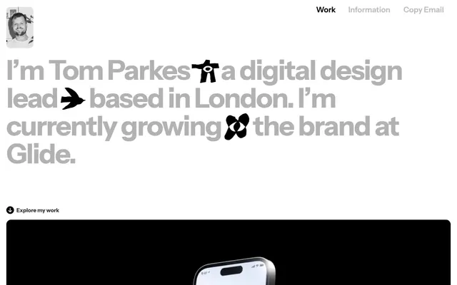
Preview image. Unlock full-res
High-contrast digital canvas.
Color palette
Highlighting card backgrounds — a soft, almost pastel tint providing a subtle content break
Page backgrounds, card surfaces
Primary text across all surfaces
Muted text, subheadings, and secondary information
Prominent text, navigation links, and strong borders
Subtle hairline borders and dividers
Medium-contrast borders, control outlines, and structural separators. Do not promote it to the primary CTA color
Typography
- Weights
- 600, 700
- Sizes
- 10px, 17px, 22px, 24px, 86px
- Line height
- 0.83, 0.95, 1.09, 1.18, 1.2, 1.8
- Letter spacing
- -0.0350em
- Fallback
- Montserrat, Inter
Primary display font for headings, navigation, and prominent text. Its bold weights at large sizes grab attention without being overly decorative, maintaining a strong, direct presence.
- Weights
- 400
- Sizes
- 14px
- Line height
- 1.43
- Letter spacing
- -0.2140em
- Fallback
- Helvetica Neue, sans-serif
Body text and supporting information. It provides a highly readable and neutral counterpoint to the primary display font, ensuring legibility for longer content blocks.
Spacing & shape
Components
Background is Accent Yellow (#f5ffbe), border-radius 12px. Padding 10px on all sides. Content inside uses primary text colors.
Text uses Midnight Black (#000000) with Instrumentsans font, size 17px, weight 600, letter-spacing -0.0350em. No explicit background or border, appears as plain text link.
Text is Silver Link (#808080) with Arial font, size 14px, weight 400. Has an implicit 1px silver border on interaction or focus, but appears as text-only by default.
Circular image with a 16px border-radius, contained within an 8px radius container. May have a subtle 1px solid Mist Border (#d6d6d6).
Images primarily with 16px border-radius, occasionally 8px. Often presented without explicit borders to form a clean, contained block.
Guidelines
- Use Instrumentsans ExtraBold (weight 700) for all main headings and prominent texts to convey directness.
- Maintain a clear distinction between Carbon Text (#333333) for primary content and Smoke Gray (#b3b3b3) for secondary or muted descriptions.
- Apply 12px border-radius consistently to all card-like containers, and 16px to larger image blocks.
- Ensure section gaps are consistently 120px to create ample visual breathing room between content blocks.
- Utilize Canvas White (#ffffff) as the dominant background color to maintain a bright, high-contrast appearance.
- Implement Accent Yellow (#f5ffbe) sparingly and only for card backgrounds where a distinct, soft highlight is needed.
- Use 1px solid Mist Border (#d6d6d6) for subtle dividers or outlines, avoiding heavy strokes.
- Do not introduce additional background colors; maintain the primary Canvas White and occasional Accent Yellow for cards.
- Avoid using multiple font sizes for body text; stick to the defined Arial 14px for consistency.
- Do not use letter-spacing values other than the specified -0.0350em for Instrumentsans and -0.2140em for Arial.
- Do not apply shadows or complex elevation to elements; surfaces are largely flat.
- Do not use saturated or bright accent colors beyond the subtle Accent Yellow; maintain a monochrome primary palette.
- Avoid decorative gradients; surfaces should be solid colors.
- Do not deviate from the established radius values: 12px for cards, 16px for images, 8px for smaller interactive elements.
About this system
ShowHide
Tparkes employs a stark, high-contrast digital canvas aesthetic. Typography, driven by a custom sans-serif, plays a central role, using a deliberate interplay of heavy weights and large sizes for impact, balanced by subdued text colors. Surfaces remain monochromatic, relying on deep gray and pure white for definition. The overall impression is one of directness and clarity, with UI details kept minimal to let content speak.
The page primarily uses a full-bleed layout, where content sections often span the full width of the viewport. The hero section features a large, centered text block. Subsequent sections typically alternate between full-width visuals (like product screenshots) and text-dominant areas. Content within these full-width sections is not strictly constrained by a max-width, maintaining a spacious, open feel. Vertical rhythm is governed by a consistent 120px section gap, creating strong visual separation. Navigation is a simple top-right bar with minimal text links. A multi-column grid is used for displaying case studies or visual feeds, suggesting modular content blocks. The overall density is comfortable, with generous white space around elements.
This system features a mix of high-fidelity product screenshots, abstract geometric illustrations, and occasional outlined icons. Product screenshots are typically dark-themed, providing a stark contrast against the light UI, often full-width or large blocks, and are precisely cropped with rounded 16px corners to eliminate any extraneous context. Illustrations are flat, geometric, and monochrome, often using a distinct single brand color or dark gray on a white background, serving as decorative accents or visual metaphors. Icons are outlined, with a moderate stroke weight, and monochromatic – predominantly black or gray. Imagery serves both as decorative atmosphere and direct product showcases, maintaining a balance between aesthetic appeal and informational density.
Reminiscent of Figma, Read.cv, Linear.
# Tparkes — Style Reference
> High-contrast digital canvas.

**Theme:** light

**Site:** https://www.tparkes.com

Tparkes employs a stark, high-contrast digital canvas aesthetic. Typography, driven by a custom sans-serif, plays a central role, using a deliberate interplay of heavy weights and large sizes for impact, balanced by subdued text colors. Surfaces remain monochromatic, relying on deep gray and pure white for definition. The overall impression is one of directness and clarity, with UI details kept minimal to let content speak.

## Tokens — Colors

| Name | Value | Token | Role |
|------|------|------|------|
| Accent Yellow | `#f5ffbe` | `--color-accent-yellow` | Highlighting card backgrounds — a soft, almost pastel tint providing a subtle content break |
| Canvas White | `#ffffff` | `--color-canvas-white` | Page backgrounds, card surfaces |
| Carbon Text | `#333333` | `--color-carbon-text` | Primary text across all surfaces |
| Smoke Gray | `#b3b3b3` | `--color-smoke-gray` | Muted text, subheadings, and secondary information |
| Midnight Black | `#000000` | `--color-midnight-black` | Prominent text, navigation links, and strong borders |
| Mist Border | `#d6d6d6` | `--color-mist-border` | Subtle hairline borders and dividers |
| Silver Link | `#808080` | `--color-silver-link` | Medium-contrast borders, control outlines, and structural separators. Do not promote it to the primary CTA color |

## Tokens — Typography

### Instrumentsans
- **Substitute:** Montserrat, Inter
- **Weights:** 600, 700
- **Sizes:** 10px, 17px, 22px, 24px, 86px
- **Line height:** 0.83, 0.95, 1.09, 1.18, 1.2, 1.8
- **Letter spacing:** -0.0350em
- **Role:** Primary display font for headings, navigation, and prominent text. Its bold weights at large sizes grab attention without being overly decorative, maintaining a strong, direct presence.

### Arial
- **Substitute:** Helvetica Neue, sans-serif
- **Weights:** 400
- **Sizes:** 14px
- **Line height:** 1.43
- **Letter spacing:** -0.2140em
- **Role:** Body text and supporting information. It provides a highly readable and neutral counterpoint to the primary display font, ensuring legibility for longer content blocks.

## Tokens — Type Scale

| Role | Size | Line height | Letter spacing |
|------|------|------|------|
| caption | 10px | 12px | -0.35px |
| body-sm | 14px | 20px | -2.996px |
| body | 17px | 20px | -0.595px |
| subheading | 22px | 26px | -0.77px |
| heading | 24px | 28px | -0.84px |
| display | 86px | 103px | -3.01px |

## Tokens — Spacing

- **Section gap:** 120px
- **Card padding:** 10px
- **Element gap:** 20px

## Tokens — Radius

- **Buttons:** 8px
- **Cards:** 12px
- **Images:** 16px
- **icons:** 8px

## Layout

The page primarily uses a full-bleed layout, where content sections often span the full width of the viewport. The hero section features a large, centered text block. Subsequent sections typically alternate between full-width visuals (like product screenshots) and text-dominant areas. Content within these full-width sections is not strictly constrained by a max-width, maintaining a spacious, open feel. Vertical rhythm is governed by a consistent 120px section gap, creating strong visual separation. Navigation is a simple top-right bar with minimal text links. A multi-column grid is used for displaying case studies or visual feeds, suggesting modular content blocks. The overall density is comfortable, with generous white space around elements.

## Imagery

This system features a mix of high-fidelity product screenshots, abstract geometric illustrations, and occasional outlined icons. Product screenshots are typically dark-themed, providing a stark contrast against the light UI, often full-width or large blocks, and are precisely cropped with rounded 16px corners to eliminate any extraneous context. Illustrations are flat, geometric, and monochrome, often using a distinct single brand color or dark gray on a white background, serving as decorative accents or visual metaphors. Icons are outlined, with a moderate stroke weight, and monochromatic – predominantly black or gray. Imagery serves both as decorative atmosphere and direct product showcases, maintaining a balance between aesthetic appeal and informational density.

## Components

### Text Accent Card
*Highlights specific content blocks or portfolio entries.*

Background is Accent Yellow (#f5ffbe), border-radius 12px. Padding 10px on all sides. Content inside uses primary text colors.

### Header Navigation Link
*Primary navigation elements in the page header.*

Text uses Midnight Black (#000000) with Instrumentsans font, size 17px, weight 600, letter-spacing -0.0350em. No explicit background or border, appears as plain text link.

### Ghost Action Link
*Interactive elements, typically for navigation or calls to explore.*

Text is Silver Link (#808080) with Arial font, size 14px, weight 400. Has an implicit 1px silver border on interaction or focus, but appears as text-only by default.

### Profile Avatar
*User or brand identifier.*

Circular image with a 16px border-radius, contained within an 8px radius container. May have a subtle 1px solid Mist Border (#d6d6d6).

### Project Preview Image
*Visual representation of projects or work.*

Images primarily with 16px border-radius, occasionally 8px. Often presented without explicit borders to form a clean, contained block.

## Guidelines

### Do

- Use Instrumentsans ExtraBold (weight 700) for all main headings and prominent texts to convey directness.
- Maintain a clear distinction between Carbon Text (#333333) for primary content and Smoke Gray (#b3b3b3) for secondary or muted descriptions.
- Apply 12px border-radius consistently to all card-like containers, and 16px to larger image blocks.
- Ensure section gaps are consistently 120px to create ample visual breathing room between content blocks.
- Utilize Canvas White (#ffffff) as the dominant background color to maintain a bright, high-contrast appearance.
- Implement Accent Yellow (#f5ffbe) sparingly and only for card backgrounds where a distinct, soft highlight is needed.
- Use 1px solid Mist Border (#d6d6d6) for subtle dividers or outlines, avoiding heavy strokes.

### Don't

- Do not introduce additional background colors; maintain the primary Canvas White and occasional Accent Yellow for cards.
- Avoid using multiple font sizes for body text; stick to the defined Arial 14px for consistency.
- Do not use letter-spacing values other than the specified -0.0350em for Instrumentsans and -0.2140em for Arial.
- Do not apply shadows or complex elevation to elements; surfaces are largely flat.
- Do not use saturated or bright accent colors beyond the subtle Accent Yellow; maintain a monochrome primary palette.
- Avoid decorative gradients; surfaces should be solid colors.
- Do not deviate from the established radius values: 12px for cards, 16px for images, 8px for smaller interactive elements.

## Agent Prompt Guide

Quick Color Reference:
- text: #333333
- background: #ffffff
- border: #d6d6d6
- accent: #f5ffbe
- primary action: no distinct CTA color

Example Component Prompts:
1. Create a hero section: Canvas White background. Headline 'I'm Tom Parkes, a digital design lead' using Instrumentsans 86px, weight 700, Carbon Text (#333333), letter-spacing -3.01px.
2. Create a Text Accent Card: Accent Yellow (#f5ffbe) background, 12px border-radius, 10px padding. Inside, place a heading 'My Visual Feed' using Instrumentsans 24px, weight 700, Carbon Text (#333333).
3. Create a Ghost Action Link: 'Explore my work' using Arial 14px, weight 400, Silver Link (#808080), letter-spacing -2.996px. No background, no visible border by default.
More like this









Keep what you find
A free account saves references to boards and can send you a weekly email of picks based on what you save.
To see every result, go Pro.