Preview image. Unlock full-res
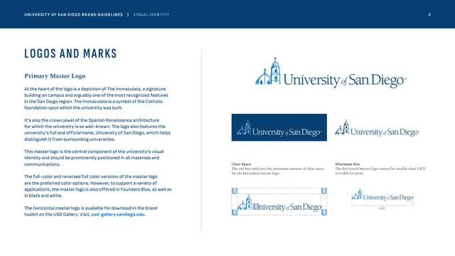
Logos and Marks chapter opener specifying the horizontal master logo with its full-color, reversed, and one-color versions plus clear-space and minimum-size diagrams.
Summary
The first Logos and Marks page, introducing the primary horizontal master logo (the Immaculata building drawing beside the wordmark) with its color variants and the standard clear-space and minimum-size rules.
Visual description
Two-column layout under the blue header band. Left column: "LOGOS AND MARKS" in tracked condensed Founders Blue caps, a "Primary Master Logo" Spectral subhead, and several paragraphs explaining the Immaculata symbolism and the logo's primacy, ending with a bright-blue toolkit link. Right column shows the full-color horizontal master logo large at top (line-drawn Immaculata church plus "University of San Diego" serif wordmark), then a two-up of the reversed version on a Founders Blue rectangle and a one-color blue version. Below, two captioned diagrams: a "Clear Space" lockup boxed by a dashed margin frame using the letter U as the spacing unit, and a "Minimum Size" version annotated at 1.875" width.
Key takeaway
The compact "one master logo, four answers" layout: primary, reversed, one-color, plus clear-space and minimum-size, all on a single right column. Using a glyph from the wordmark (the "U") as the clear-space measuring unit is a clean, self-documenting convention.
Reuse notes
A canonical first logo page for any identity guide. The dashed clear-space and minimum-size diagrams are directly reusable. Pairs with the secondary-configuration and improper-usage pages that follow it.
From this deck: Primary master logo, clear space and minimum size
View deck




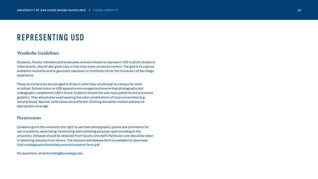
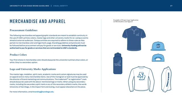
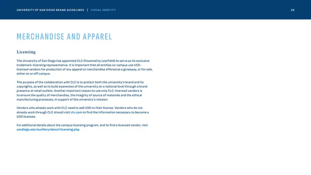
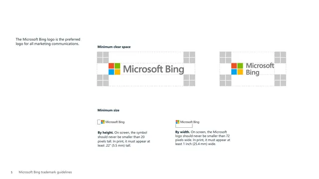
More like this







Keep what you find
A free account saves references to boards and can send you a weekly email of picks based on what you save.
To see every result, go Pro.