
Preview image. Unlock full-res
A payments-brand identity system built on a single bold electric-blue, a globe-and-star monogram, and a heavy geometric sans logotype.
Summary
The brand guidelines for Optty, a payments company, organized into numbered sections (Logos & Usage, Primary Brand Colors, Brand Fonts). The whole system rests on one saturated electric blue, a custom globe-and-star icon, and a heavy lowercase geometric-sans logotype with a superscript trademark.
Visual description
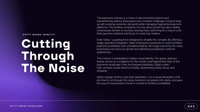
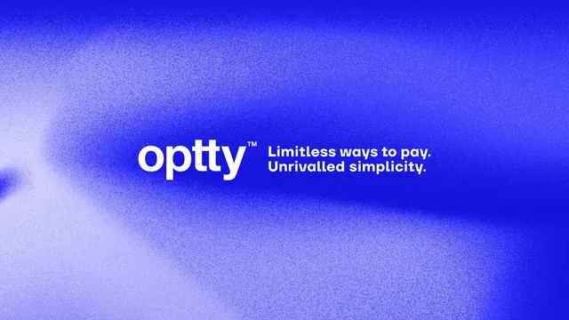
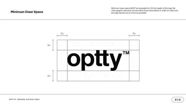
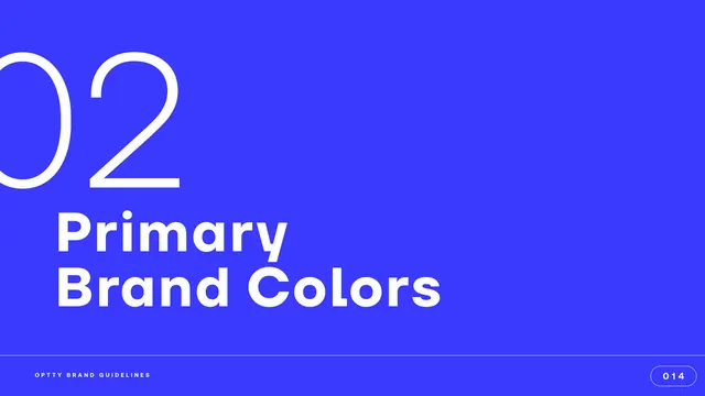
The deck alternates two visual registers. Content pages sit on white with a hairline rule under a fixed top band: a bold section label at top left, a paragraph of intro copy at top right, and a footer reading "OPTTY BRAND GUIDELINES" with a pill-shaped page number at bottom right. Section dividers and bookend pages flip to full-bleed: the dividers are flat electric-blue fields with a giant outline numeral (01, 02, 03) and a heavy white two-line title; the cover and closing use a dark navy-to-blue grainy gradient with a faint, blurred globe motif in the lower left.
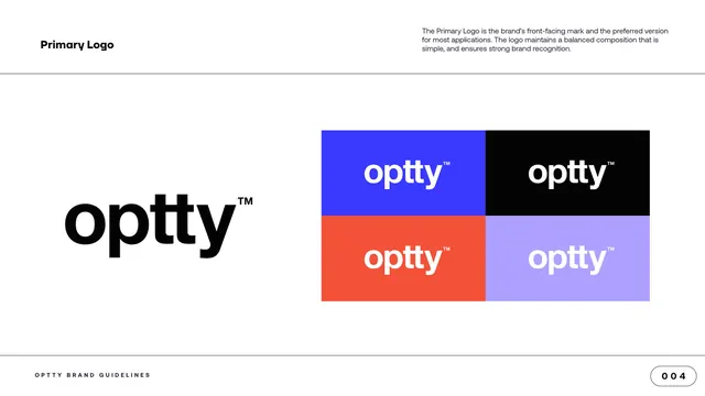
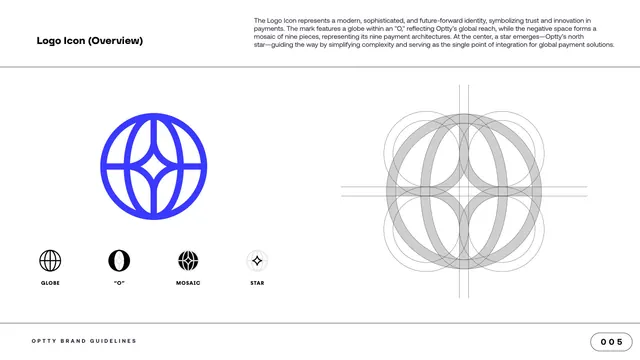
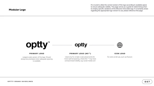
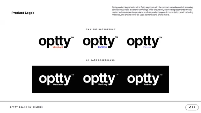
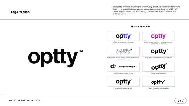
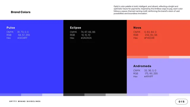
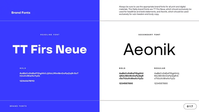
The logotype is "optty" set lowercase in a heavy geometric sans (TT Firs Neue) with a small superscript trademark. The icon is a line-drawn globe whose latitude and longitude lines frame a four-point star in the center, built on a circle-construction grid and described as a globe inside an "O" with a nine-piece mosaic and a central north star. The logo system is modular (full logotype, logotype without trademark, icon-only) and extends to product lockups (Merchant, Banking, Partner) and a tagline lockup ("Limitless ways to pay. Unrivalled simplicity."). The color system is four named swatches plus white, each given a space-themed name (Pulse blue, Eclipse near-black, Nova orange, Andromeda lavender) with CMYK, RGB and Hex specced. Type is a two-font pairing: TT Firs Neue for headlines, Aeonik for sub-headers and body.
Key takeaway
The one-color discipline: a single high-chroma electric blue carries dividers, icon, social avatar and gradients, so the brand reads instantly. The grainy navy-to-blue gradient with a ghosted version of the brandmark makes a premium, ownable cover and closing pair. The space-themed color naming (Pulse, Eclipse, Nova, Andromeda) is a tidy way to make a small palette feel considered and on-narrative for a "limitless ways to pay" story.
Reuse notes
A strong reference for a fintech or payments identity that wants to feel modern and confident without illustration or photography. The fixed top-label / top-copy / bottom-footer page furniture is a clean, reusable guideline template. The monochrome-plus-accents palette leans heavily on the blue, so the orange and lavender are best kept as small accents rather than co-leads.
From this deck: Optty Brand Guidelines 2025/2026
View deck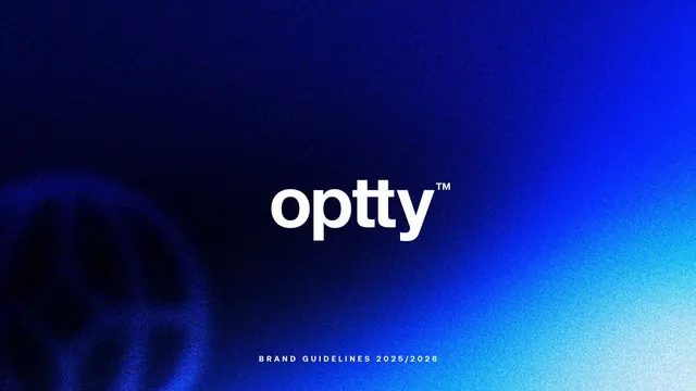



More like this








Keep what you find
A free account saves references to boards and can send you a weekly email of picks based on what you save.
To see every result, go Pro.