Preview image. Unlock full-res
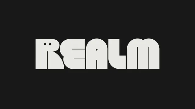
An off-white REALM wordmark set in a heavy rounded display face with playful inktrap dots and tightly fused letterforms on a near-black field.
Summary
A horizontal REALM logotype rendered in a super-heavy rounded display face, where the defining move is the dotted detailing punched into the counters of the R and the A.
Visual description
Five all-caps letters in a warm off-white sit centered on a near-black ground, set so tight the strokes nearly touch. The forms are extremely fat with fully rounded outer corners and squared baselines, giving a soft, almost pill-like silhouette. Inside the bowl of the R sit two small black dots like eyes, and a third black dot floats in the crossbar gap of the A, reading as quirky ink-trap or eyelet detailing. Hairline negative-space cuts separate the R leg and the M stems, keeping the heavy mass legible. No tagline, no mark, just the word filling the frame.
Key takeaway
The dot motif carved into the counters turns a generic fat display face into something proprietary and a little playful. Pairing extreme stroke weight with hairline internal separations is what keeps a near-touching wordmark readable at large scale.
Reuse notes
Good reference for a consumer brand or app logotype that wants warmth and personality without an icon. The dotted counters are a cheap way to add character to a licensed display font. Needs generous size; the fine internal cuts and dots collapse at small sizes or low contrast.
More like this

Keep what you find
A free account saves references to boards and can send you a weekly email of picks based on what you save.
To see every result, go Pro.