Preview image. Unlock full-res
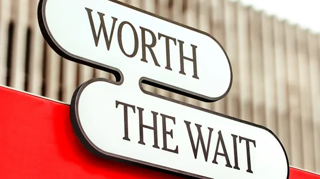
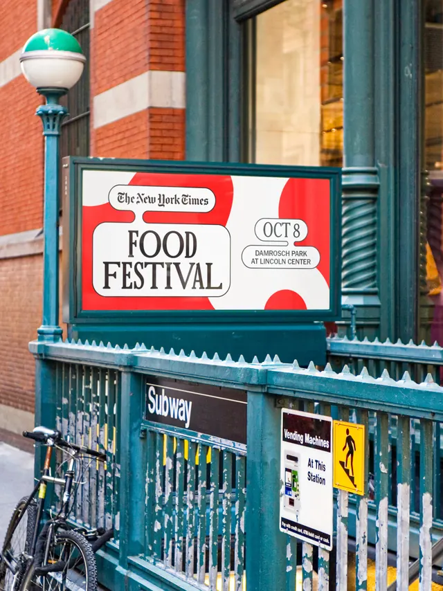
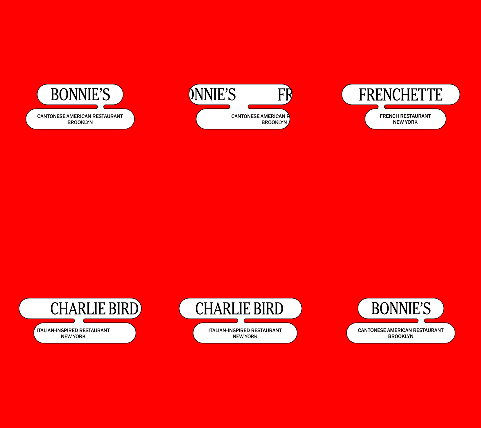
Tall red frame in which a two tier white lozenge lockup swaps restaurant names, each set in a high contrast serif above a small caps descriptor pinned beneath it.
More like this
See all
Summary
A single reusable name tag, animated as a conveyor: the white two piece lozenge holds its position on a flat red field while restaurant after restaurant slides through it.
Visual description
The frame is portrait and filled edge to edge with a pure red. In the upper third sits a lockup made of two stacked white shapes with fully rounded ends. The top lozenge carries the restaurant name in black in a high contrast serif with sharp bracketed serifs, set in caps and sized to fill the shape. The lower lozenge is narrower, offset to the right and joined to the one above by a short white notch so the pair reads like a tail or a speech tag, and it holds two lines of tiny black sans in caps: the cuisine or restaurant type on the first line and the borough or city on the second. The rest of the frame below is empty red. Across the loop the pair holds for a beat and then both shapes slide horizontally in opposite directions, the outgoing name clipped at the frame edge as the next one arrives, cycling through Bonnie's with Cantonese American Restaurant, Brooklyn; Frenchette with French Restaurant, New York; and Charlie Bird with Italian Inspired Restaurant, New York. The lockup width changes to fit each name, so the shapes visibly stretch and contract between beats.
Key takeaway
The notch joining the two lozenges does all the character work, turning a plain label into something that reads as a tag or a caption bubble. Letting the shapes resize to the length of each name is what keeps a long list of partners feeling like one designed system instead of a spreadsheet.
Reuse notes
Ideal for a festival, awards or lineup announcement where dozens of names must be presented in the same slot, and it survives being cut into individual stills for each partner. The empty lower two thirds is designed to carry a date, ticket call to action or food imagery, so it looks unfinished if used alone. The serif and sans pairing is doing the editorial signalling, so swapping to a single family would flatten it.