Preview image. Unlock full-res
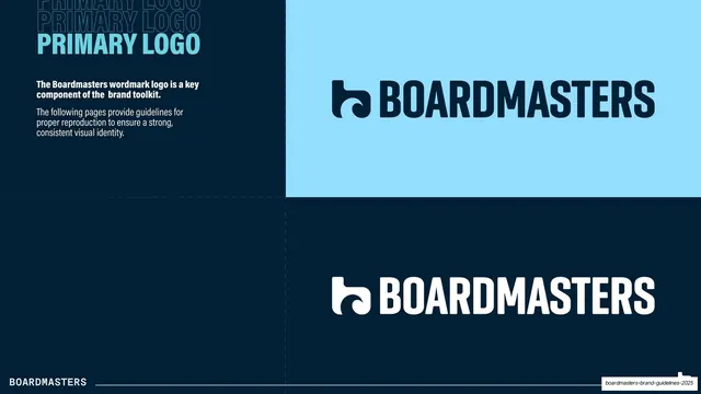
Primary wordmark slide showing the dark-blue logo on a light-blue panel and the white logo on a dark navy panel.
Summary
The primary logo page: the Boardmasters wordmark shown in its dark-blue version on a light-blue panel and its white version on a dark navy panel.
Visual description
Dark navy field. Top-left, a "PRIMARY LOGO" title in light-blue condensed bold caps over two ghost repeats. A short white text block explains that the wordmark is a key brand component and that the following pages give reproduction rules. The right two-thirds is split into a 2x2-feeling arrangement: a large light-blue panel (top) holds the dark navy version of the logo, and the dark navy field below it holds the white version, so the two correct color treatments sit one above the other. The logo throughout is the wave-tab "b" mark followed by "BOARDMASTERS" in condensed bold caps. A faint dashed quadrant guide and the white "BOARDMASTERS" footer wordmark complete the page.
Key takeaway
Demonstrating positive and negative logo versions by stacking them on their actual background colors rather than in neutral boxes, so the reader sees the real contrast each version is built for. The light-blue panel doubles as a brand-color sample.
Reuse notes
Standard, clean primary-logo page for any brand book. Showing the logo on the brand's own accent panel (not just black and white) is a useful upgrade. Works best when the logo has clearly distinct light and dark cuts.
From this deck: Primary logo on light and dark
View deck







More like this








Keep what you find
A free account saves references to boards and can send you a weekly email of picks based on what you save.
To see every result, go Pro.