Preview image. Unlock full-res
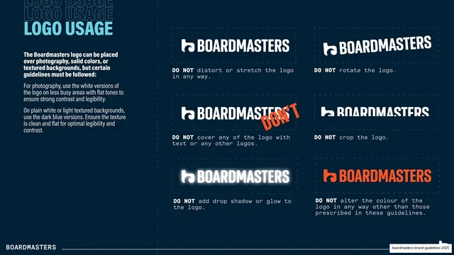
A six-cell DO NOT grid showing logo misuses (distort, rotate, cover, crop, glow, recolour) with monospace captions.
Summary
The logo misuse page: six dashed cells each showing one wrong way to use the logo, captioned in monospace with a bold "DO NOT".
Visual description
Dark navy field. Top-left, a second "LOGO USAGE" title in light-blue condensed caps over ghost repeats, with a white note on placing the logo over photography, solid colors, or texture. The right two-thirds is a 2-column by 3-row grid of dashed-outline cells, each holding a white logo demonstrating a violation: stretched/distorted, rotated, covered by an orange "DON'T" scrawl, cropped, given a soft glow, and recolored to orange. Below each cell a monospace caption begins with a bold "DO NOT" and states the rule (distort or stretch, rotate, cover with text or other logos, crop, add drop shadow or glow, alter the colour). The white "BOARDMASTERS" footer sits on a hairline rule.
Key takeaway
The compact six-cell DO NOT grid with monospace captions, an efficient, scannable way to encode all the no-go rules on one page. Using a hand-scrawled orange "DON'T" inside the "cover the logo" example is a small witty touch that also demonstrates the violation.
Reuse notes
The canonical logo-misuse page; this layout (2x3 dashed cells, bold DO NOT lead, terse monospace explanation) is directly copyable for any brand book. Keep examples to the most common real violations so the page stays at a glance.
From this deck: Logo misuse grid
View deck

More like this








Keep what you find
A free account saves references to boards and can send you a weekly email of picks based on what you save.
To see every result, go Pro.