Preview image. Unlock full-res
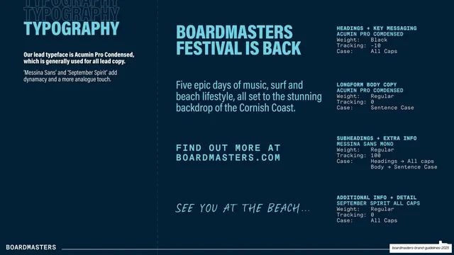
Typography page showing Acumin Pro Condensed, Messina Sans Mono, and a handwritten script as live samples beside monospace weight and tracking specs.
Summary
The type page: the three brand typefaces shown as real headline, body, and detail samples, each annotated with monospace weight, tracking, and case specs.
Visual description
Dark navy field. Top-left, "TYPOGRAPHY" in light-blue condensed caps over ghost repeats, with a white note naming Acumin Pro Condensed as the lead typeface and Messina Sans and a script face as supporting voices. The center column shows live samples in light-blue: an oversized condensed headline "BOARDMASTERS FESTIVAL IS BACK", a lighter sub-paragraph, a spaced monospace line "FIND OUT MORE AT BOARDMASTERS.COM", and a handwritten "SEE YOU AT THE BEACH...". The right column lists matching specs in monospace under labels (HEADINGS + KEY MESSAGING, LONGFORM BODY COPY, SUBHEADINGS + EXTRA INFO, ADDITIONAL INFO + DETAIL), each giving typeface, weight, tracking, and case. The white "BOARDMASTERS" footer sits on a hairline rule.
Key takeaway
Pairing each type role with a live, on-brand sample on the left and a precise monospace spec block (weight / tracking / case) on the right, so the page is both inspirational and usable as a build reference. Assigning a clear job to each of three faces (condensed display, mono detail, handwritten accent) keeps the system disciplined.
Reuse notes
An excellent model for a type page in any brand book; the role-labelled sample-plus-spec layout is directly reusable. The handwritten accent face suits a festival or youth-lifestyle brand; drop it for something more corporate. Works on dark only as shown, but the structure ports to light.
From this deck: Typography system
View deck
More like this








Keep what you find
A free account saves references to boards and can send you a weekly email of picks based on what you save.
To see every result, go Pro.