Preview image. Unlock full-res
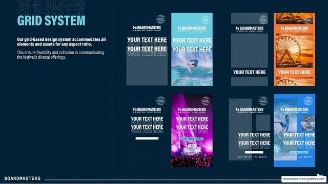
Layout page showing the grid-based system applied across eight vertical poster and social mockups in different colourways and aspect ratios.
Summary
The grid page: the brand's layout system shown across eight vertical poster and social templates, some bare grids and some filled with photography and "YOUR TEXT HERE" placeholders.
Visual description
Dark navy field. Top-left, "GRID SYSTEM" in light-blue condensed caps over ghost repeats, with a white note that the grid accommodates all elements and assets for any aspect ratio. The right two-thirds is a two-row grid of eight tall portrait mockups. Several show the underlying column grid in grey with placeholder "YOUR TEXT HERE" lines and the logo plus event lockup at the top; others are filled-out poster examples over photography in different colourways, a turquoise surf shot, an orange Ferris-wheel shot, a magenta concert poster with a "CTA GOES HERE" button, and a blue beach poster. Each carries the Boardmasters mark, a small "FEAT. ONLY" circular stamp, and oversized condensed headlines. The white "BOARDMASTERS" footer sits on a hairline rule.
Key takeaway
Proving a grid by showing the same skeleton both empty (with placeholders) and fully designed across multiple colourways and formats, so readers see the rules and the range at once. Keeping a fixed top lockup (logo, date, "FEAT. ONLY" stamp) while the imagery and color change is the core consistency move.
Reuse notes
A practical layout page for any brand producing lots of posters, ads, or social assets. Pairing bare-grid and finished examples is the most useful way to document a grid. The vertical/poster emphasis suits an event campaign; add landscape and square examples for fuller coverage.