Preview image. Unlock full-res
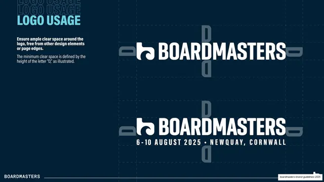
Clear-space rule slide showing the logo (and a dated event lockup) with the letter D used as the minimum spacing unit, marked by dashed guides.
Summary
The clear-space page: the logo bounded by dashed exclusion guides, with the minimum margin defined as the height of the letter D, shown for both the plain wordmark and a dated event lockup.
Visual description
Dark navy field. Top-left, a "LOGO USAGE" title in light-blue condensed bold caps over two ghost repeats, with a short white note that the minimum clear space equals the height of the letter "D". The right zone shows the white logo twice: above, the plain wordmark; below, a lockup with "6-10 AUGUST 2025 - NEWQUAY, CORNWALL" set in spaced monospace-style caps beneath it. Around each, grey D-shaped glyphs are placed at the top, bottom, left and right edges to mark the exclusion zone, with thin dashed guide lines forming the bounding box. The white "BOARDMASTERS" footer sits on a hairline rule.
Key takeaway
Using an actual letterform from the logo (the D) as the spacing unit and literally placing copies of that letter at each margin, so the rule is self-documenting. Showing the dated event lockup alongside the plain mark covers the two real-world uses on one page.
Reuse notes
A clear, conventional exclusion-zone page that any brand book needs. Deriving the clear-space unit from a glyph in the wordmark itself is a tidy, memorable convention. The date-and-location lockup pattern is reusable for any recurring event brand.
From this deck: Logo clear space
View deck









More like this









Keep what you find
A free account saves references to boards and can send you a weekly email of picks based on what you save.
To see every result, go Pro.