Preview image. Unlock full-res
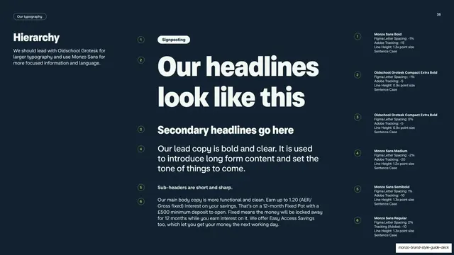
Dark three-column type-hierarchy slide ranking headline to body copy down the center with numbered weight and tracking specs on the right.
Summary
A dark hierarchy reference: the type scale runs largest-to-smallest down a center column, each tier numbered and matched to a precise weight, tracking and line-height spec in the right column.
Visual description
Near-black navy background. Top-left pill "Our typography", page number "38" top-right. A left column carries the title "Hierarchy" and a short intro about leading with Oldschool Grotesk for large type and Monzo Sans for focused content. The wide center column descends through the scale: a small "Signposting" pill, then a huge two-line headline "Our headlines look like this", a smaller "Secondary headlines go here", a medium lead paragraph, a bold sub-header line, and a block of functional body copy. Each line is tagged with a small numbered circle (1 to 6). The right column repeats those numbers next to typeset specs (e.g. "Monzo Sans Bold, Figma Letter Spacing -1%, Line Height 1.3x point size, Sentence Case"; "Oldschool Grotesk Compact Extra Bold").
Key takeaway
The three-track layout that lines up live specimens, numbered anchors and exact engineering specs across one row each, so a designer can read the look and the values together. The numbered circles tie the demo column to the spec column without any leader lines.
Reuse notes
The canonical type-hierarchy reference page for a brand or design-system guideline. Reusable as a documentation template for any type scale. Needs accurate per-tier specs to be useful. Works on dark; high information density.
From this deck: Type hierarchy specimen ladder
View deck
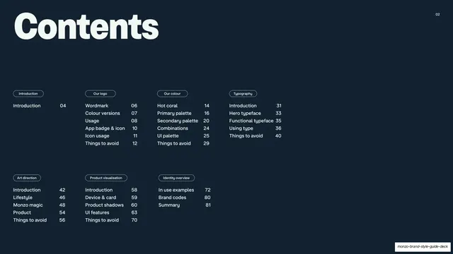

















































More like this
Keep what you find
A free account saves references to boards and can send you a weekly email of picks based on what you save.
To see every result, go Pro.