Preview image. Unlock full-res
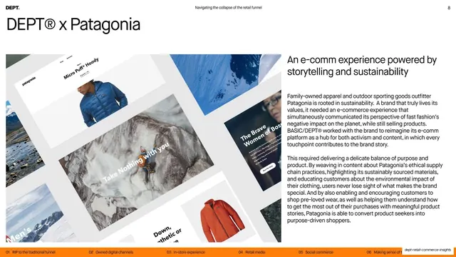
A Patagonia case study pairing a left collage of tilted website mockups with a right column headline and two body paragraphs.
Summary
A Patagonia case study: an angled collage of e-commerce website mockups fills the left, while the right holds the subhead "An e-comm experience powered by storytelling and sustainability" and two paragraphs of explanation.
Visual description
A small "DEPT x Patagonia" label sits at the top-left. Below, the left two-thirds is a collage of tilted, perspective-skewed Patagonia website screens, mountaineering and product photography, jacket shots, and editorial headlines like "The Brave Women of Bosnia" overlapping at an angle. The right column opens with a medium headline, "An e-comm experience powered by storytelling and sustainability," followed by two body paragraphs about balancing activism, sustainability messaging, and product. The standard running header and orange chapter-strip footer frame the slide.
Key takeaway
The tilted, overlapping website-mockup collage, which shows a redesign as a dynamic flat-lay rather than a single flat screenshot, implying depth and breadth of work. The "DEPT x Brand" label is a tidy, repeatable way to brand each case study.
Reuse notes
A strong template for agency or studio case studies that need to show a lot of UI at once. The angled mockup collage carries the visual half, so it needs good-quality screens to assemble. Keep the right-hand subhead plus two paragraphs format consistent across case-study slides for a uniform rhythm.
From this deck: DEPT x Patagonia case study
View deck




More like this

Keep what you find
A free account saves references to boards and can send you a weekly email of picks based on what you save.
To see every result, go Pro.