Preview image. Unlock full-res
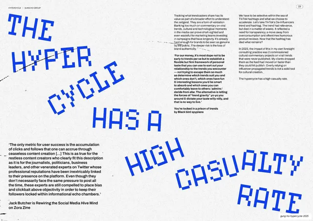
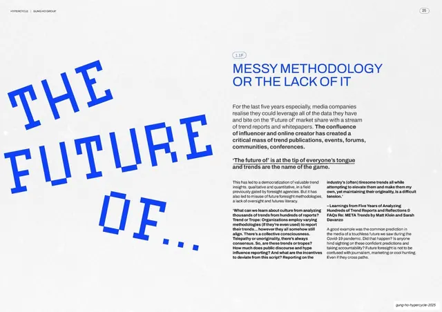
A spread dominated by a giant tilted electric-blue pixel headline "THE FUTURE OF..." on the left, with a blue chapter title and multi-column body on the right.
Summary
A finding spread where an enormous tilted blue pixel headline "THE FUTURE OF..." owns the left half and a tidy blue-titled text block fills the right.
Visual description
Warm off-white paper-textured ground. The left half carries an oversized electric-blue bitmap/pixel headline reading "THE FUTURE OF..." set on three stepped, slightly rotated lines that fill the page. The right column has a pill chapter badge "1.1F", a two-line electric-blue all-caps grotesque heading ("MESSY METHODOLOGY OR THE LACK OF IT"), a bold black intro paragraph, an italic-style pull line ("The future of is at the tip of everyone's tongue and trends are the name of the game."), then two columns of small black body copy with a bold attributed source. Running header top-left, circled "25" top-right, footer slug bottom-right.
Key takeaway
Reusing the oversized pixel headline as a recurring graphic device (here echoing the earlier "high casualty rate" spread) builds a consistent voice across the report. The trailing ellipsis turns the headline into a hanging phrase that pulls the eye into the body copy.
Reuse notes
A clean pattern for chapter or section openers inside a long report: one giant typographic statement, one structured text column. Keep the pixel face and electric-blue accent consistent with sibling spreads. Best on a light textured ground for contrast.
From this deck: Messy methodology or the lack of it
View deck