Preview image. Unlock full-res
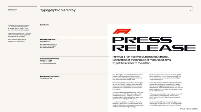
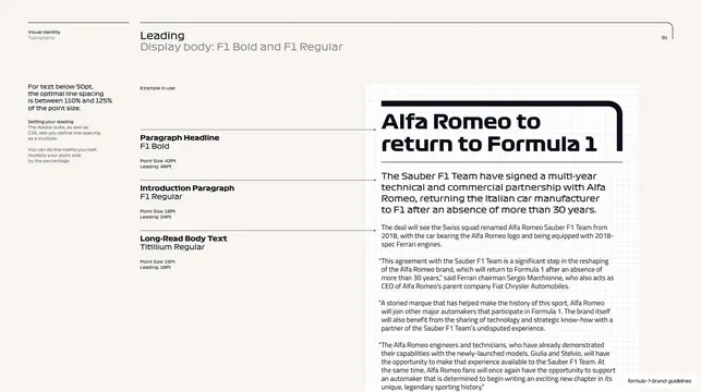
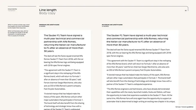
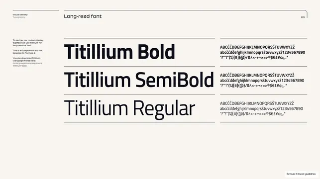
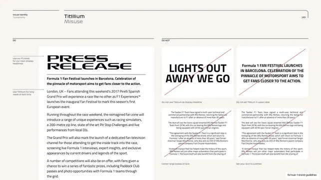
Typographic hierarchy page mapping display headline, supporting headline, and long-read body sizes against a sample F1 press release.
Summary
A type-hierarchy page that labels each tier (display headline Wide 64pt, supporting headline Regular 18pt, long-read body Titillium 10pt) and ties the labels by leader lines to a real F1 "Press Release" mockup on the right.
Visual description
Off-white page, standard running header with "Visual Identity / Typography" top left and page number 76 top right under a hairline rule that rounds at the corner. A narrow left column of intro copy. The center holds a stacked spec list: each level shows its name and point size in bold plus a one-line description, connected by long thin leader lines across to the example. The right two-thirds is a press-release mockup on a light panel: a red F1 mark above a huge black all-caps "PRESS RELEASE" headline, a Regular sub-headline about a Shanghai Fan Festival, and several columns of small Titillium body copy beneath a hairline.
Key takeaway
Pinning an abstract type scale to a single realistic document and drawing leader lines from each spec to where it actually appears, so hierarchy reads as cause and effect rather than a list. The oversized "PRESS RELEASE" lockup shows the display face at its intended impact.
Reuse notes
Reusable as the "type scale" page in any guideline. The leader-line-to-mockup device communicates hierarchy faster than a stacked specimen ladder. Needs a believable sample document to anchor it.
From this deck: Typographic hierarchy
View deck






More like this
Keep what you find
A free account saves references to boards and can send you a weekly email of picks based on what you save.
To see every result, go Pro.