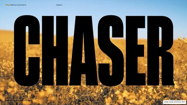
Preview image. Unlock full-res
A 14-slide Awwwards conference talk by Claudio Guglieri that pairs oversized typographic statements with full-bleed imagery, meme collages, and 3D renders, each slide framed by tiny all-caps utility credits.
Summary
A 14-slide Awwwards conference talk by Claudio Guglieri (Head of Design at Opal Camera) titled "Design Trends To Live And Die For." Its personality is presentation theater: almost every slide is one oversized typographic statement, often clipped over a full-bleed photo, render, or meme collage, with all the running credits shrunk to near-illegible utility text in the corners.
Visual description
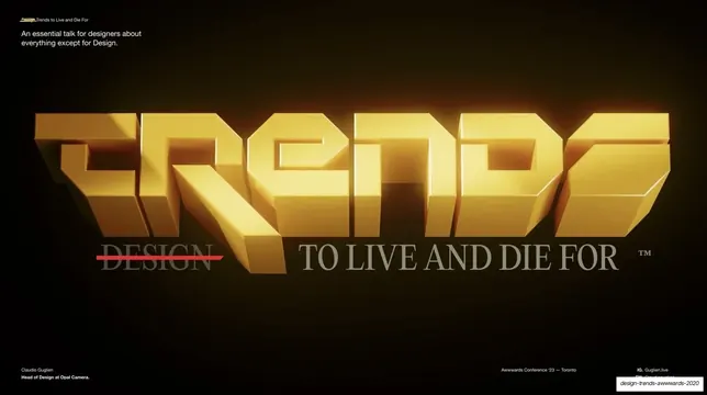
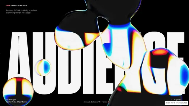
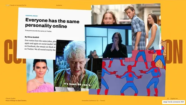
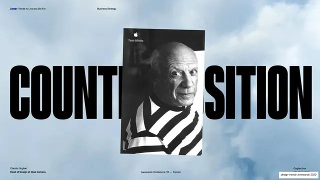
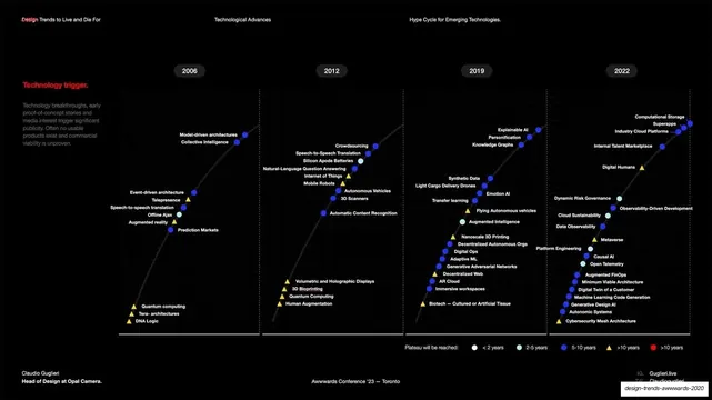
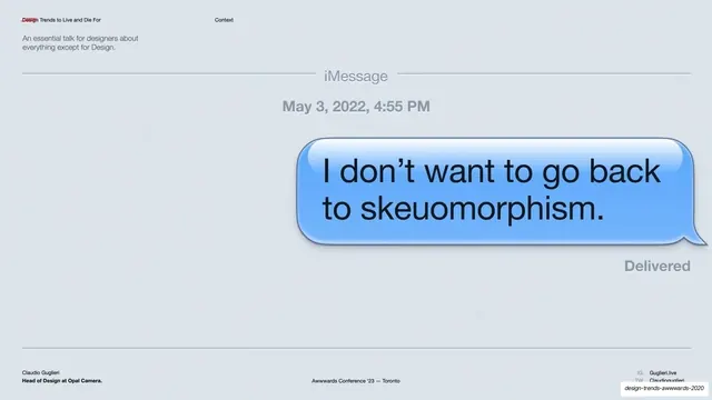
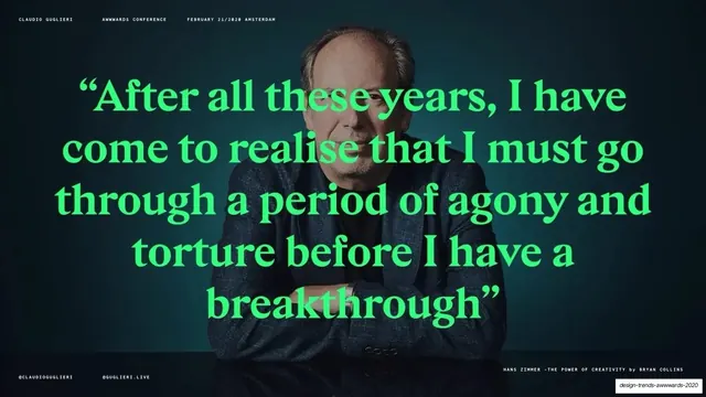
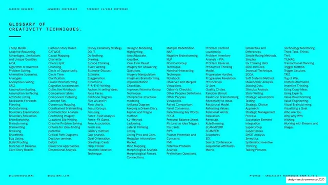
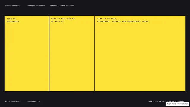
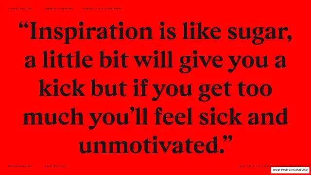
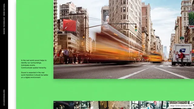
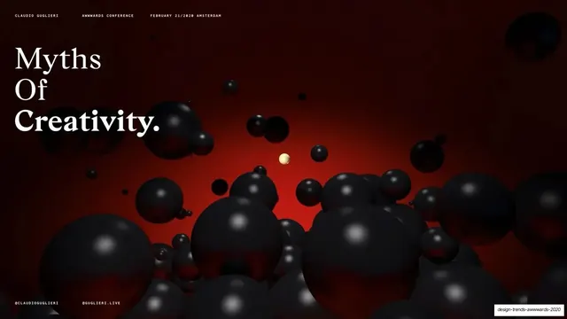
Slides run 16:9 and lean heavily on contrast and full-bleed treatments rather than a fixed grid. Backgrounds swap dramatically slide to slide: a golden canola field, near-black with a glowing 3D wordmark, pure black, saturated yellow, electric cyan, vivid red, and a dark red 3D sphere field. Type alternates between a heavy condensed grotesque set enormous (CHASER, AUDIENCE, COUNTERPOSITION span edge to edge) and a high-contrast serif used for long pull quotes (the red "Inspiration is like sugar" slide, the green Hans Zimmer quote). A recurring device is single words knocked out so the background photo or chrome render shows through the letterforms. Two utility framing systems appear: earlier slides carry a small mixed-case header ("Design Trends to Live and Die For" with a section label like Audience / Business Strategy / Context) plus a bottom credit line ("Claudio Guglieri / Head of Design at Opal Camera," "Awwwards Conference '23, Toronto," "Guglieri.live"); later slides switch to a centered all-caps tracked header ("CLAUDIO GUGLIERI / AWWWARDS CONFERENCE / FEBRUARY 21/2020 AMSTERDAM") with "@CLAUDIOGUGLIERI / @GUGLIERI.LIVE" footing. Content slides include a Gartner-style hype-cycle chart of emerging technologies, a meme/screenshot collage on yellow, a giant iMessage skeuomorphic bubble, a five-up creativity-techniques glossary in tiny columns, and a three-panel yellow "time to disconnect / fail / play" layout. Accent colors are deployed one-per-slide at full saturation.
Key takeaway
Treating every slide as a single loud idea, with all administrative text demoted to tiny corner utility labels so the visual statement owns the frame. The knockout-type-over-image device (one word, photo or chrome render showing through) is a repeatable hero move. And the willingness to swing the background color hard from slide to slide, using one saturated accent at a time, to keep a talk visually awake.
Reuse notes
A strong reference for conference talks, keynote decks, and any presentation meant to be projected and felt rather than read closely. The big-word-knockout-over-image and full-color statement slides are directly reusable; the meme collage and skeuomorphic-bubble gags are tone-specific to a design-culture audience. Body copy is intentionally sparse, so this grammar suits a spoken talk, not a leave-behind document. Note the credits vary between an Awwwards 2023 Toronto line and a February 2020 Amsterdam line across slides.
From this deck: Design Trends To Live And Die For (Claudio Guglieri)
View deck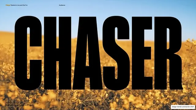
More like this






Keep what you find
A free account saves references to boards and can send you a weekly email of picks based on what you save.
To see every result, go Pro.