
Preview image. Unlock full-res
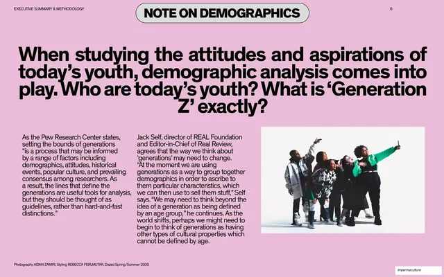
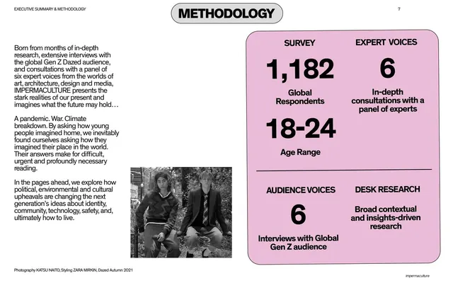
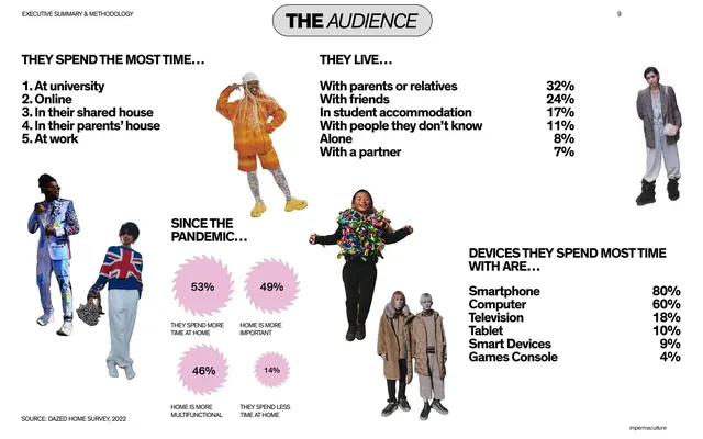
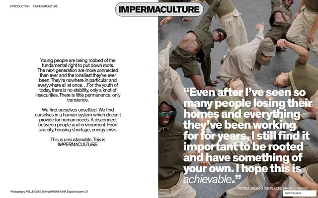
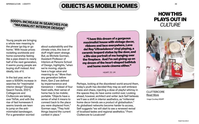
White comparison spread with a grey "Great Expectations" panel of ranked desires on the left wired by hand-drawn lines to a pink "Reality" panel of sourced counter-facts on the right.
Summary
A white side-by-side comparison: a grey rounded panel listing what Gen Z wants from home (with percentages) on the left, hand-drawn lines crossing to a pink rounded panel of cited, often deflating, real-world facts on the right.
Visual description
White background. Two rounded pill badges head the columns: a pink "GREAT EXPECTATIONS" (with "EXPECTATIONS" italic) left and a grey "REALITY" right. Below left, a large light-grey rounded panel lists desires in bold all-caps with percentages: More Space 25%, Safety 42%, Home Ownership Aspiration 67%, Natural Light 51%, A Space To Explore Interests And Hobbies 48%, A Space To Escape 33%. Below right, a pink rounded panel holds matching sourced facts in smaller type (for example "Home ownership is declining globally. (The Economist, 2020)"; "1 in 5 children in England live in cramped or unsuitable homes. (National Housing Federation, 2021)"). Thin hand-drawn black lines arc from each left item to its corresponding reality on the right. The impermaculture badge sits bottom-right.
Key takeaway
The two-panel expectation-versus-reality device, with hand-drawn connector lines doing the pairing so the reader literally follows each hope to its hard fact. Color-coding the panels (pink aspiration, grey reality) signals the contrast instantly.
Reuse notes
A strong rhetorical layout whenever a report wants to puncture or contextualize stated preferences with evidence. Works best when each left item has exactly one matching right fact, or the connector lines get tangled. Keep the cited sources visible to retain credibility.
From this deck: Great expectations vs reality comparison spread
View deck






































More like this







Keep what you find
A free account saves references to boards and can send you a weekly email of picks based on what you save.
To see every result, go Pro.