Preview image. Unlock full-res
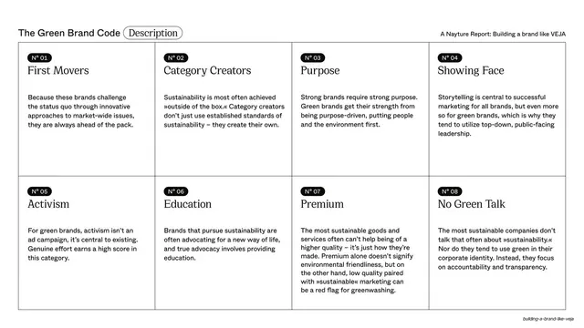
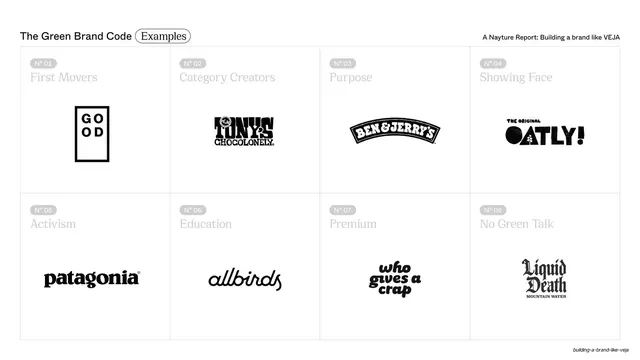
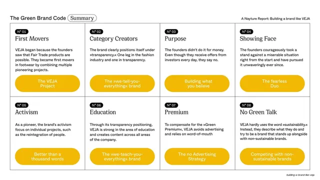
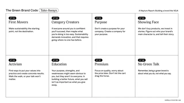
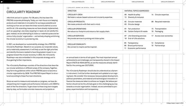
The same eight-category grid as the overview, now filled with a short body paragraph in each numbered cell describing what the category means.
Summary
The category grid repeated, now with a short explanatory paragraph in each of the eight numbered cells defining First Movers, Category Creators, Purpose, Showing Face, Activism, Education, Premium and No Green Talk.
Visual description
White slide, same header pattern with an outlined "Description" pill. The 4-by-2 thin-ruled grid returns, but each cell now holds its black "N°" pill, a serif category name, and three to five lines of small sans-serif body copy explaining the principle. Text is left-aligned and top-aligned within each cell; the bottom row runs slightly longer. Guillemets (»...«) appear in the copy as a recurring typographic detail.
Key takeaway
Reusing the exact overview grid but populating it with copy is an efficient way to go from index to detail without a new layout, reinforcing structure through repetition. Keeping each cell to a few tight lines preserves scannability even when the slide is text-heavy.
Reuse notes
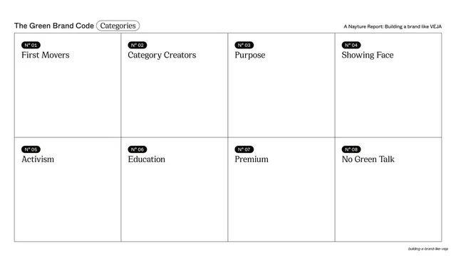
A good "definitions" slide for frameworks, glossaries, or principle sets. Works when each item can be explained in roughly thirty words; longer copy should move to dedicated slides. Pairs directly with the empty overview grid as a before/after pattern.
From this deck: Green Brand Code categories described
View deck

























More like this





Keep what you find
A free account saves references to boards and can send you a weekly email of picks based on what you save.
To see every result, go Pro.