Preview image. Unlock full-res
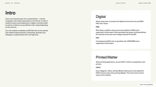
A light text page contrasting RGB/HEX color for digital with CMYK for print, set in two rounded explainer cards.
Summary
A mostly-text page explaining when to use which color model: an "Intro" column on the left, then two stacked rounded cards, "Digital" (RGB/HEX) and "Printed Matter" (CMYK).
Visual description
Warm off-white ground. Top left an oversized "Intro" heading sits above two body paragraphs about color driving identity and ASE files for Creative Suite. The right two-thirds holds two rounded-corner cards. The upper card, "Digital", explains RGB for screens and HEX as the hexadecimal form supported in all browsers, with "RGB" and "HEX" subheads. The lower card, "Printed Matter", explains CMYK for print, with a "CMYK" subhead. A monospace header reads "DIGITAL VS. PRINTED" / "COLOR PALETTE" / "BRAND GUIDELINES".
Key takeaway
Splitting the color-model explanation into two labeled cards (Digital, Printed Matter) so the screen-versus-press distinction is structural, not buried in a paragraph. The big "Intro" word anchors an otherwise text-heavy page.
Reuse notes
A clear reference page for teams that produce both digital and printed collateral. The two-card pattern reuses anywhere a single concept splits cleanly into two contexts; keep the subheads (RGB, HEX, CMYK) scannable.
From this deck: Mash digital vs print color rules
View deck




































More like this







Keep what you find
A free account saves references to boards and can send you a weekly email of picks based on what you save.
To see every result, go Pro.