Preview image. Unlock full-res
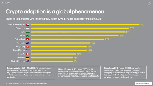
Horizontal yellow bar chart of crypto-ownership by country with flags, over three regulatory callout boxes, on a mid-gray field.
Summary
A data slide: a ranked horizontal bar chart of crypto ownership by country, each bar in yellow with a national flag and a percentage, sitting above three regulatory callout boxes.
Visual description
Mid-gray field. The headline "Crypto adoption is a global phenomenon" sits top-left over a one-line sub-title about share of respondents who owned or used crypto in 2023. The body is a horizontal bar chart: eleven country rows (United Arab Emirates 31% down to United Kingdom 12%), each labeled with a country name and a small flag icon, with a solid yellow (#F4D000) bar and its percentage in yellow at the bar's end. Below the chart, three equal outlined callout boxes carry short regulatory notes for the European Union, United Kingdom and Hong Kong, each with a bold lead-in. A small cited source line runs along the bottom.
Key takeaway
A clean ranked horizontal bar chart in a single accent color with the value repeated at each bar end, so the ranking reads at a glance. Pairing the chart with a row of three equal callout boxes adds qualitative context (regulation) under the quantitative ranking without a second chart.
Reuse notes
A reusable layout for any "ranked-by-country" or "ranked-by-segment" data slide that also needs short supporting notes. Flags make geographic rankings instantly scannable. Keep bars to one accent color and always label the value; cite the data source in the footer as done here.
From this deck: Crypto adoption bar chart
View deck



More like this




Keep what you find
A free account saves references to boards and can send you a weekly email of picks based on what you save.
To see every result, go Pro.