Preview image. Unlock full-res
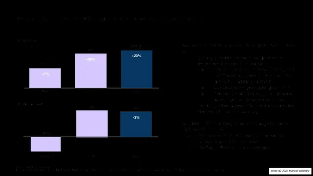
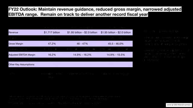
A dark slide with two stacked bar charts on the left showing revenue and adjusted EBITDA growth, with supporting commentary on the right.
Summary
A data slide making the revenue-and-profitability case with two stacked bar charts on the left and explanatory commentary on the right.
Visual description
Near-black full-bleed background. A headline runs across the top. The left two-thirds holds two stacked bar charts, each a three-bar series sitting on a thin horizontal baseline: the upper chart (revenue) and the lower chart (profitability/EBITDA) each show two pale lavender bars and one deep-navy bar, with percentage callouts above or inside the bars ("-17%", "+90%", "+20%" on the upper; "-3%" on the lower navy bar). The right third is a column of small bulleted commentary. The text is very low-contrast against the black ground; figures are partly hard to read in this capture.
Key takeaway
The two-tone bar treatment, pale lavender for context periods and deep navy to spotlight the current period, lets a chart highlight "this quarter" without a legend. Stacking two related charts in one column ties revenue and profit into a single visual argument.
Reuse notes
Good pattern for a results-trend slide where you want one bar to pop as the headline period. The dark ground here crushes contrast; on a lighter background or with heavier labels it would read far better. Flagged needs_review: the capture is very dark and several axis and value labels are not legible.
From this deck: Record Q2 revenue and profitability
View deck







More like this





Keep what you find
A free account saves references to boards and can send you a weekly email of picks based on what you save.
To see every result, go Pro.