Preview image. Unlock full-res
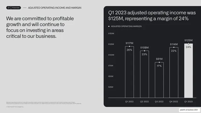
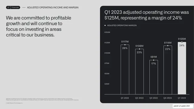
Headline-left, chart-right split: a profitable-growth statement on the left and a five-bar adjusted operating income chart with margin percents inside each bar on the right.
Summary
An operating-income slide: a profitable-growth statement on the left and a five-bar adjusted operating income chart on the right that prints the margin percent inside each bar.
Visual description
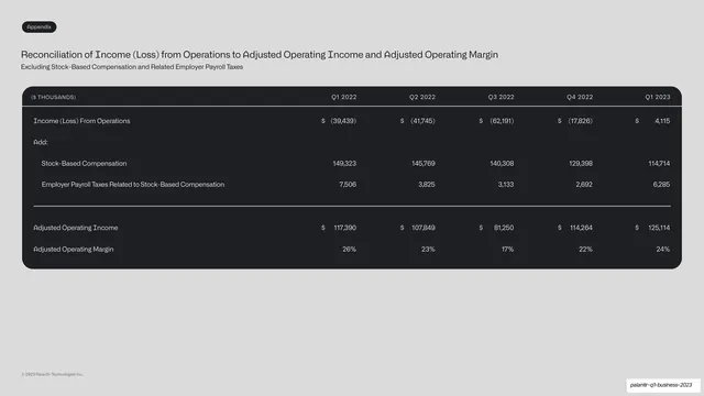
A light grey slide. Running header reads "Q1 | Financials" and "ADJUSTED OPERATING INCOME AND MARGIN". The left holds a four-line dark headline about committing to profitable growth and investing in critical areas. The right is a rounded near-black card titled "Q1 2023 adjusted operating income was $125M, representing a margin of 24%". Inside, five bars across Q1 2022 to Q1 2023 carry dollar values above ($117M, $108M, $81M, $114M, $125M) and the margin percentage inside each bar (26%, 23%, 17%, 22%, 24%); the final bar is solid white and the rest outlined. A small monospace legend and grey footnotes sit nearby.
Key takeaway
Printing a second metric (margin) inside each bar while the dollar value sits above it, so one bar chart carries both an absolute and a ratio reading without a second axis. The solid final bar again marks the current quarter.
Reuse notes
A compact way to show value and rate together on a single bar series. Keep the in-bar label short (a percentage) and high-contrast against the fill. Reuse for any income-and-margin or volume-and-rate pairing.
From this deck: Adjusted operating income and margin bar chart
View deck



More like this






Keep what you find
A free account saves references to boards and can send you a weekly email of picks based on what you save.
To see every result, go Pro.