Preview image. Unlock full-res
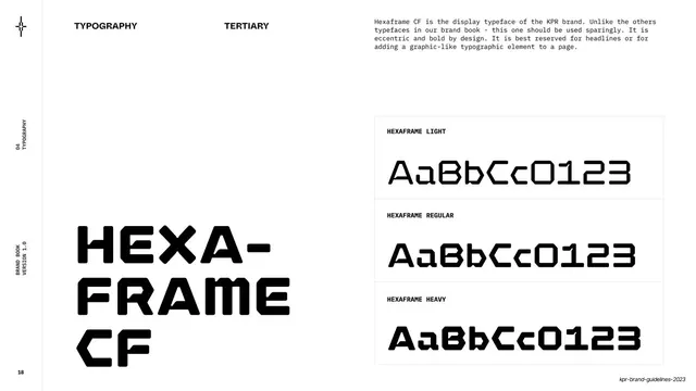
A type specimen page for Hexaframe CF, the eccentric display face, with the name set huge at left and light/regular/heavy rows boxed at right.
Summary
The tertiary typeface specimen: "Hexaframe CF" set very large at lower-left, with light, regular and heavy rows of "AaBbCc0123" boxed on the right.
Visual description
White page, "TYPOGRAPHY" and "TERTIARY" labels across the top, with a monospace note that Hexaframe CF is the display typeface, "eccentric and bold by design", to be used sparingly for headlines or graphic typographic elements. The lower-left sets "HEXA- FRAME CF" in three large stacked lines of the squared, chamfered display face. The right column is a bordered specimen table labeled HEXAFRAME LIGHT / REGULAR / HEAVY, each showing "AaBbCc0123" so the distinctive numerals read clearly. Left rail reads "04 / TYPOGRAPHY".
Key takeaway
Reserving a third, eccentric display face purely for big headline moments and numerals, and saying so explicitly. This is the face behind the section dividers and the KPR mark, so the page quietly explains the deck's own loudest type.
Reuse notes
The model for documenting a "use sparingly" display face alongside workhorse text fonts. Showing digits in the specimen is smart when the face has signature numerals, as the dividers rely on them.
From this deck: Tertiary typeface - Hexaframe CF
View deck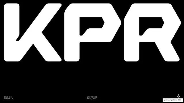






More like this








Keep what you find
A free account saves references to boards and can send you a weekly email of picks based on what you save.
To see every result, go Pro.