Preview image. Unlock full-res
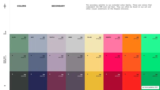
An extended secondary palette laid out as eight color columns, each with 300/500/700 tints and hex values.
Summary
The secondary palette page: eight named color columns (olive, navy, thistle, smoke, yellow, magenta, coral, lime), each split into 300/500/700 tints with hex values.
Visual description
White page, "COLORS" and "SECONDARY" labels across the top, with a monospace note that this is the extended color family complementing the core look, often found in KPR art. The lower two-thirds is an eight-column swatch grid; each column is one hue (OLIVE, NAVY, THISTLE, SMOKE, YELLOW, MAGENTA, CORAL, LIME) divided into three stacked tiles labeled 300, 500, 700 with a small black dot and hex on the deeper tints. Values shown include OLIVE #879C91 / #6A8275 / #383D3B, NAVY #A2AABD / #586685 / #282752, YELLOW #F4E6B5 / #F9D477 / #ECB935, MAGENTA #FF76A5 / #FE075B / #AF0A32, CORAL #FF7E12 / #FF591F / #FA231E, LIME #25F893 / #00E57B / #00AF5C. Left rail reads "03 / COLOR".
Key takeaway
Presenting an extended palette as named hues with a tight 300/500/700 tint scale and hex on each step. It turns a loose "supporting colors" set into a usable, systematic ramp.
Reuse notes
A dense, practical secondary-palette page for brands with a colorful art layer over a monochrome core. The three-step tint columns are directly reusable as a token scale. Best when paired with a restrained primary palette as here.
From this deck: Secondary color palette
View deck















More like this






Keep what you find
A free account saves references to boards and can send you a weekly email of picks based on what you save.
To see every result, go Pro.