Preview image. Unlock full-res
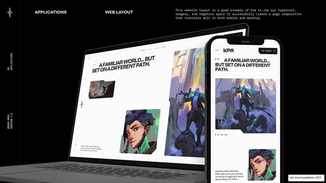
An applications page showing the KPR website on a laptop and phone against black, demonstrating responsive layout with big type and character art.
Summary
The web layout application page: the KPR site shown on a laptop and a phone over black, demonstrating the identity translating to desktop and mobile.
Visual description
Black page, "APPLICATIONS" and "WEB LAYOUT" labels across the top in white, with a monospace note about using the typestack, imagery and negative space to build a page that translates across mobile and desktop. The center-right shows a laptop mockup and an overlapping phone mockup, both displaying a white-background KPR homepage: a bold all-caps headline "A FAMILIAR WORLD... BUT SET ON A DIFFERENT PATH.", a "KPR" nav with a "BUY KEEPERS" button, folder-style image cards, and character art with section labels like "THE NEW EDEN". Left rail reads "08 / APPLICATIONS".
Key takeaway
Demonstrating the brand's responsive behavior with a paired laptop-and-phone mockup on a dark stage. The same big-headline / folder-card / character-art system reads clearly at both sizes.
Reuse notes
A reusable web-application page for a brand book. The dark backdrop makes light device screens pop. Swap in real site frames; the desktop-plus-mobile pairing is the transferable idea. Caption is offset from content, so flagged for review.