Preview image. Unlock full-res
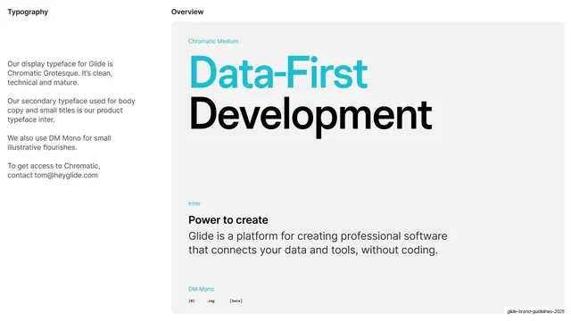
Light slide specifying the three typefaces, with a left rationale column and a right specimen card showing Chromatic, Inter, and DM Mono.
Summary
The typography overview: a left column naming and explaining the three typefaces, beside a large specimen card showing each in use, with cyan labels.
Visual description
Light off-white ground. Header reads "Typography" left and "Overview" center. A left column explains the three faces: Chromatic Grotesque as the clean, technical, mature display typeface; Inter as the secondary body and small-title face; and DM Mono for small illustrative flourishes; closing with a contact line to request Chromatic. The right two-thirds is a large rounded-rectangle specimen card: a cyan label "Chromatic Medium" above a two-tone headline "Data-First" (cyan) over "Development" (black); a cyan "Inter" label above a bold "Power to create" subhead and a grey paragraph; and a cyan "DM Mono" label above small monospace tokens like "(0)", ".img", "[Data]".
Key takeaway
A compact type-specimen card that shows all three families in their actual roles (display headline, body, mono accents) on one panel, each tagged with a small cyan face-name label, so the hierarchy is demonstrated rather than just listed.
Reuse notes
A reusable typography overview for any brand or design-system guideline. The single specimen card showing each face in its real role is an efficient alternative to multiple type-detail slides. Pairs with the typography section divider before it.
From this deck: Typography overview specimen
View deck


More like this








Keep what you find
A free account saves references to boards and can send you a weekly email of picks based on what you save.
To see every result, go Pro.