
Preview image. Unlock full-res
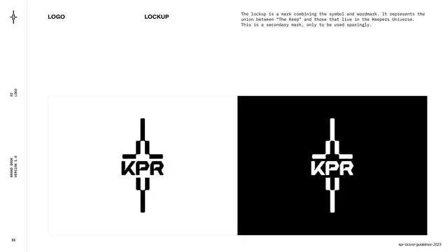
A logo page showing the KPR wordmark on a faint clearspace grid in black on white beside white on black.
Summary
The wordmark page: "KPR" shown black-on-white over a faint clearspace grid on the left and white-on-black on the right, with a short monospace rationale.
Visual description
White page, bold "LOGO" and "WORDMARK" labels across the top, with a monospace paragraph at upper right explaining the wordmark is the primary, "simple but ownable" mark. A wide horizontal panel runs across the lower two-thirds, split down the middle: the left half shows the black "KPR" wordmark sitting on a faint light clearspace grid; the right half is a solid black box with the same wordmark reversed to white. Left rail reads "02 / LOGO".
Key takeaway
Demonstrating the primary mark positive and negative side by side on one panel, with a light clearspace grid only on the positive side. It communicates both color treatments and spacing rules in a single glance.
Reuse notes
A standard, reusable logo-usage layout. The side-by-side positive/negative split is directly transferable to any wordmark or logotype guideline page.
From this deck: Wordmark on light and dark
View deck












More like this








Keep what you find
A free account saves references to boards and can send you a weekly email of picks based on what you save.
To see every result, go Pro.