Preview image. Unlock full-res
A 5-slide editorial marketing deck by It's Nice That x Adobe, laid out like a magazine feature with oversized thin all-caps section words, justified multi-column body copy, and vivid collage illustrations over saturated yellow and pink fields.
Summary
A 5-slide marketing deck for Adobe Creative Cloud for teams, produced as a branded editorial feature ("Connecting the Dots") by It's Nice That. Its personality is print, not slideware: each interior slide reads like a magazine spread, with one giant thin all-caps section word, dense justified body columns, and a loud cut-paper collage illustration carrying the visual energy.
Visual description
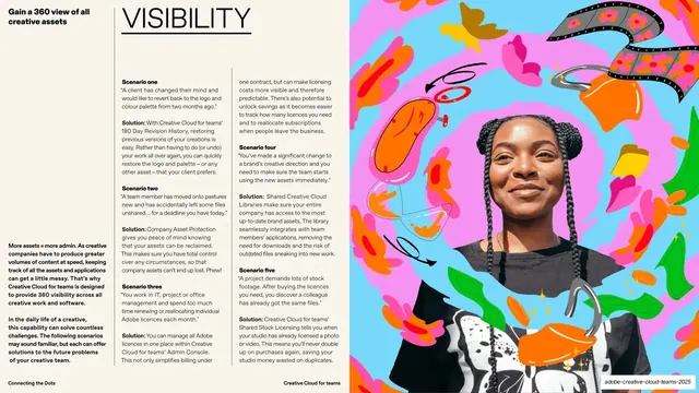
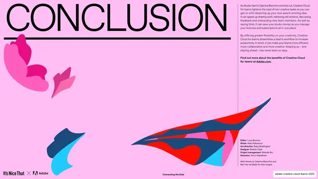
Slides run 16:9 and split into two formats. The opener (slide 1) and closer (slide 5) are full-bleed flat color fields, butter-yellow then bubblegum-pink, with an oversized thin sans headline ("CONNECTING THE DOTS", "CONCLUSION") underlined by a heavy double or single rule, plus abstract origami paper-plane and butterfly shapes in red, navy, cyan and magenta. The three middle slides (Shareability, Visibility, Scalability) follow one fixed magazine grammar: a small bold deck/lead line top-left, a single oversized outline-thin all-caps section word spanning the top, then three to four columns of small justified body text with bold sub-heads, set against a cream-white text zone; the outer third of each spread is a full-bleed maximalist collage illustration combining a photographed cut-out person with hand-drawn squiggles, speech bubbles, film strips, devices and confetti shapes in a hot palette. A consistent running footer anchors every slide: the "It's Nice That x Adobe" lockup bottom-left, "Connecting the Dots" centered, and a section/running label bottom-right. Type throughout is a single clean grotesque sans, used hairline-thin and huge for section words and small for body.
Key takeaway
The decision to treat a sponsored marketing deck as an editorial magazine feature: one giant thin section word per spread, real justified body columns, and an illustration that does all the shouting so the type can stay quiet and refined. The fixed three-part interior template (lead line, section word, body columns, edge illustration) gives three different topics instant visual unity. And the yellow/pink full-bleed bookends frame the dense middle without any extra chrome.
Reuse notes
A strong reference for brand-collaboration content, thought-leadership marketing, and any deck meant to read like a publication rather than a pitch. The single-word section header plus justified-column layout suits longform, copy-heavy slides where you still want a designed feel. It leans hard on commissioned collage illustration and good cut-out photography, so it only works with a real illustration budget; without that artwork the layout would feel empty. Body copy is genuinely small and dense, better for a read-at-leisure PDF than a projected room.