Preview image. Unlock full-res
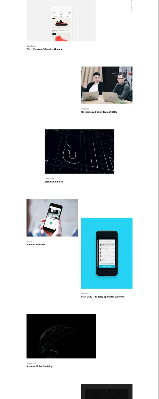
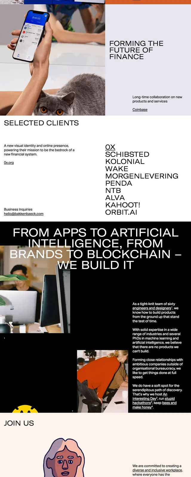
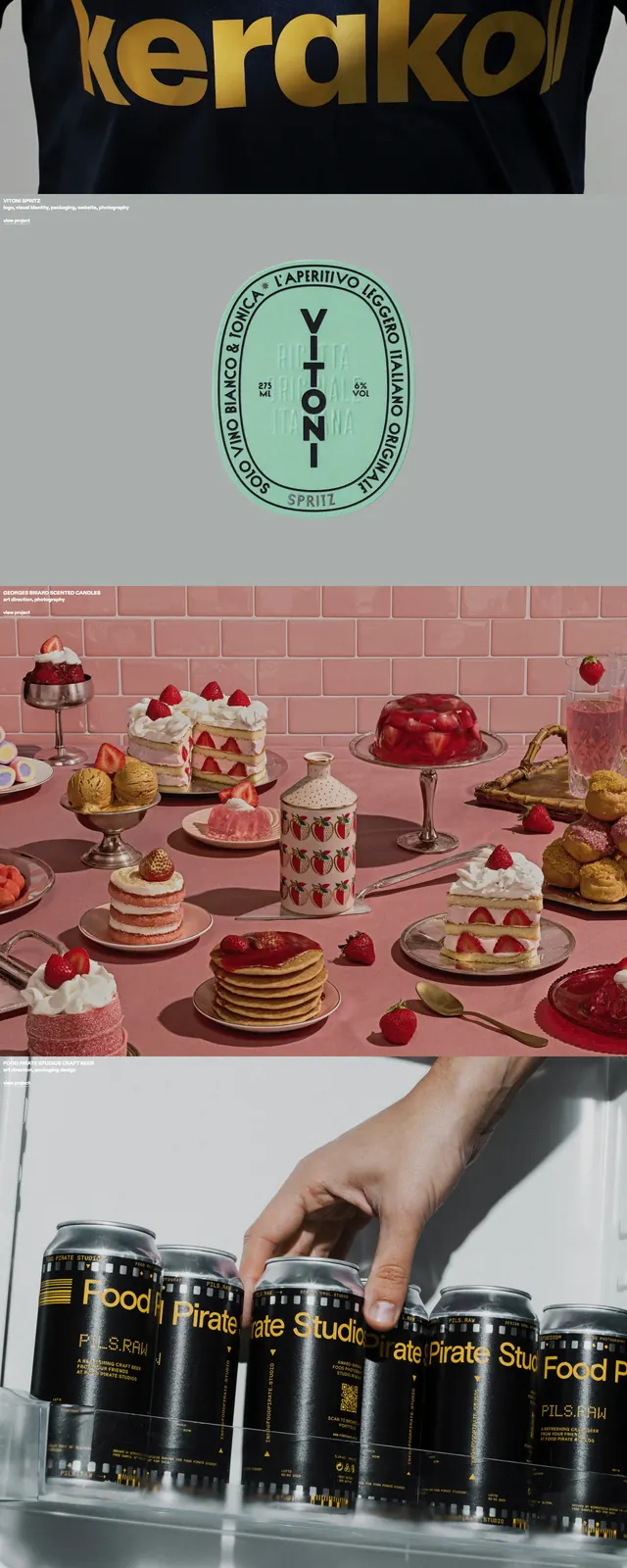
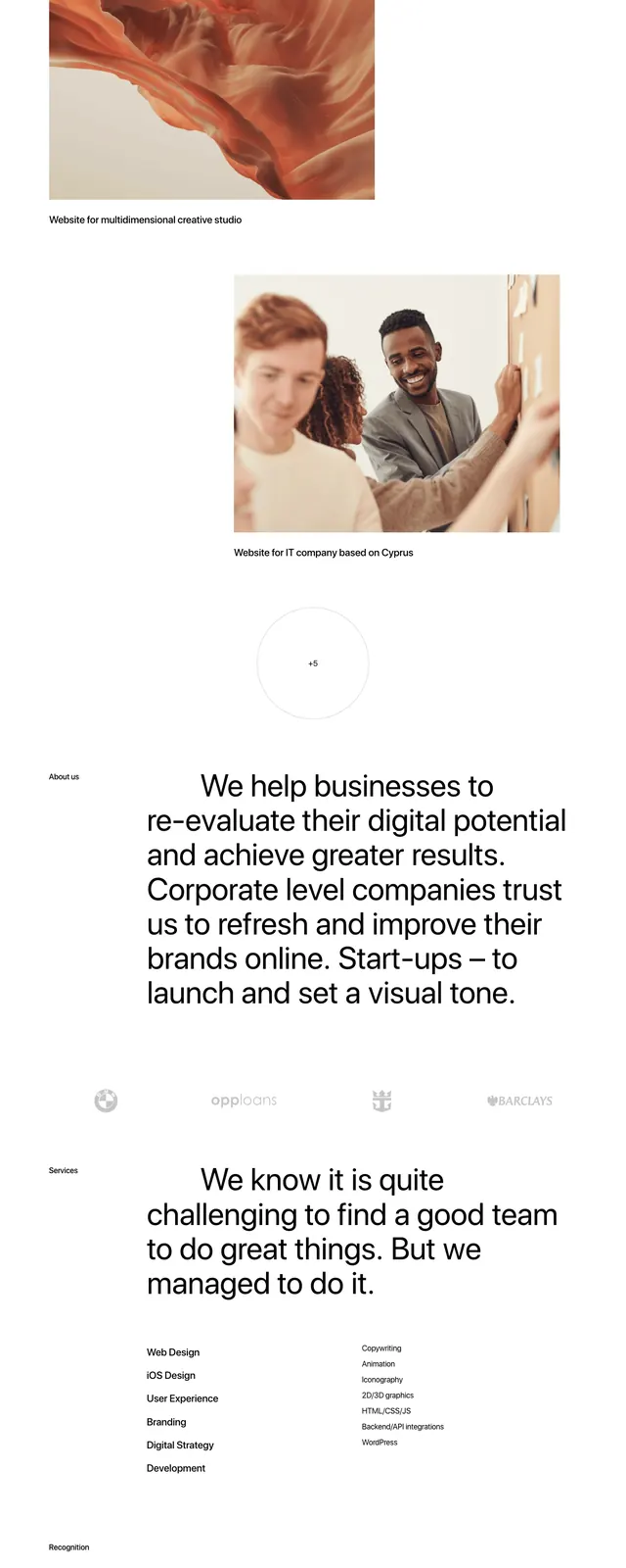
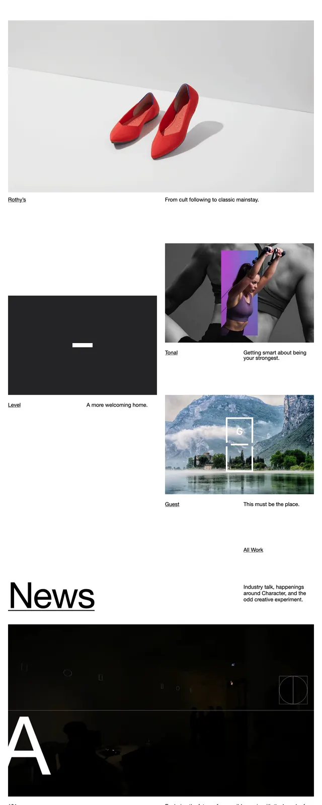
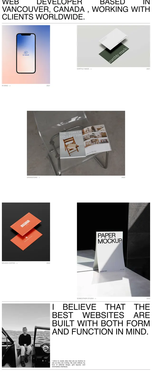
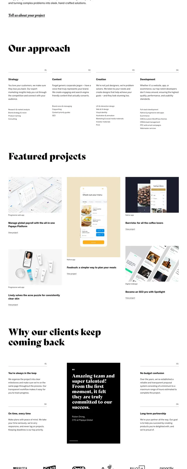
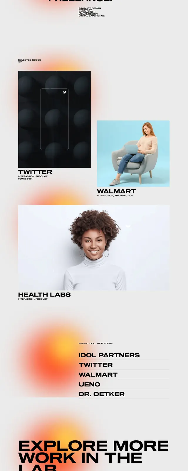
A high-contrast, editorial-style portfolio page focusing on tactile packaging and physical design.
Summary
A high-contrast, editorial-style portfolio page focusing on tactile packaging and physical design.
Visual description
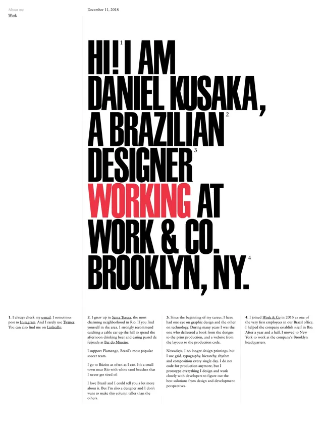
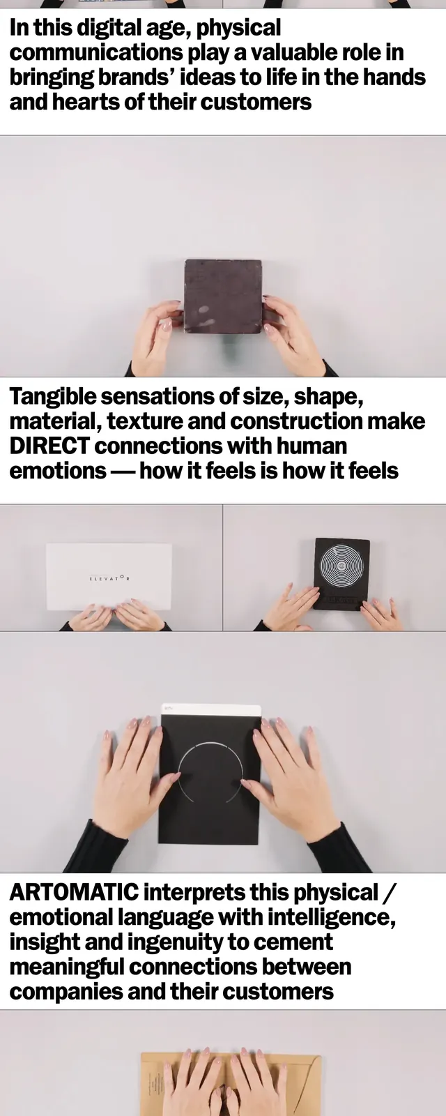
The page features a stark white background with heavy, oversized black sans-serif typography. Large, high-quality photographic images of hands interacting with physical objects are arranged in a stacked and grid layout. The footer is a solid black block with white contact information.
Key takeaway
The use of extreme typographic scale creates a strong visual hierarchy that balances the minimalist aesthetic with a bold, confident brand voice.
Reuse notes
Ideal for creative agencies or design studios wanting to emphasize a 'less is more' approach while maintaining high impact through imagery and type.