Preview image. Unlock full-res
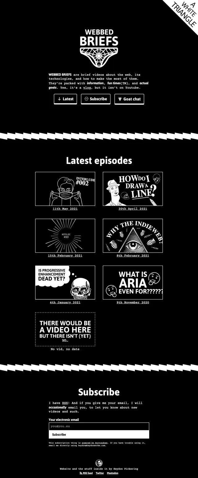
A stark black-and-white landing page for Webbed Briefs with a centered hero, episode grid, and subscription section.
Summary
A stark black-and-white landing page for Webbed Briefs with a centered hero, episode grid, and subscription section.
Visual description
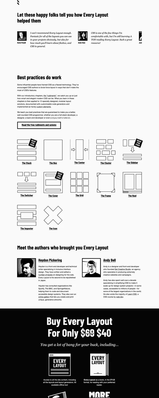
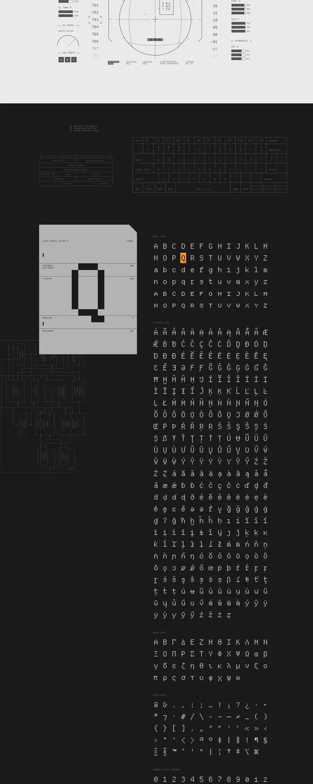
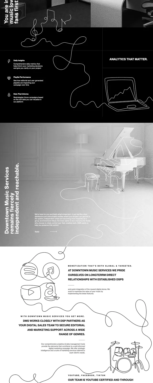
The page uses a pure black background with white typography and line-art graphics. The top section is a centered hero with the 'WEBBED BRIEFS' logo, a short intro paragraph, and three outlined buttons, plus a diagonal corner ribbon reading 'A WHITE TRIANGLE'. Below that is a 'Latest episodes' section laid out as a two-column grid of framed thumbnail cards with dates, followed by a subscribe block with a single email field and submit button. A zigzag white divider separates the major sections, reinforcing the handmade monochrome look.
Key takeaway
The strongest idea is the stripped-down monochrome system: large centered type, thin white frames, and hand-drawn graphic accents. The layout stays simple, but the contrast and custom illustration style give it a distinct identity.
Reuse notes
Use this pattern for editorial, media, or newsletter homepages where personality matters more than polish. It works best when the content itself is the focus and can be organized into a clean card grid under a strong hero.