Preview image. Unlock full-res
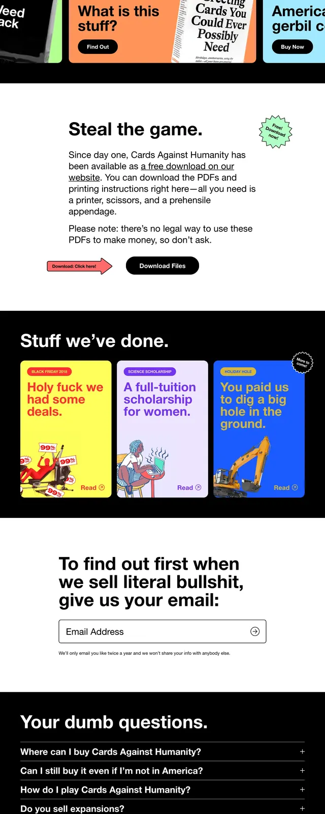
A bold, black-and-white landing page with oversized card imagery, playful copy, and stacked content blocks that mix product, philanthropy, FAQ, and footer sections.
Summary
A bold, black-and-white landing page with oversized card imagery, playful copy, and stacked content blocks that mix product, philanthropy, FAQ, and footer sections.
Visual description
The page opens with a full-bleed black hero showing large tilted playing cards scattered across the screen, with the Cards Against Humanity wordmark on the left and a sparse top navigation on the right. Below it is a white section with a short centered description and two prominent call-to-action buttons. Farther down, a black section titled 'Stuff we've done.' presents three colorful square cards in a three-column grid, followed by a stacked FAQ accordion on black and a clean white footer with link columns and an email signup field.
Key takeaway
The main reusable move is the contrast between stark monochrome framing and loud, playful content blocks. The layout uses simple structure to make absurd copy and card-like visuals feel organized and memorable.
Reuse notes
Works well for brands that want a rebellious, humorous tone with strong visual contrast and minimal interface chrome. The same structure can support campaign pages, product launches, or nonprofit storytelling, but it depends on distinctive copy and image-driven content.