Preview image. Unlock full-res
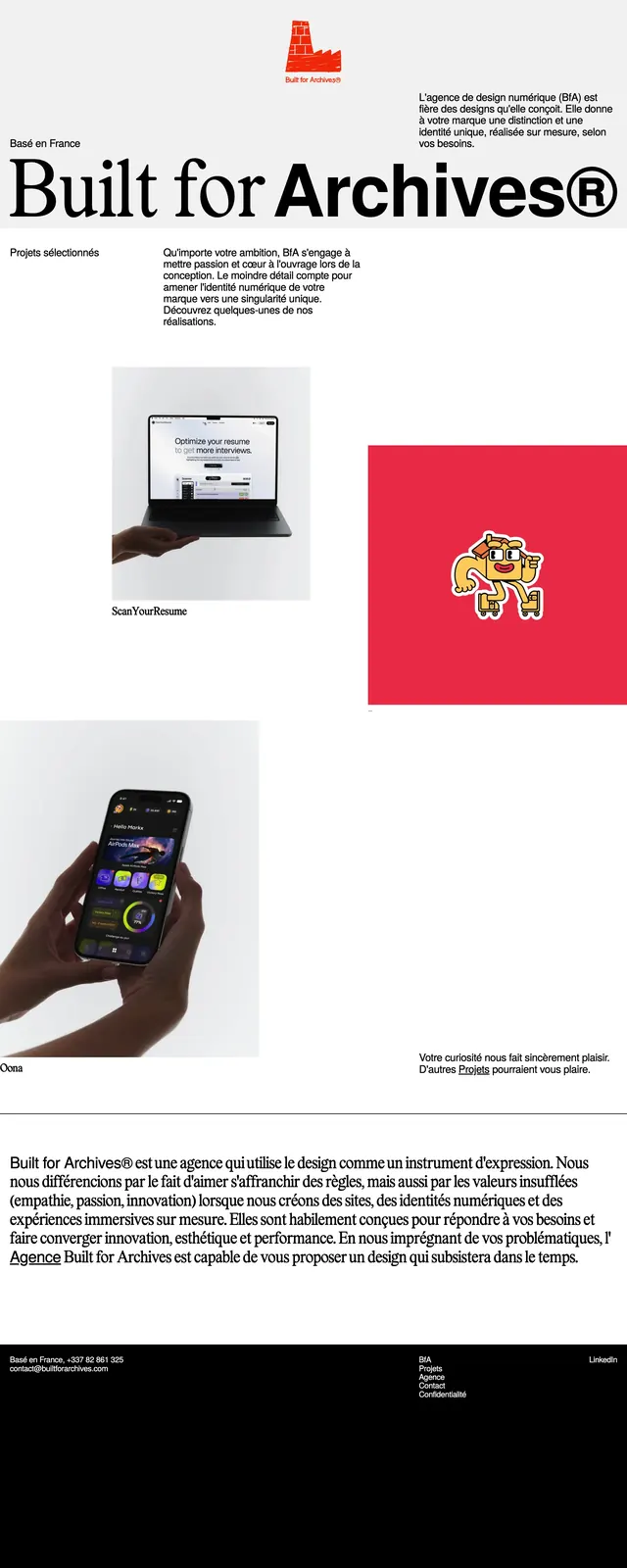
A stark black-and-white agency homepage with oversized serif branding, sparse navigation, and asymmetric portfolio sections.
Summary
A stark black-and-white agency homepage with oversized serif branding, sparse navigation, and asymmetric portfolio sections.
Visual description
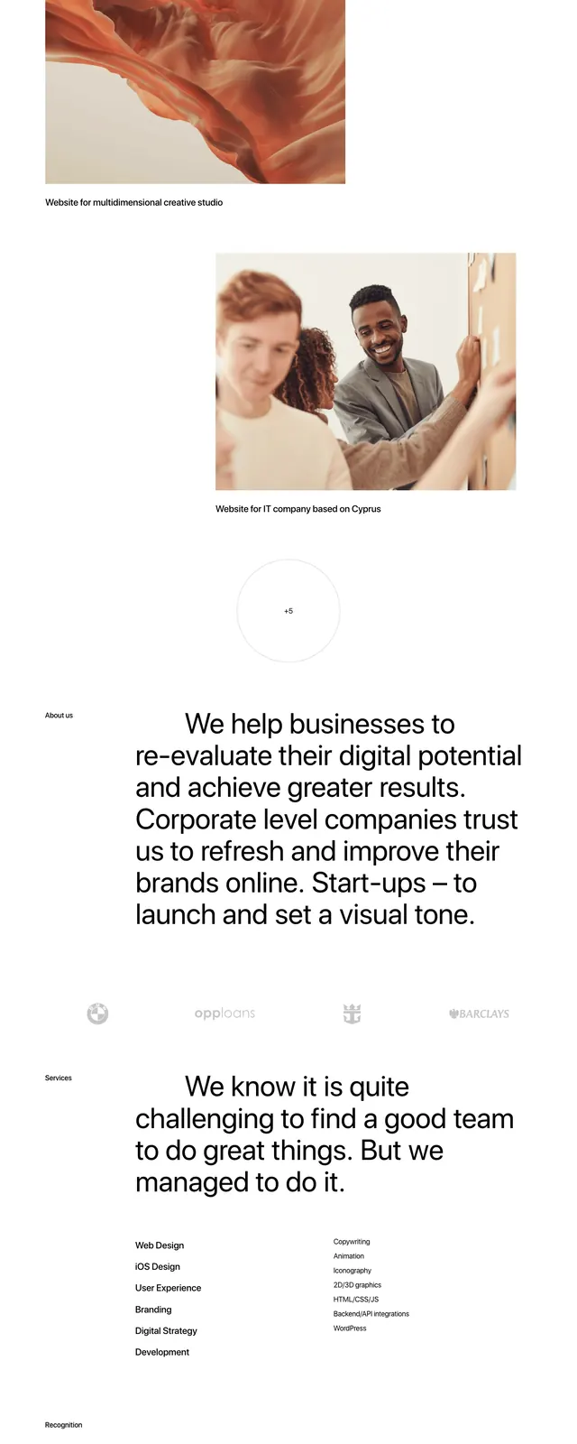
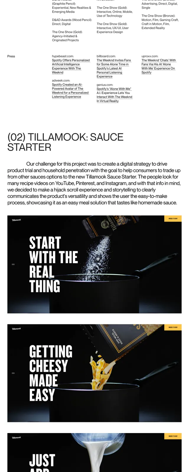
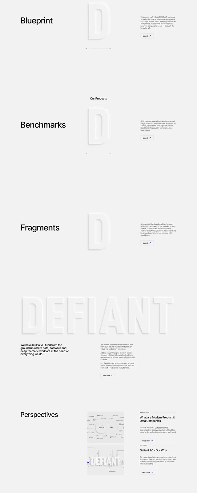
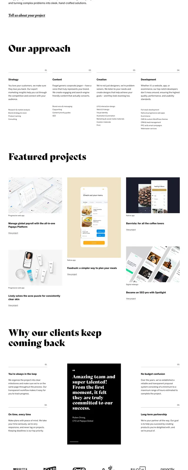
The page uses a very large serif wordmark paired with small sans-serif navigation and body copy. The top section is mostly white space with a centered logo mark and short French intro text split across the page. Midpage, project thumbnails are arranged in an offset grid with generous spacing and minimal labels, followed by a dense about paragraph and a black footer band. The footer repeats the brand name in oversized type and includes contact details and secondary links.
Key takeaway
The design relies on extreme contrast, editorial typography, and spatial restraint to make the brand feel premium and distinctive. It emphasizes portfolio presentation over feature explanation, with each section kept visually sparse but highly deliberate.
Reuse notes
This pattern works well for creative agencies, studios, and portfolio sites that want a refined monochrome identity. Reuse the oversized type, asymmetric image placement, and minimal navigation to create a strong first impression without heavy UI chrome.