Preview image. Unlock full-res
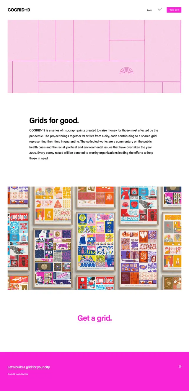
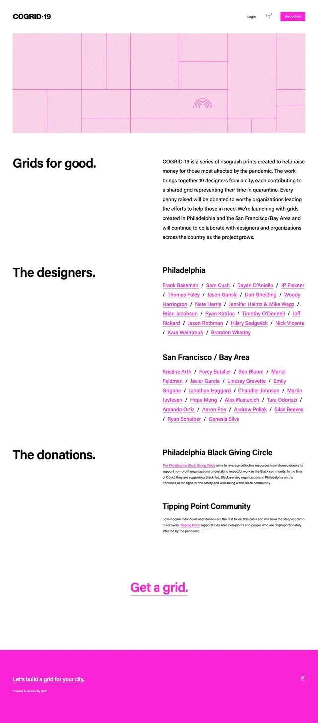
A clean editorial nonprofit landing page with a pink grid hero, section-led typography, and a bright donation CTA.
Summary
A clean editorial nonprofit landing page with a pink grid hero, section-led typography, and a bright donation CTA.
Visual description
The page opens with a simple top navbar, a bold black wordmark on the left, and small utility links plus a bright magenta call-to-action button on the right. A wide hero image shows a soft pink tiled grid with thin magenta lines and a small rainbow-like mark near the lower center. Below, the layout alternates large section headers on the left with dense explanatory copy on the right, followed by designer name lists and donation information in the same two-column structure. Near the bottom, a centered magenta 'Get a grid.' link sits above a full-width hot pink footer bar.
Key takeaway
The design pairs Swiss-style spacing with a playful pink brand accent to make a civic/fundraising message feel modern and approachable. The repeated two-column rhythm makes long informational content easy to scan.
Reuse notes
Use this structure for nonprofit campaign pages, community initiatives, or editorial landing pages that need a clear hierarchy without visual clutter. It works best when paired with a strong brand color and content that benefits from section-by-section storytelling.