Preview image. Unlock full-res
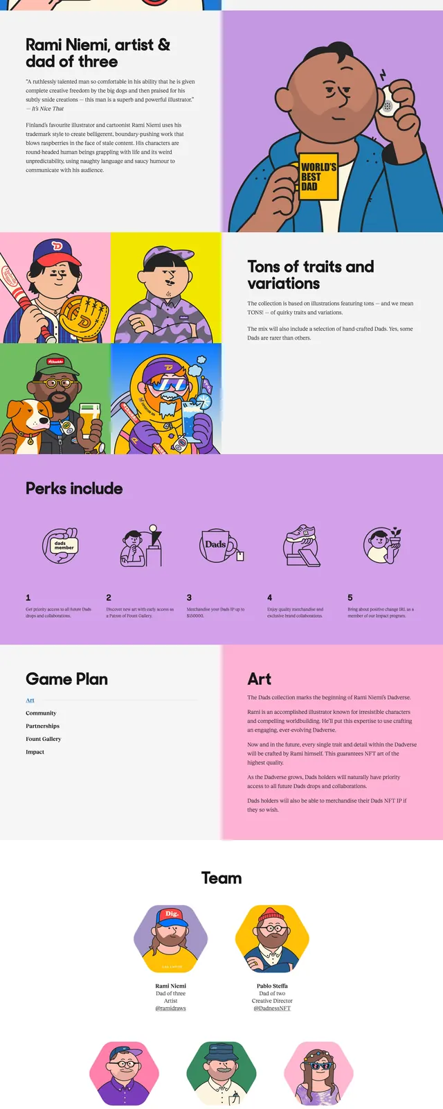
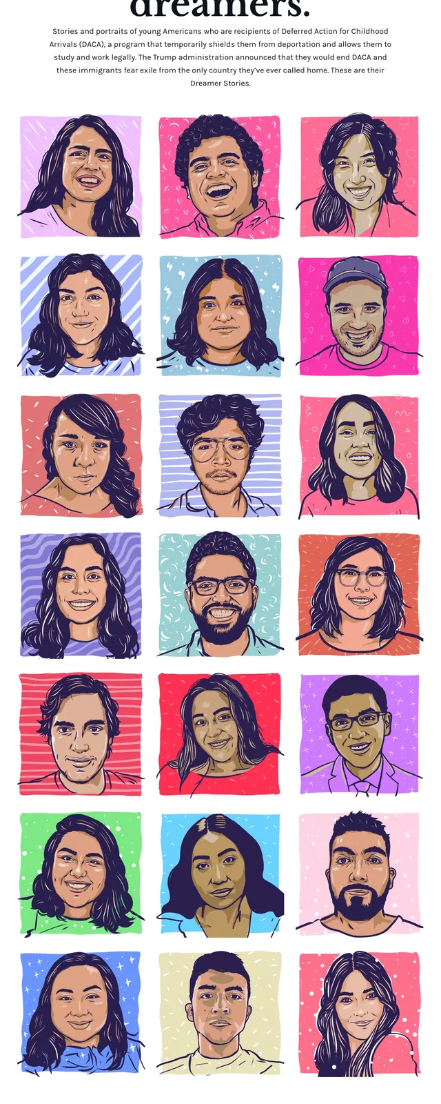
A centered nonprofit landing page hero with oversized serif messaging above a grid of illustrated portrait cards.
Summary
A centered nonprofit landing page hero with oversized serif messaging above a grid of illustrated portrait cards.
Visual description
The page uses a clean white background with a small centered wordmark and simple top navigation. A large serif headline, set in bold black type, dominates the first screen and is followed by a centered explanatory paragraph. Below that is a tight three-column grid of colorful illustrated portrait cards, each with a different bright background and hand-drawn character styling; the page continues with more rows of the same gallery. The footer repeats the brand and links in a minimal, centered treatment.
Key takeaway
The strongest idea is the contrast between austere editorial typography and a lively illustrated portrait grid. It creates a clear, human-centered identity without heavy UI chrome.
Reuse notes
Works well for nonprofit storytelling, campaign landing pages, or profile-driven galleries that need warmth and social impact. The layout is especially effective when the visual system is driven by repeated portrait or avatar cards.