Preview image. Unlock full-res
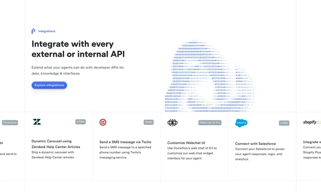
Light integrations section with a left intro, ASCII-art cloud and a row of bordered integration cards with monochrome logos and category tags.
Summary
A light integrations section pairing a left intro and ASCII-art cloud with a row of integration cards, each carrying a monochrome logo, category tag and short description. The dotted ASCII cloud and tagged cards define it.
Visual description
Top left shows a small blue "Integrations" eyebrow with a mark, an oversized two-line black headline "Integrate with every external or internal API", two lines of grey sub-copy, and a filled blue "Explore integrations" pill. To the right, a dotted ASCII-character rendering of a cloud fades toward the edge. Below a hairline, a horizontal row of bordered cards (partly cut off at both sides) each carry a small uppercase category tag in the top corner (Analytics, CRM, SMS, Webchat UI Kit), a monochrome brand logo (Zendesk, Twilio, a webchat mark, Salesforce, Shopify Plus), a bold heading like "Dynamic Carousel using Zendesk Help Center Articles" or "Send a SMS message via Twilio", and two lines of grey body. The card row reads as a scrollable strip with peeked cards on each end.
Key takeaway
Tagging each integration card with its category in the corner so a mixed logo wall stays organized by type, and the ASCII cloud reused as a consistent motif across the brand's sections. The peeked cards signal a horizontally scrollable list.
Reuse notes
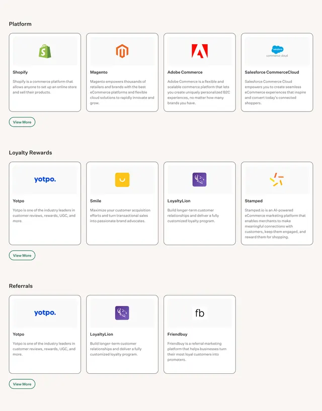
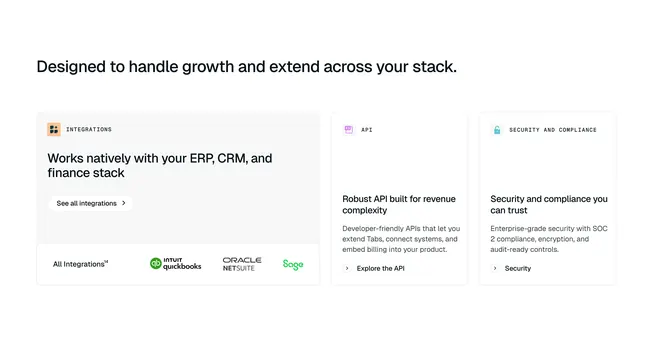
Good for a product whose value is in connecting many third-party tools, where each integration deserves a sentence rather than just a logo. The category tags help when integrations span CRM, analytics, messaging and more. Pairs with the brand's other ASCII-art sections.
More integrations sections
See all


More like this

Keep what you find
A free account saves references to boards and can send you a weekly email of picks based on what you save.
To see every result, go Pro.