Preview image. Unlock full-res
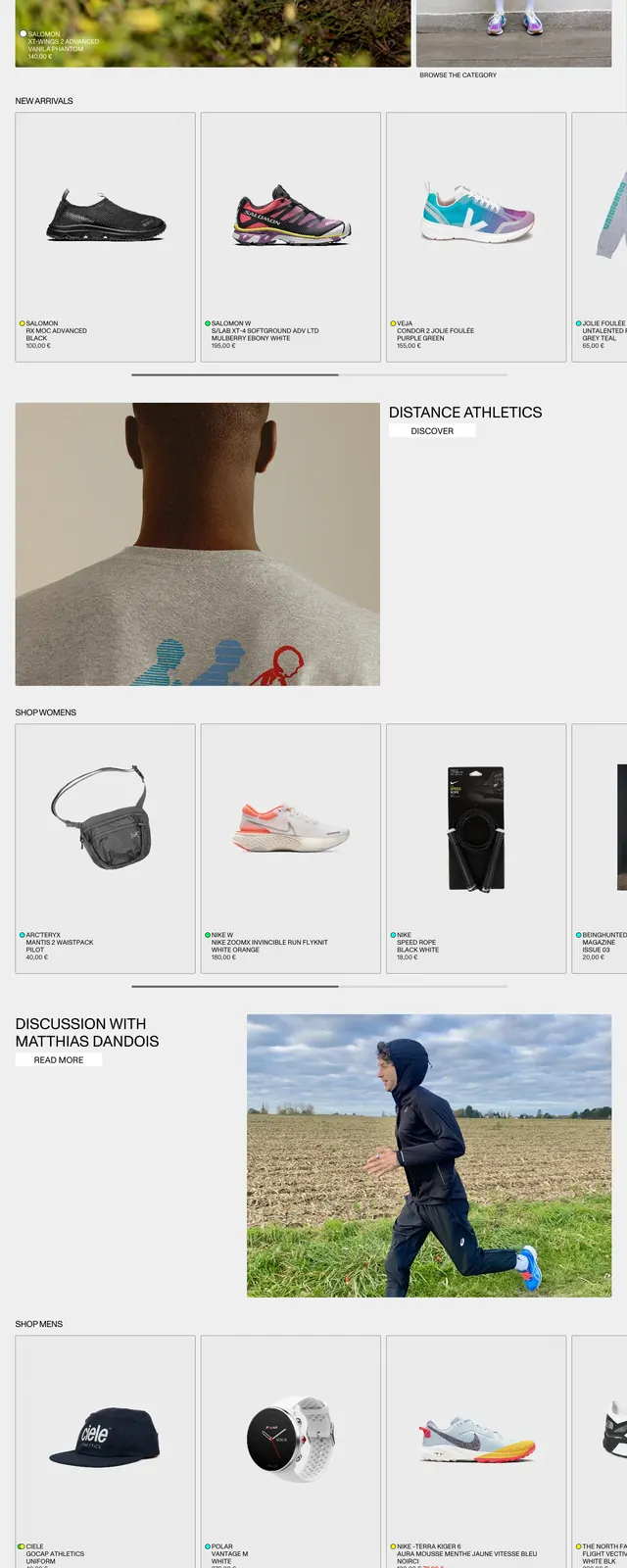
A light, magazine-like ecommerce homepage for Distance Store built around large product and lifestyle photography, thin rules, and compact navigation.
Summary
A light, magazine-like ecommerce homepage for Distance Store built around large product and lifestyle photography, thin rules, and compact navigation.
Visual description
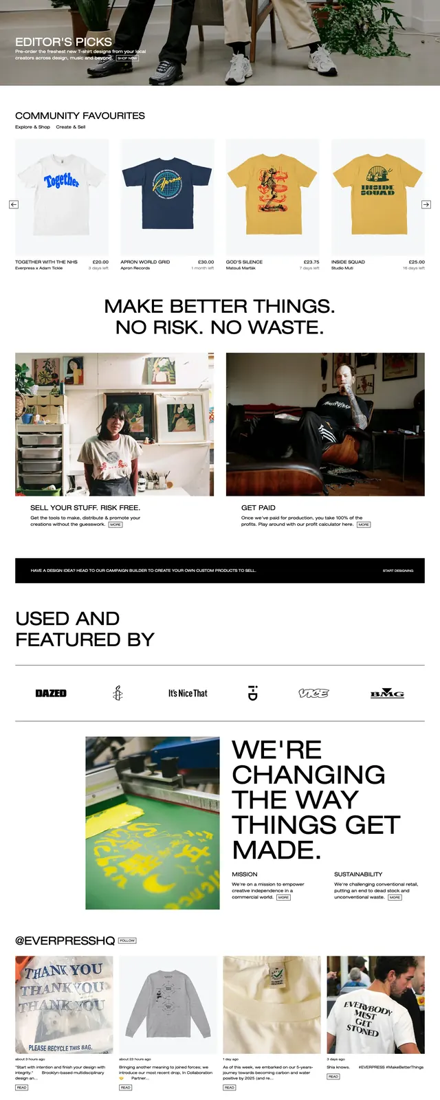
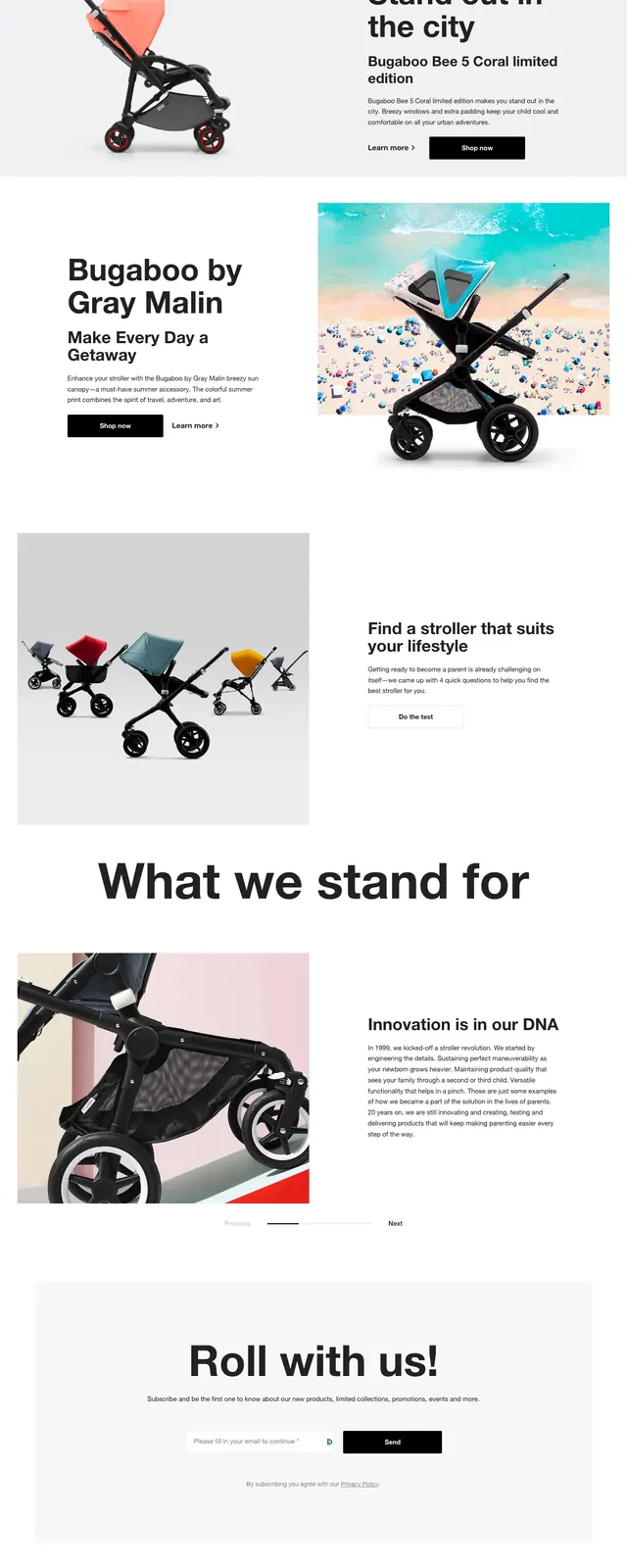
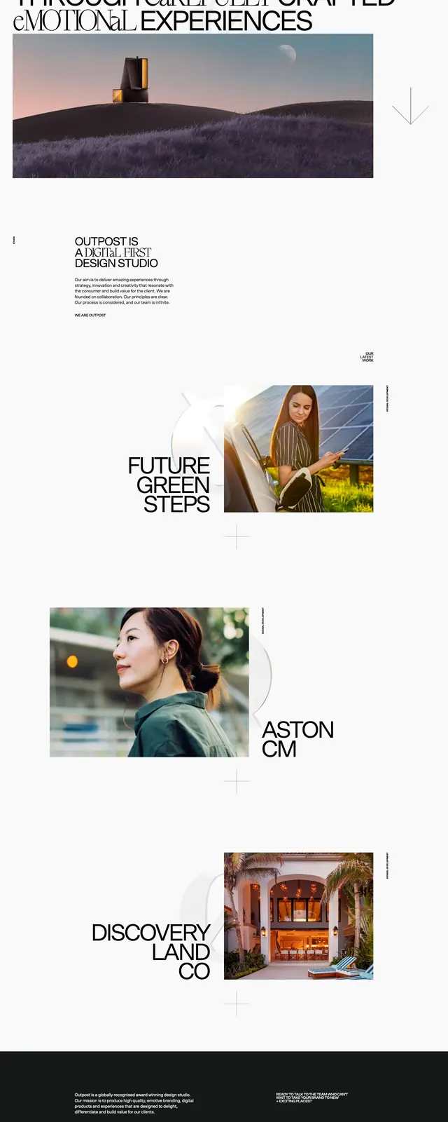
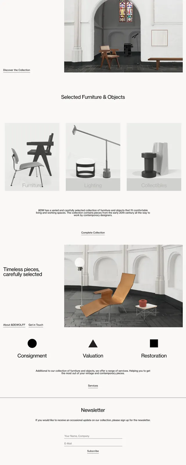
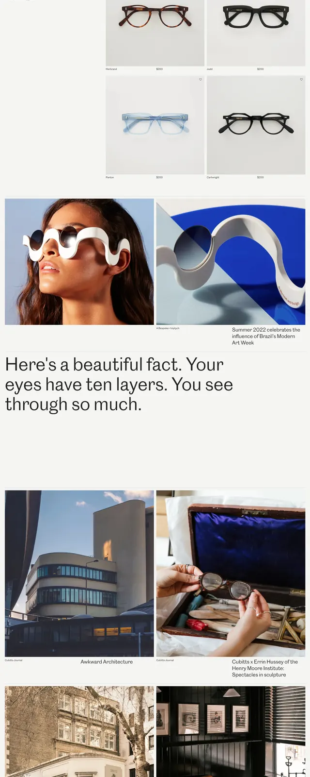
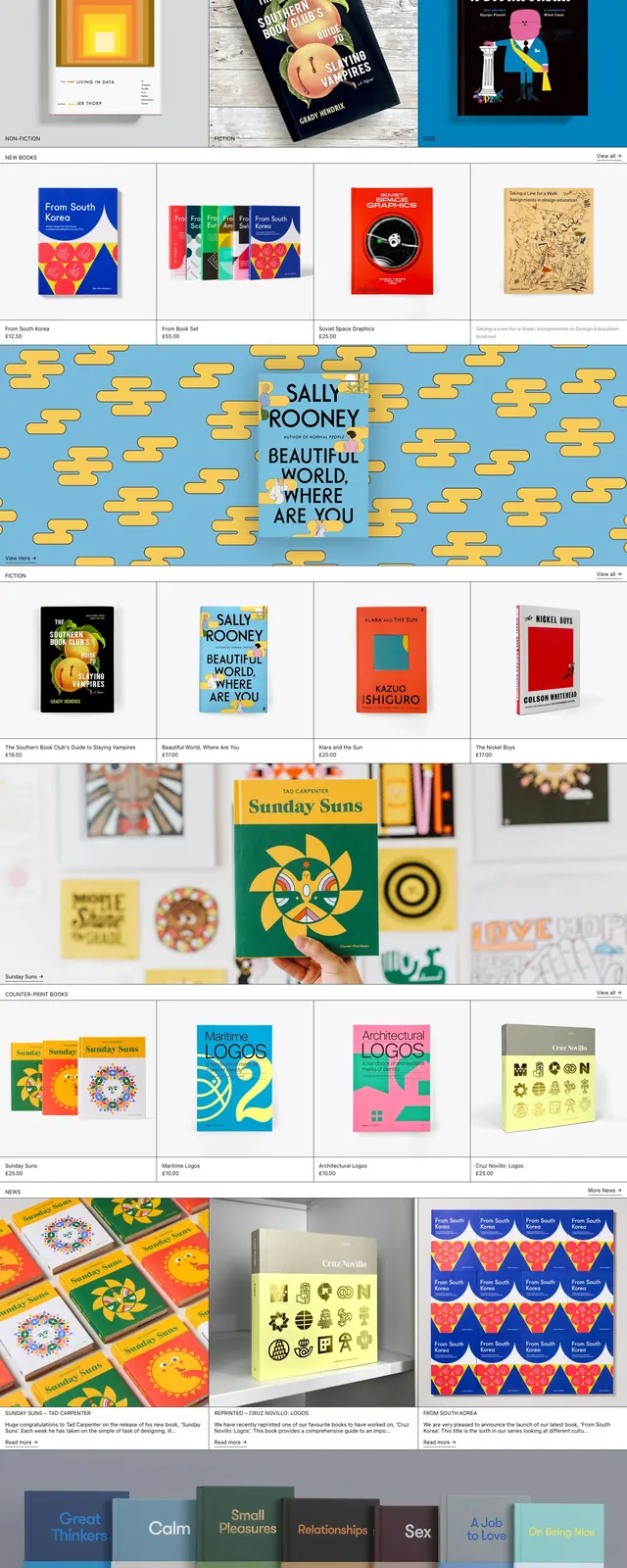
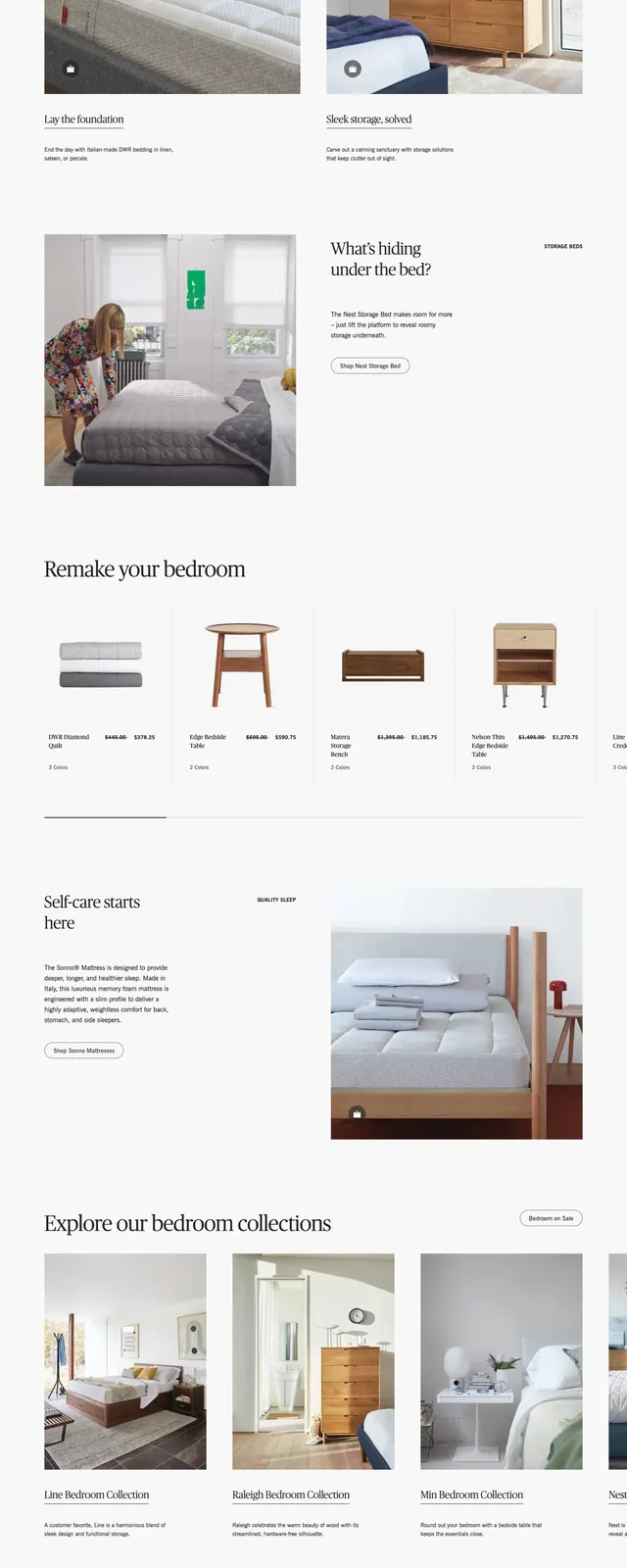
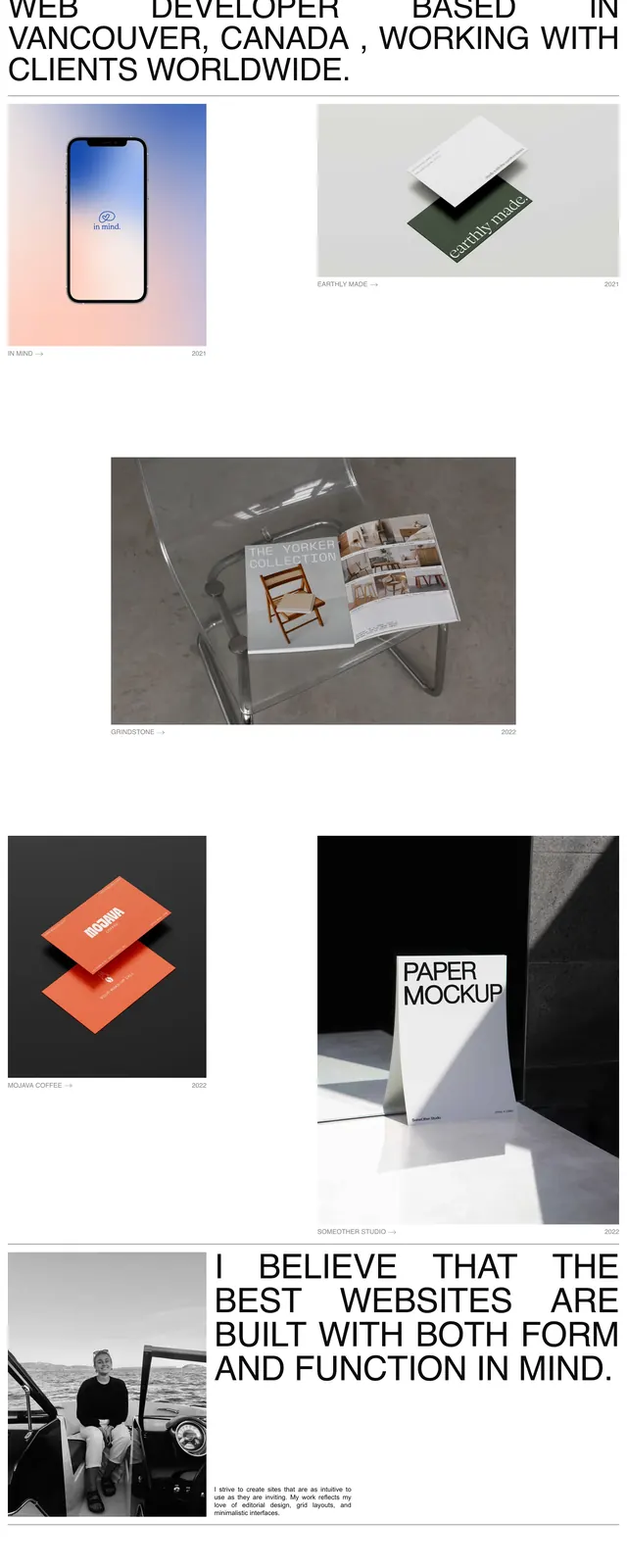
The page uses a pale background with a compact top navigation, a centered wordmark, and large editorial hero imagery. The first screen combines a wide left feature image with oversized title text and a narrower right portrait panel, followed by product rows laid out as clean bordered cards. Lower on the page, a large image banner, more product shelves, a discussion teaser, and a structured footer continue the same minimal retail system.
Key takeaway
The strongest move is the blend of editorial fashion photography with a strict, lightweight grid and lots of white space. Thin borders and small uppercase labels keep the page feeling curated rather than promotional.
Reuse notes
Works well for premium retail, sneaker, and fashion marketplaces that want a magazine feel. Reuse the card grid and restrained header system, then swap in strong product photography and short category labels.