Preview image. Unlock full-res
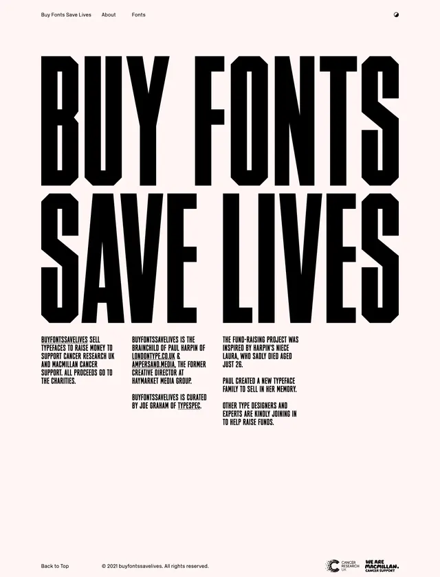
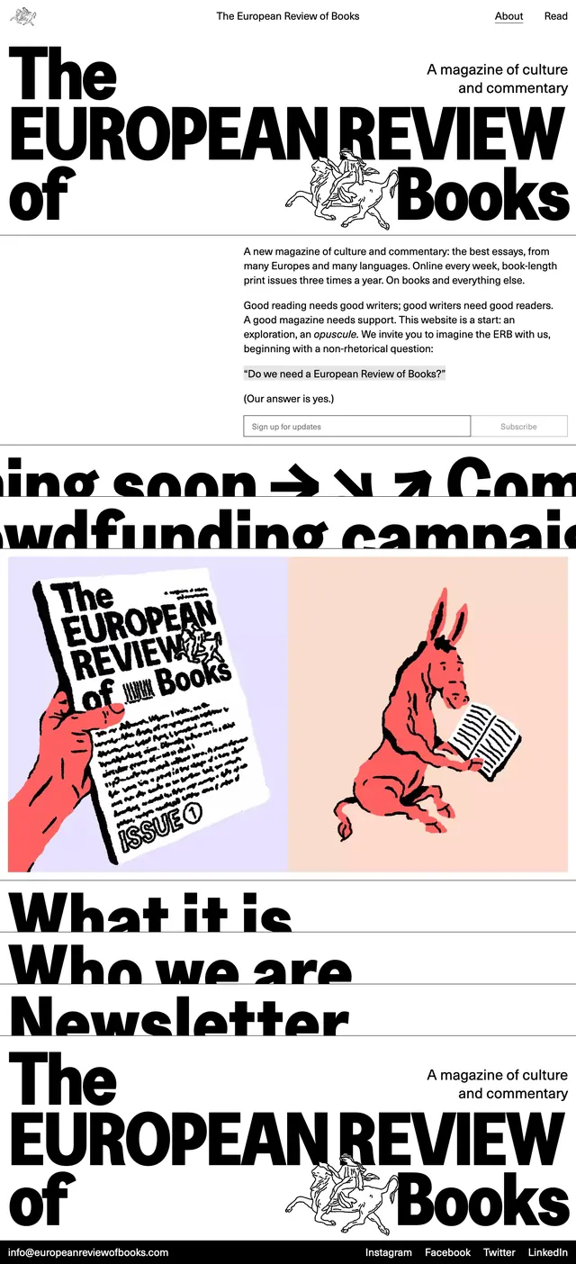
A stark editorial homepage hero for a culture magazine, built around oversized black typography, sparse navigation, and a strong print-inspired layout.
Summary
A stark editorial homepage hero for a culture magazine, built around oversized black typography, sparse navigation, and a strong print-inspired layout.
Visual description
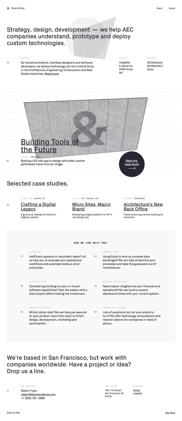
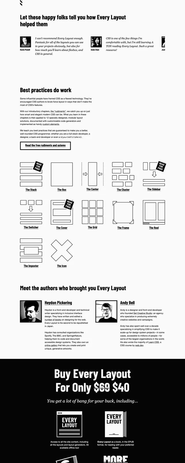
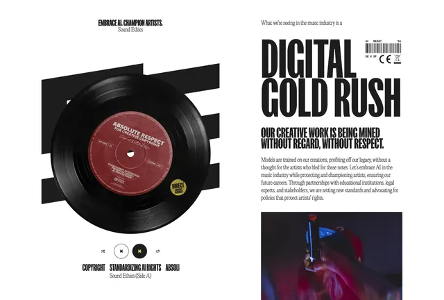
The page opens with a very large black headline set in heavy sans-serif type, broken across multiple lines and paired with a small illustrated emblem in the center. A thin top navigation sits above the hero with a centered site title and simple links on the right, while a short editorial intro and newsletter signup form appear beneath the headline. Lower on the page, oversized cropped typography and colorful illustrated issue artwork appear in stacked sections, followed by bold link-like headings and a dark footer bar with contact and social links.
Key takeaway
The main move is extreme typographic scale against a mostly white background, creating immediate editorial authority. The sparse UI and print-like composition make the site feel like a magazine cover translated into a web homepage.
Reuse notes
Useful for culture, publishing, or research brands that want a serious editorial tone without heavy chrome. The oversized type treatment works best when the content itself is the hero and the supporting interface can stay minimal.