Preview image. Unlock full-res
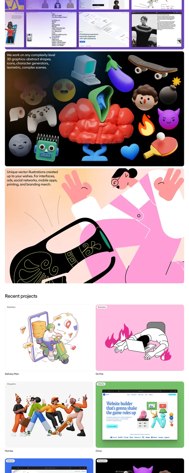
A light, editorial agency homepage with a minimal top nav, oversized intro copy, and stacked portfolio and illustration sections.
Summary
A light, editorial agency homepage with a minimal top nav, oversized intro copy, and stacked portfolio and illustration sections.
Visual description
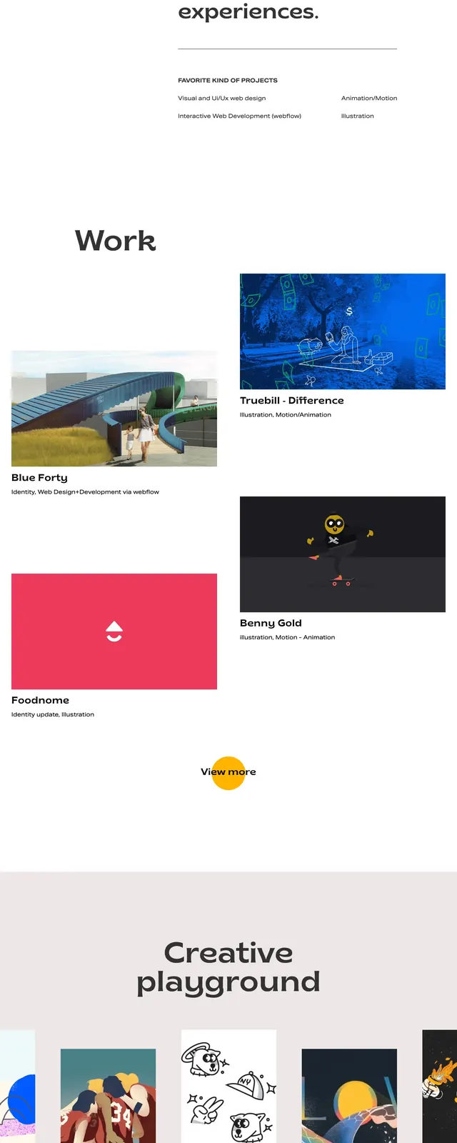
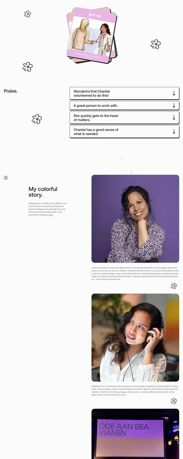
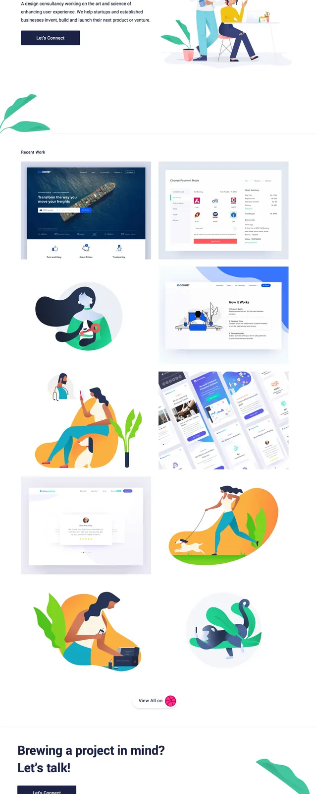
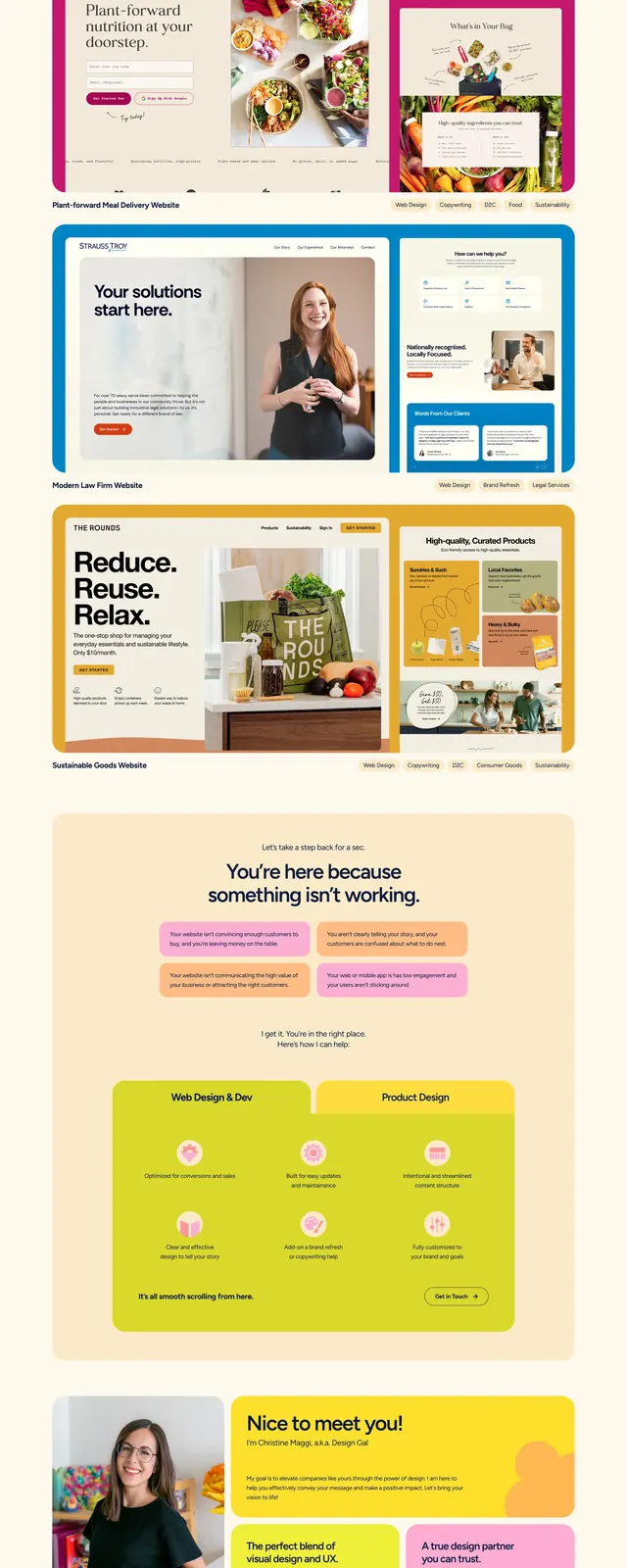
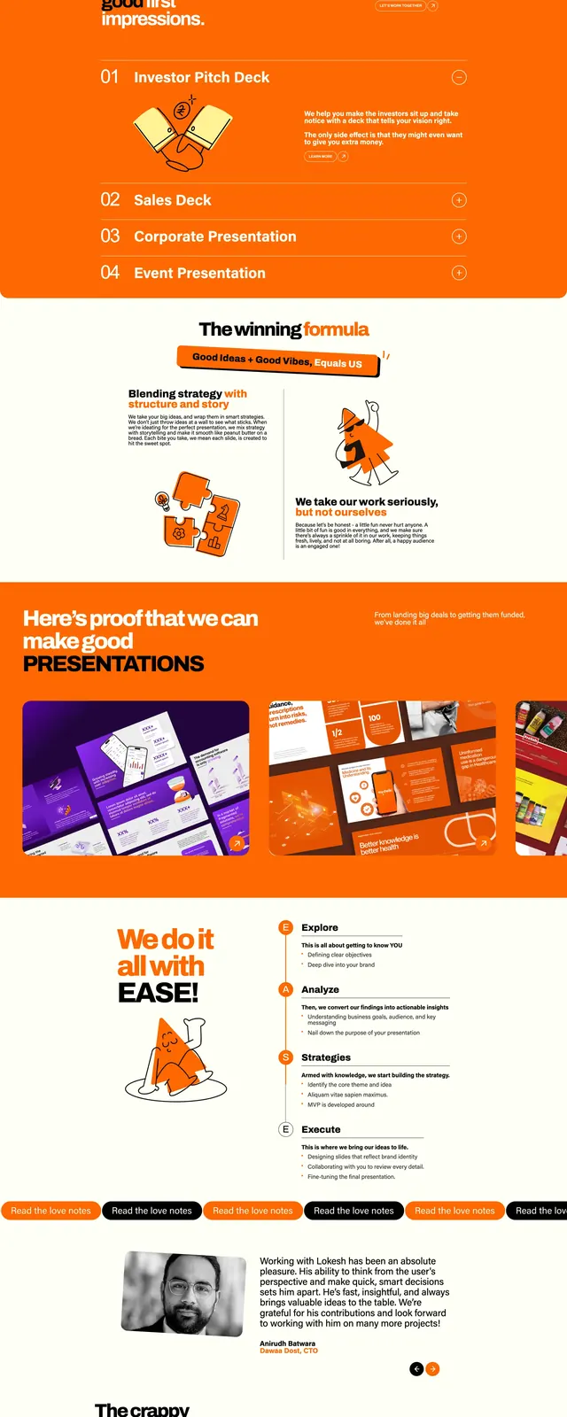
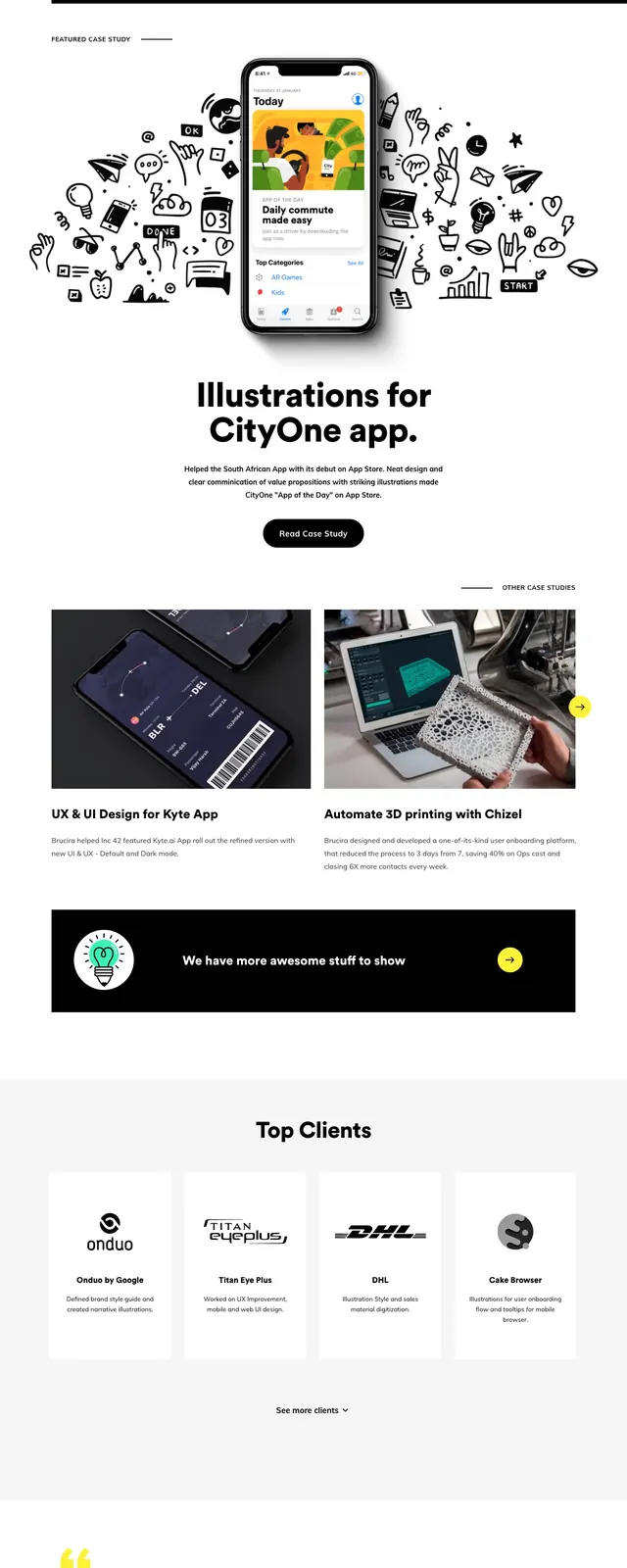
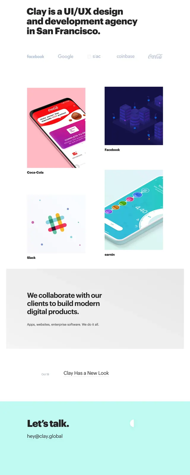
The page opens on a white background with a small top navigation of pill-shaped category badges on the left and small pill links on the right. A large left-aligned headline and short supporting copy sit above an underlined blue text CTA. Below, the page stacks several large content blocks: a purple-to-blue portfolio mosaic, a dark horizontal divider strip, a peach illustration panel with a large character illustration, and a recent projects section with two-column project cards. The bottom area finishes with a short about-style text block and a simple footer with social links.
Key takeaway
The design relies on big vertical rhythm, rounded pill labels, and large visual modules to keep an agency homepage feeling playful without losing clarity. The strong contrast between neutral whitespace and bright section blocks is the main reusable move.
Reuse notes
Use this structure for creative studios, portfolios, or agencies that need to showcase multiple disciplines on one long page. It works best when the content mix includes both screenshots and illustrations; the layout will feel sparse if the visuals are weak or repetitive.