Preview image. Unlock full-res
A full-bleed, high-saturation product landing page for Drinkonda with oversized neon typography, lifestyle photography, and stacked promotional sections.
Summary
A full-bleed, high-saturation product landing page for Drinkonda with oversized neon typography, lifestyle photography, and stacked promotional sections.
Visual description
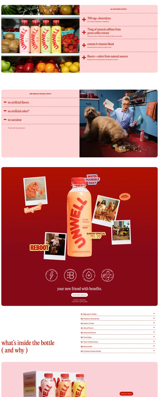
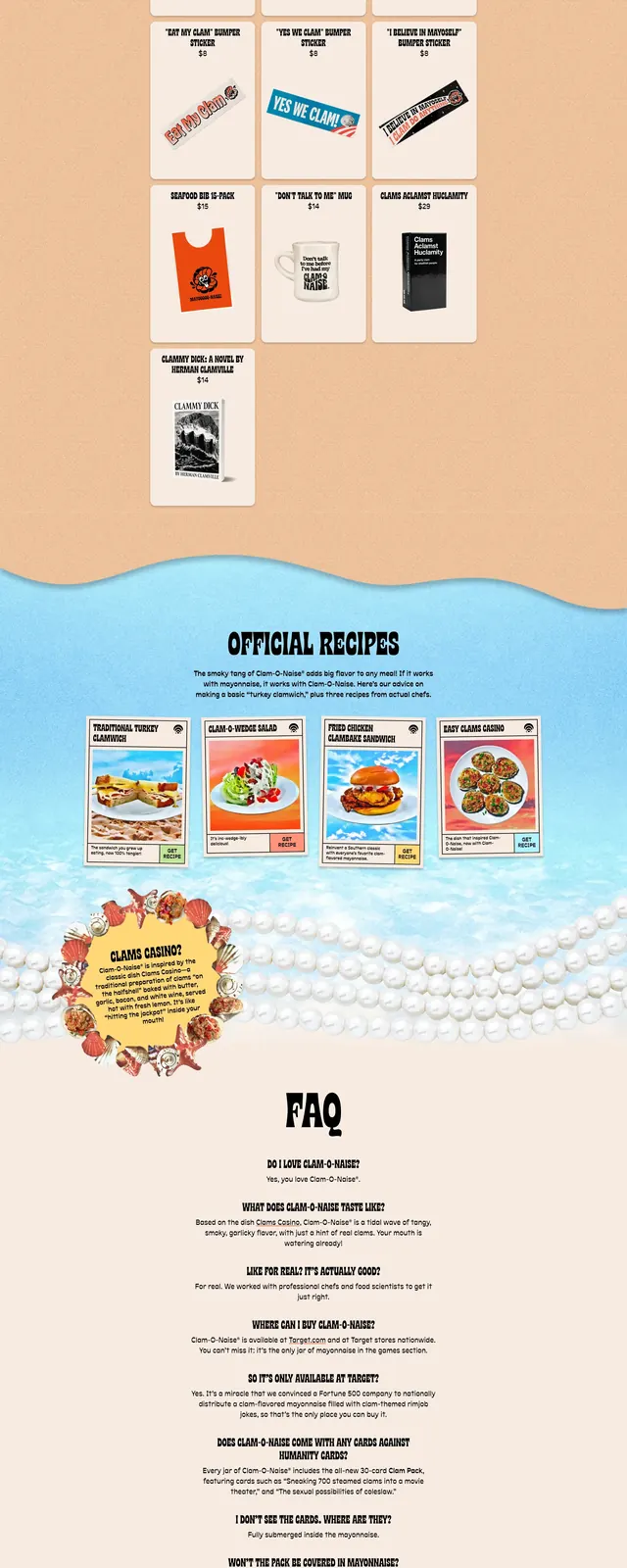
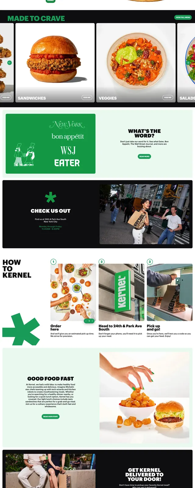
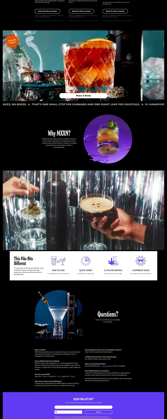
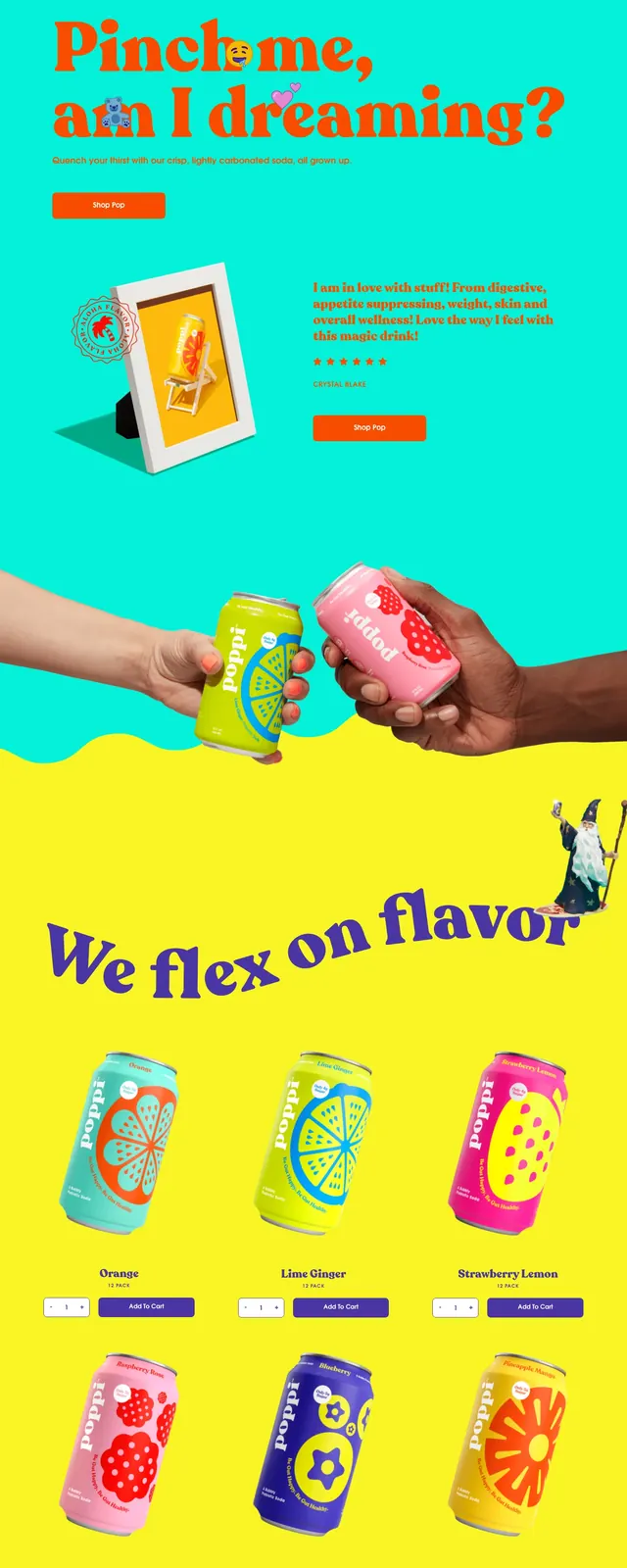
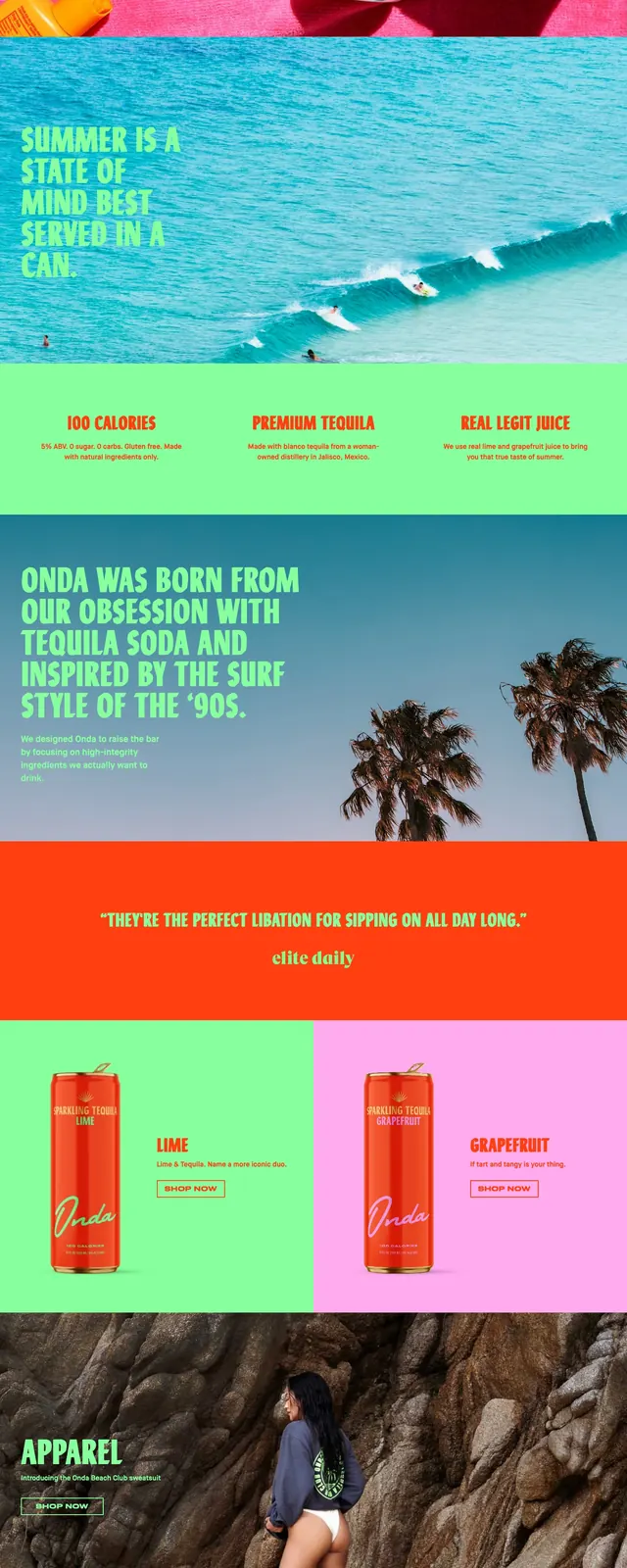
The page opens with a full-width hero shot of brightly colored canned drinks and a bottle on a hot pink background, with a large neon-green headline and small outlined button overlaid on the left. Below, the page stacks additional bold sections: a turquoise water divider, an about block with palm-tree photography and large headline text, a bright orange testimonial band, an apparel feature image, a social grid, and a simple email signup footer. The typography is oversized, condensed, and heavily stylized, with a handwritten brand mark and vivid color blocking throughout.
Key takeaway
The strongest move is the mix of saturated product photography with oversized neon editorial type on top of loud color fields. The stacked page rhythm keeps the site feeling like a campaign poster rather than a standard ecommerce homepage.
Reuse notes
Use this pattern for beverage, lifestyle, or youth-oriented consumer brands that want a loud, summer-forward identity. It works best when the imagery is highly stylized and the content is short, because the layout depends on big visual moments and simple calls to action.