Preview image. Unlock full-res
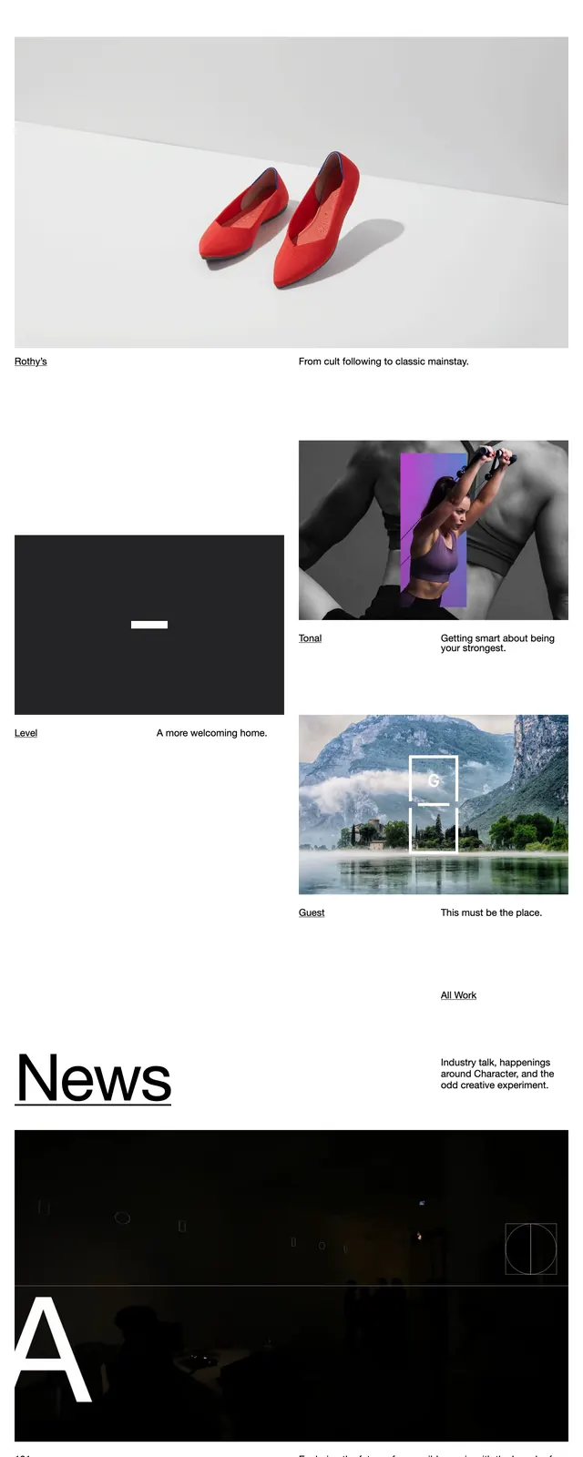
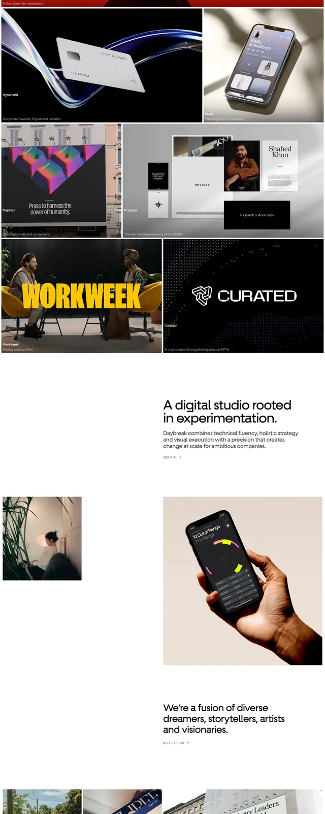
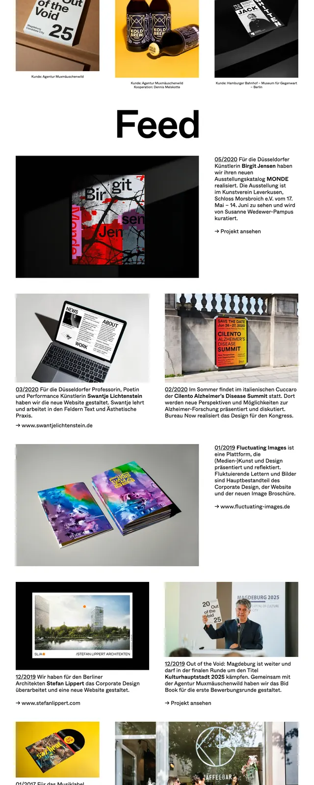
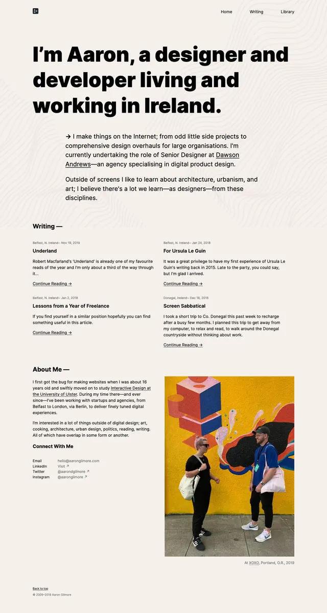
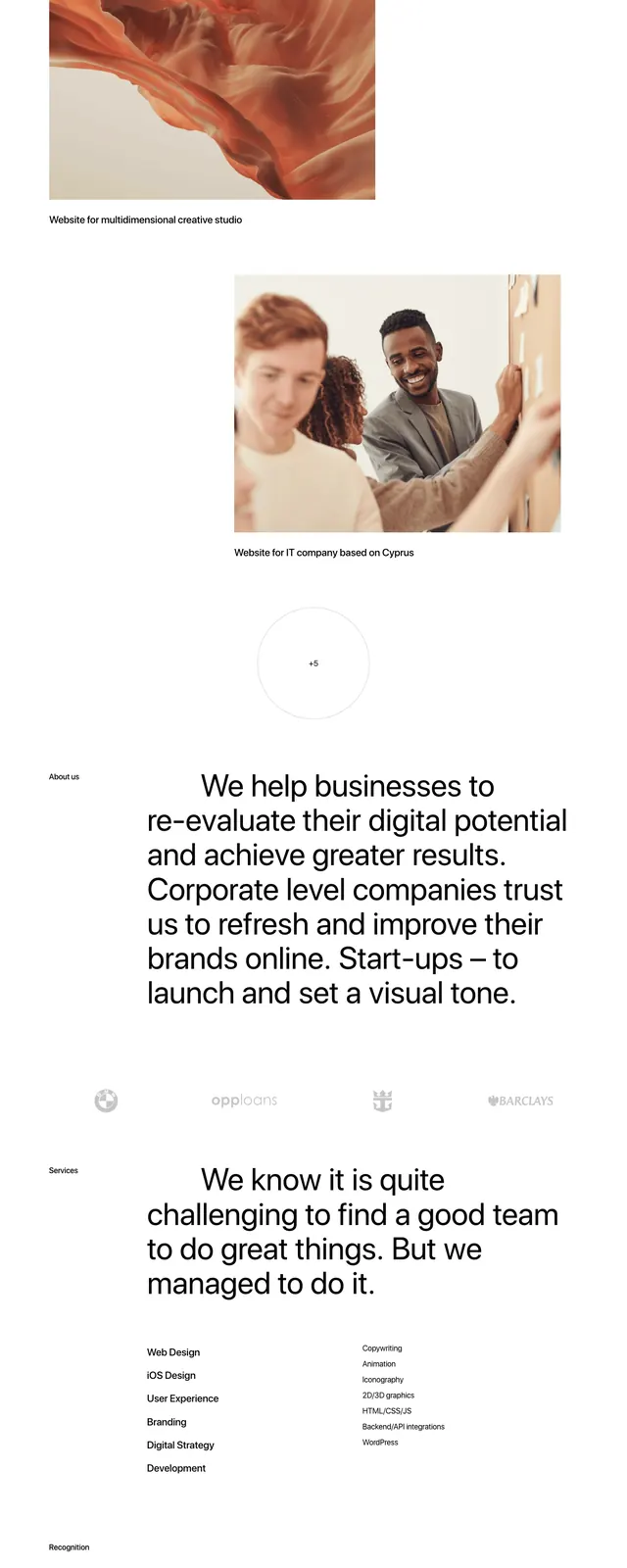
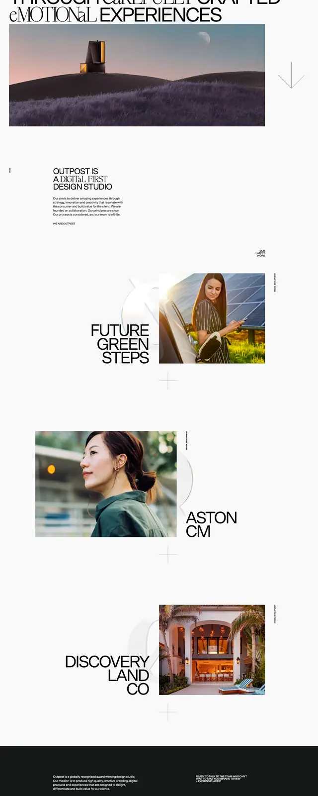
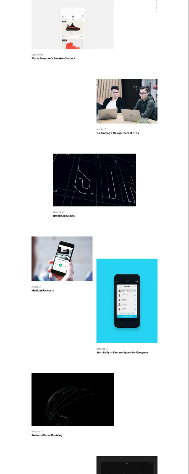
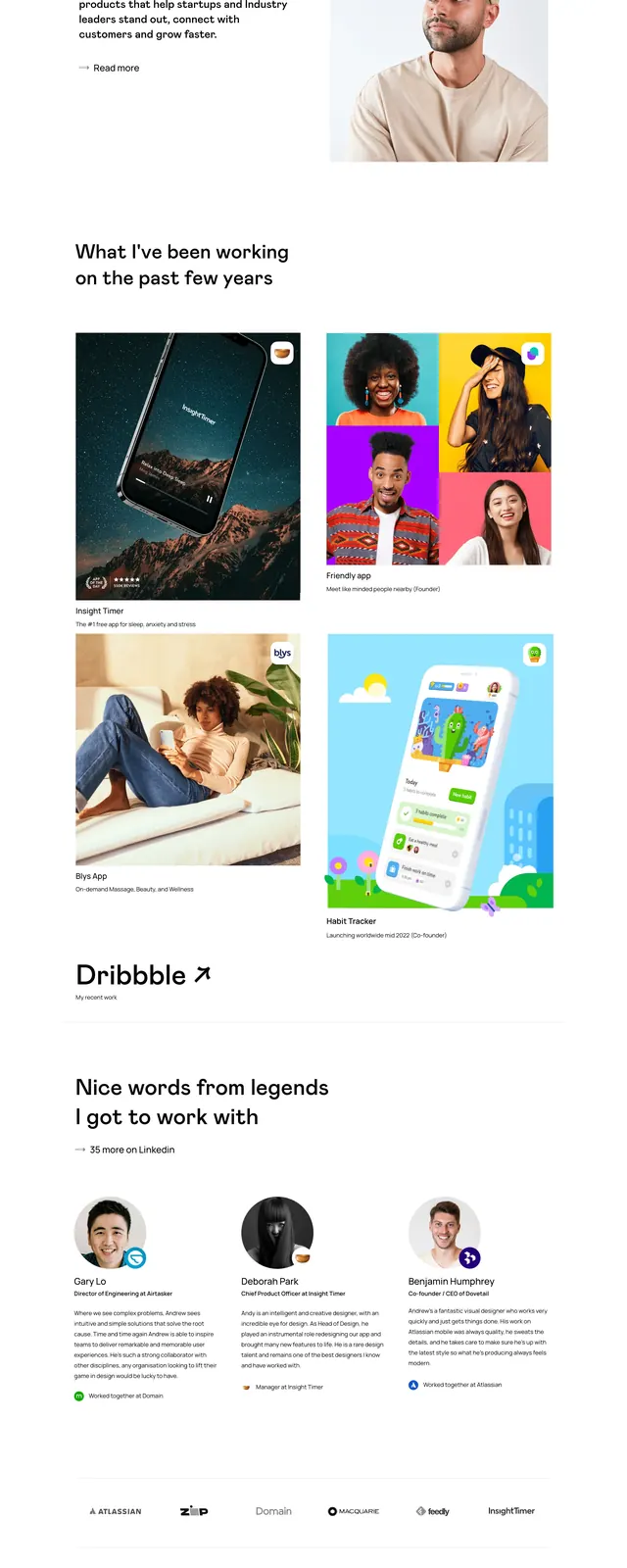
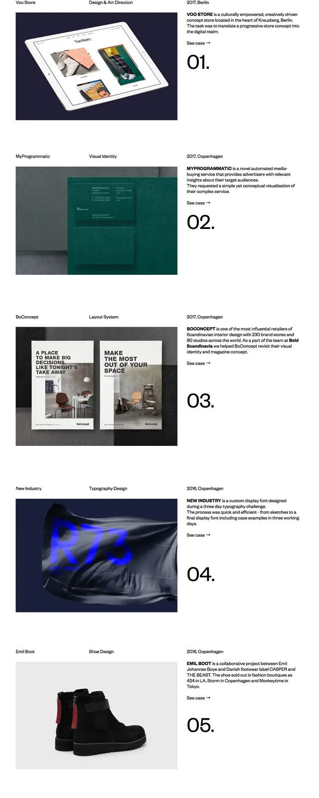
A minimalist portfolio landing page with oversized editorial headings, sparse navigation, and stacked project case-study previews.
Summary
A minimalist portfolio landing page with oversized editorial headings, sparse navigation, and stacked project case-study previews.
Visual description
The page uses a clean white background with small top navigation and a very large left-aligned headline reading "Selected Work:". Each project section is arranged in a wide, asymmetric split layout with the project title and metadata above a large image on the left, and a short text description with a numbered case label on the right. The lower part of the page ends with a pale pink footer-like services and experience block laid out in multiple columns of compact text.
Key takeaway
The strongest move is the contrast between huge editorial headlines and very small supporting text. The layout feels premium by giving each project generous whitespace and a clear numbered progression.
Reuse notes
Use this pattern for portfolio, studio, or agency sites that need a refined but straightforward case-study presentation. It works best when the imagery is strong and the copy can stay short and structured.