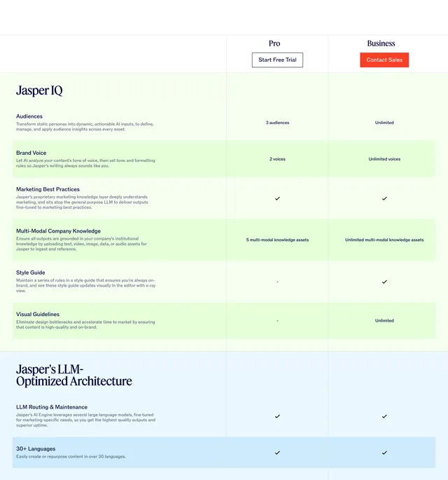
Light-mode three-column package comparison table pitting G-P Meridian Core against Meridian Prime with category-grouped checkmarks and dual CTAs.
Summary
A centered comparison section with a bold headline and a three-column matrix that groups EOR, HR, tools, support, and add-on features under category headers, using blue and purple checkmarks to differentiate the Core and Prime tiers.
Visual description
White background with a small all-caps "PACKAGES COMPARISON" label above a large black headline. Three columns: a left feature list grouped into five categories (Employer of Record, HR Support, Advanced Tools, Customer Success Hub, G-P Meridian Select Add-on Option), a middle Core column with a blue-green circular logo and blue "Book a demo" CTA in a lightly bordered card, and a right Prime column with a purple-pink logo and outlined "Learn more" CTA. Rows use blue checkmarks for Core inclusions, purple checkmarks for Prime, and gray dashes for exclusions. Small "New" and "New countries" badges appear beside select rows. CTAs repeat at the table footer.
Key takeaway
The tier-highlight treatment on the primary column (subtle border and shadow) without loud pricing cards. Category headers break a long feature list into scannable blocks, and color-coded checkmarks make tier differences readable at a glance.
Reuse notes
Strong for B2B SaaS or services comparing two product tiers with many line items. Works best when one tier is the recommended default. Needs enough vertical space for a long matrix; pair with simpler pricing cards elsewhere on the page for users who want a quick summary.