Preview image. Unlock full-res
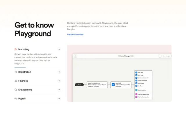
Split features section with a vertical category nav on the left and an expandable product screenshot on the right for Playground's platform modules.
Summary
A platform features section using a left-column vertical tab list and a right-column product canvas preview, with Marketing expanded to show workflow automation.
Visual description
White background in a two-column split. Left: large bold "Get to know Playground" heading above a vertical list of five modules (Marketing, Registration, Finances, Engagement, Payroll). Marketing is active with a red megaphone icon, blue underline, and expanded gray description about lead capture and campaigns; inactive rows show muted labels, small icons, and right arrows. Right: short intro copy about replacing broken tools, a blue "Platform Overview" text link, then a large rounded container on a pale pink-beige fill holding a product screenshot of a workflow builder. The canvas shows a "When" trigger, a condition box for lead form submission, an arrow to a "Send SMS" action node, and a floating action menu with colorful icons for SMS, email, lead updates, waits, and conditions.
Key takeaway
Vertical category tabs that expand inline copy instead of hiding everything behind clicks, paired with a live product canvas that changes per selection. The soft tinted screenshot frame separates UI chrome from marketing copy without a heavy device mockup.
Reuse notes
Best for multi-module platforms where prospects need to scan categories quickly then inspect one workflow. Requires strong product screenshots per tab. Inactive tab rows need enough contrast for accessibility; consider accordion on mobile.